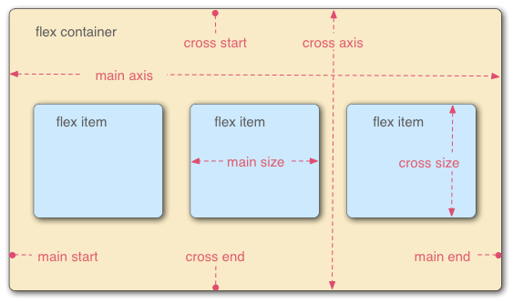
圖片來源:https://developer.mozilla.org/zh-TW/docs/Web/CSS/CSS_Flexible_Box_Layout/Using_CSS_flexible_boxes
先看過最重要的7個部分,再介紹它們的用法。
display
顧名思義,容器裝的就是我們要排列的元素,要讓元素能夠使用Flexbox方式排版,首先要做的就是先在容器 .flex的display屬性設定flex,Flexbox才會作用。
  <div class="flex">
    <div class="item1">1</div>
    <div class="item2">2</div>
    <div class="item3">3</div>
  </div>
.flex {
    display: flex;
}
flex-direction
決定元素「水平」或「垂直」排列。
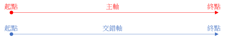
主要設定「主軸」的方向,若主軸為「水平」,則交錯軸為「垂直」,反之亦然。
.flex {
    display: flex;
    flex-direction: row | row-reverse | column | column-reverse ;
}
總共有4種:
row:預設值,由左至右。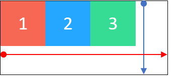
row-reverse:由右至左。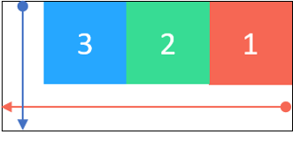
column:由上而下。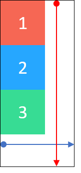
column-reverse:由下而上。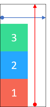
justify-content
元素在主軸上的對齊方式。
.flex {
  display: flex;
  justify-content: flex-start | flex-end | center | space-around | space-between;
}
總共有5種:
flex-start:預設值,貼齊主軸起點。
flex-end:貼齊主軸終點。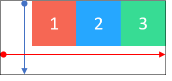
center:置中。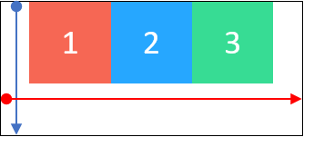
space-around:平均分配間隔,每個元素都有等距的間隔。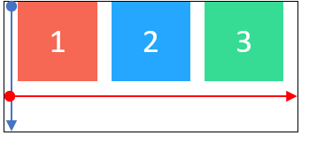
space-between:平均分配間隔,鄰近邊界元素,會貼齊主軸起點/終點。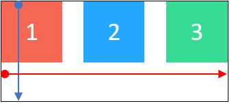
align-items
元素在交錯軸上的對齊方式。
.flex {
  display: flex;
  align-items: flex-start | flex-end | center | stretch | baseline;
}
總共有5種:
flex-start:貼齊交錯軸起點。
flex-end:貼齊交錯軸終點。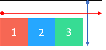
center:置中。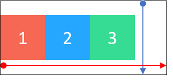
stretch:預設值,若元素未設置高度,將延展至容器的長或寬。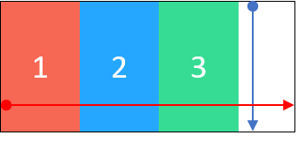
baseline:對齊元素的基線。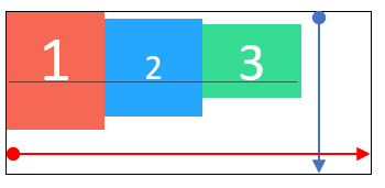
flex-wrap
元素的數量超出容器的範圍時,是否換行。
.flex {
  display: flex;
  flex-wrap: wrap | nowrap | wrap-reverse;
}
總共有3種:
wrap:換行。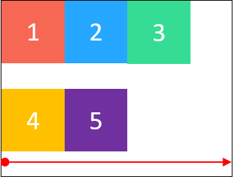
nowrap:預設值,不換行,元素的長/寬會壓縮。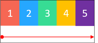
wrap-reverse:換行反轉。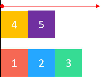
align-content
多行的排列方式。
.flex {
  display: flex;
  align-content: flex-start | flex-end | center | space-around | space-between | stretch;
}
總共有6種:
flex-start:預設值,貼齊交錯軸起點。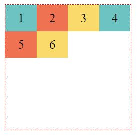
flex-end:貼齊交錯軸終點。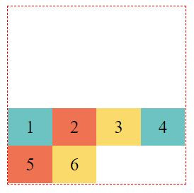
center:置中。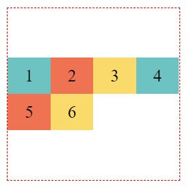
space-around:平均分配間隔,每行上下都有等距的間隔。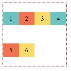
space-between:平均分配間隔,鄰近邊界行,會貼齊交錯軸起點/終點。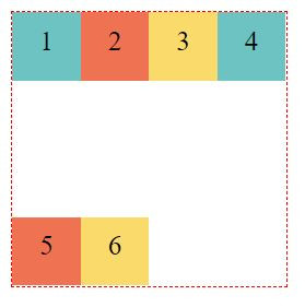
stretch:若元素未設置高度,會延展至該行的高度。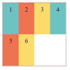
剛剛介紹的都是flex container(容器)的屬性,每個屬性值的設定,影響的是包含的所有元素,如若我們要特別設定某個元素,可以在該元素的屬性值上設定。
align-self:.flex {
display: flex;
}
.item2 {
align-self: auto | flex-start | flex-end | center | baseline | stretch;
}
auto:預設值,使用align-items的設定。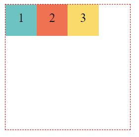
flex-start:貼齊交錯軸起點。
flex-end:貼齊交錯軸終點。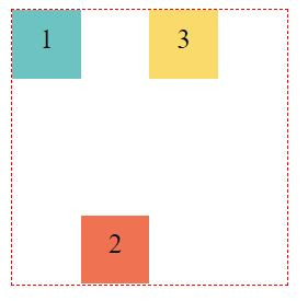
center:置中。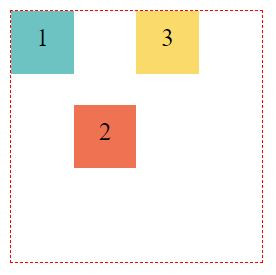
baseline:對齊元素的基線。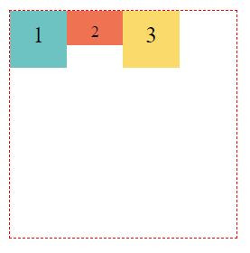
stretch:若元素未設置高度,將延展至容器的長或寬。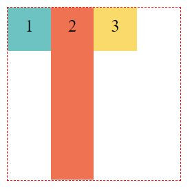
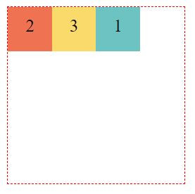
order:.item1 {
order: 3;
}
.item2 {
order: 1;
}
.item3 {
order: 2;
}
以上所介紹的,是Flexbox的基礎,搭配各種不同的屬性值,可以呈現千變萬化的排版方式。
還有一個元素的屬性值「flex」,比較進階,我打算下個篇幅再介紹。
最後,來個小小的應用練習,使用flex排出如下的左邊logo圖,右邊menu的header吧。

重點提示:該如何讓logo圖與menu群組分別置於header的兩側呢?可以使用margin-right: auto;的技巧,把menu群組推到另一側。
 WM
WM

 iThome鐵人賽
 看影片追技術