通常:
     #d2{
        transition-timing-function: linear;
        }
可利用兩個控制點,決定一個曲線:
https://cubic-bezier.com/
(左邊的圖案可以拉,GO看變化)
     #d2{
        transition-timing-function:cubic-bezier(.09,1.13,1,-0.14);
        }
      nav a {
        font-size: 1.2rem;
        display: block;
      }
display: flex;
使用這個才會換行
flex-wrap: wrap;
先往左推-1.1rem,圖片消失(0倍)
        }
        nav a .fa {
            transform: scale(0);
            transition: 0.3s all linear;
            margin-right: -1.1rem;
        }
滑鼠碰到之後歸0,並讓圖片出現(1倍)
        nav a:hover .fa {
            margin-right: 0rem;
            transform: scale(1);
            }
摸與不摸圖形改變
transform(摸)
2D =>
transform: translateX(100px)
3D =>
transform: rotateX(40deg);
transform: rotateY(50deg);
transform: rotateZ(60deg);
animation(不摸)
      div {
        animation-name: apple;
        animation-duration: 2s;
        animation-iteration-count: infinite;
      }
置中對齊
     .wavy {
        position: absolute;
        top: 50%;
        left: 50%;
        transform: translate(-50%, -50%);
      }
原理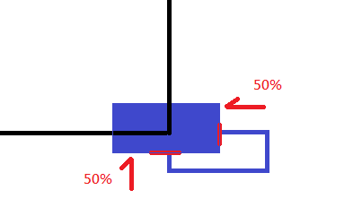
7.### animation 動畫製作
      .box {
        /* 使用jump(可自定義) */
        animation-name: jump;
        animation-duration: 1s;
        animation-iteration-count: infinite;

      }
@定義
      @keyframes jump {
        0% {
          top: 0px;
        }
        50% {
          /* 外推80px */
          top: 80px;
          border-radius: 0 0 30px 0;
        }
        100% {
          top: 0px;
        }
      }
position: static;"以外"的都可以
因為static是預設,位置(top)就不可以被移動
 .box {
        position: relative;
      }
      @keyframes jump {
        0% {
          top: 0px;
        }
        50% {
          /* 外推80px */
          top: 80px;
          border-radius: 0 0 30px 0;
        }
        100% {
          top: 0px;
        }
      }
先抓取檔案,放到檔案下引用animate.css
https://github.com/animate-css/animate.css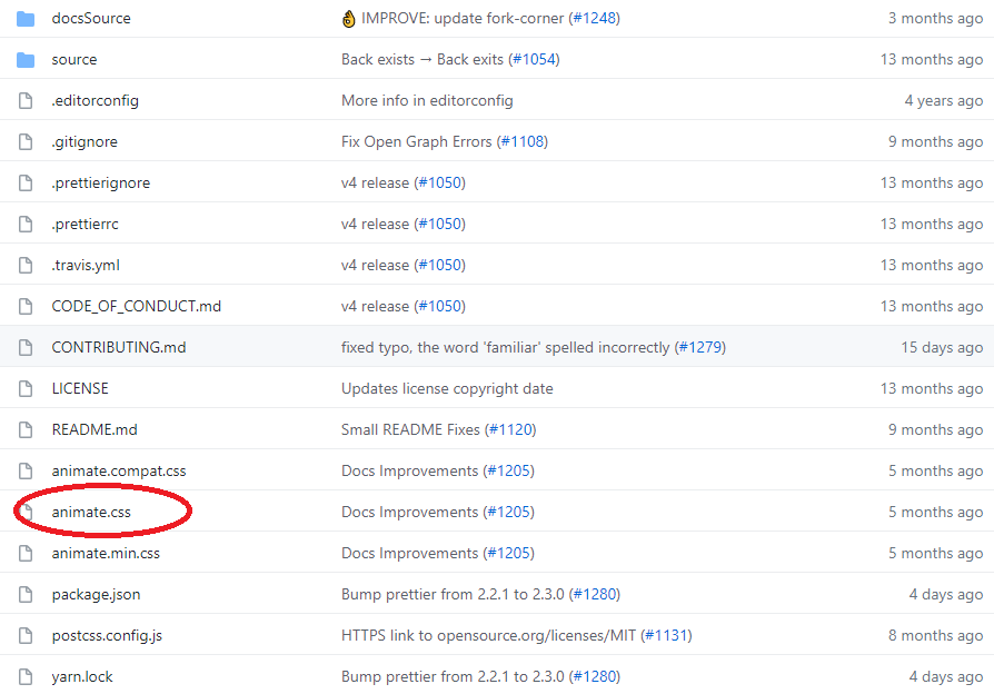
找喜歡的效果套入(右側)
https://animate.style/
使用方法
1.一定要有
animate__animated
animate__bounce
2.delay
/* All delay classes will take 2x longer to start */
:root {
  --animate-delay: 2s;
}
3.重複次數 infinite無限次
.my-element {
  --animate-repeat: 2;
}
 rouoxo

 iThome鐵人賽
 看影片追技術