本文同步上傳到筆者的個人部落格,裡面透過 Sandpack 直接編輯程式碼!
Slots, 也可以稱為插槽, 就是一個預設的區塊 (placeholder),其顧名思義,可以透過 Slots 在組件中插入任何預先定義的內容,包含其他組件、文字、圖片等等。
在介紹 Slots 之前,我們先來探討現今 React 組件中最常見的兩種 API 設計方式:配置模式 (Configuration) 和組合模式 (Composition)。再深入瞭解 Slots 是如何為其提供解決方案的。
說到了配置模式,就讓筆者回想到當初在建 <TextInput /> 或是其他一些比較複雜的組件,時常會遇到需要 客製化 的情況。
而那時候的解法都是透過傳入 props 大法,雖然這樣的方法在短期內是有效的,但隨著需求的增加,組件的 API 也會變得越來越繁鎖。
以下筆者將用 <TextInput /> 舉例, 一起來看看其組件的成長史。
首先 v1 版本通常會是和組件的設計指南一樣,有基本的 label、input、helperText,這時候的組件可能會長這樣
// v1
const TextInput = ({ label, helperText, icon, ...props }) => {
  return (
    <div className="text-input">
      <label>{label}</label>
      <input {...props} />
      <span className="helper-text">{helperText}</span>
      {icon}
    </div>
  );
};
然而,隨著時間的進展,可能有同事提出需要改變 label 的顏色。於是我們引入 labelProps 以便開發者進行客製化:
// v2
const TextInput = ({ label, helperText, icon, labelProps, ...props }) => {
  return (
    <div className="text-input">
      <label {...labelProps}>{label}</label>
      <input {...props} />
      <span className="helper-text">{helperText}</span>
      {icon}
    </div>
  );
};
不久之後,又有同事反應說需要 input 需要加入前綴與後綴,於是我們就加入 prefix 與 suffix 讓開發者可以自由的客製化 prefix 與 suffix。
// v3
const TextInput = ({ label, helperText, icon, labelProps, prefix, prefixProps, suffix, suffixProps, ...props }) => {
  return (
    <div className="text-input">
      <label {...labelProps}>{label}</label>
      <div>
        {prefix && <span {...prefixProps}>{prefix}</span>}
        <input {...props} />
        {suffix && <span {...suffixProps}>{suffix}</span>}
      </div>
      <span className="helper-text">{helperText}</span>
      {icon}
    </div>
  );
};
隨著設計千奇百怪的需求迎面而來,為了讓組件能夠複用,我們就會需要越來越多的 props 來客製化組件,到最後 <TextInput /> API 可能會非常冗長,讓組件變得難以維護,且混合了各種邏輯。
而組合模式的出現,正是為了嘗試解決這樣的問題。接下來,我們來看看組合模式如何達到這個目的。
React 是一個組件化的 UI 框架,而組件化的好處就是可以將一個大的組件拆分成更小的組件,並且可以複用。這就是組合模式的核心思想。
<TextField>
  <TextField.Label />
  <TextField.Input />
  <TextField.HelperText />
  <TextField.Icon />
</TextField>
這種方式提供開發者可以靈活運用組件,自由的定制組件的每一部分,但這引起了另一個問題:一致性,使用者必須按照預期的順序放入子組件,否則可能會導致 Accessibility 問題。
舉例來說 <TextField /> 組件的順序應該是 Label -> Input -> HelperText -> Icon。
此時使用者將 Label 放在最後面,並透過 CSS 將 Label 移到 Input 的上方,這樣就會導致 Accessibility 問題,因為對於 Screen Reader 使用者來說,因為他們可能首先接觸到的是 Input,卻還不知道這個輸入框的具體用途。
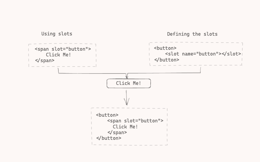
在介紹如何設計 React Slots 之前我們可以透過 Web Components 的 API 來看看 Slots 是如何解決這個問題的。
舉例來說,現在要設計一個 Button 組件,有了 Slots 我們就可以 Slot 的位置,像是按鈕的文字,並且給予一個預設的內容,當有需要客製化的時候,就可以透過 slot 屬性直接來插入內容。
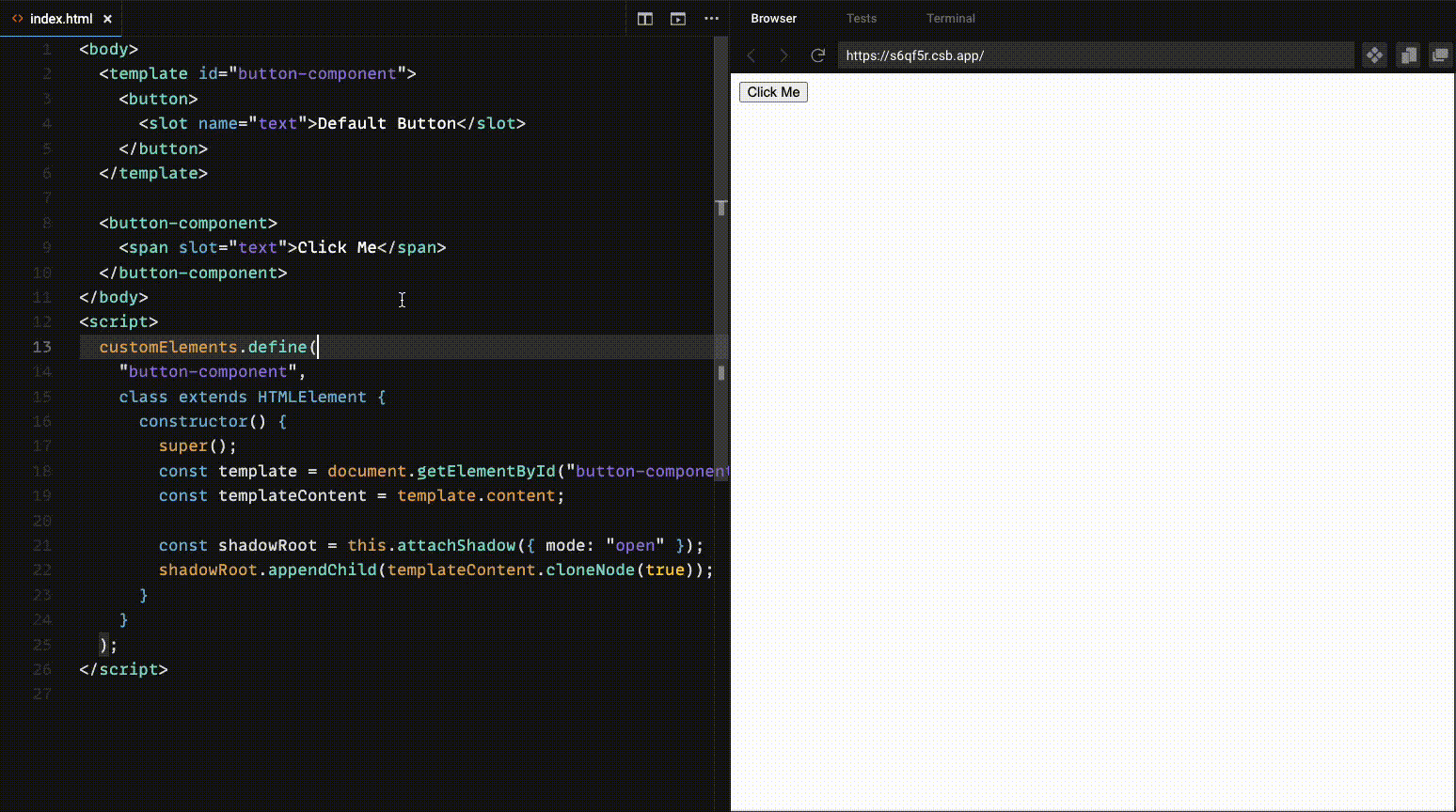
在 React 中,雖然沒有原生 Slots AP,但我們可以透過 children 來達到相同的效果,但是 children 並沒有提供名稱的概念,因此需要透過 props 來定義。
首先,先介紹當只需要定義一個 Slot, 讓我們來看看如何透過 children 來實現 Slots。
const Button = ({ children }) => {
  return <button>{children || 'Default Button'}</button>;
};
這樣的寫法,就可以讓開發者在使用 <Button /> 組件時,可以自由的插入任何內容。
<Button>
  <span>Click Me</span>
</Button>
當需要定義多個 Slots 時,例如 Button 與 Icon, 此時我們可以透過 props 來定義
const Button = ({ icon, content }) => {
  return (
    <button>
      {icon}
      {content || 'Default Button'}
    </button>
  );
};
而這個做法有一個缺點,所有的 Slot 都需要透過 props 來定義。
<Button icon={<Icon />} content={<span>Click Me</span>} />
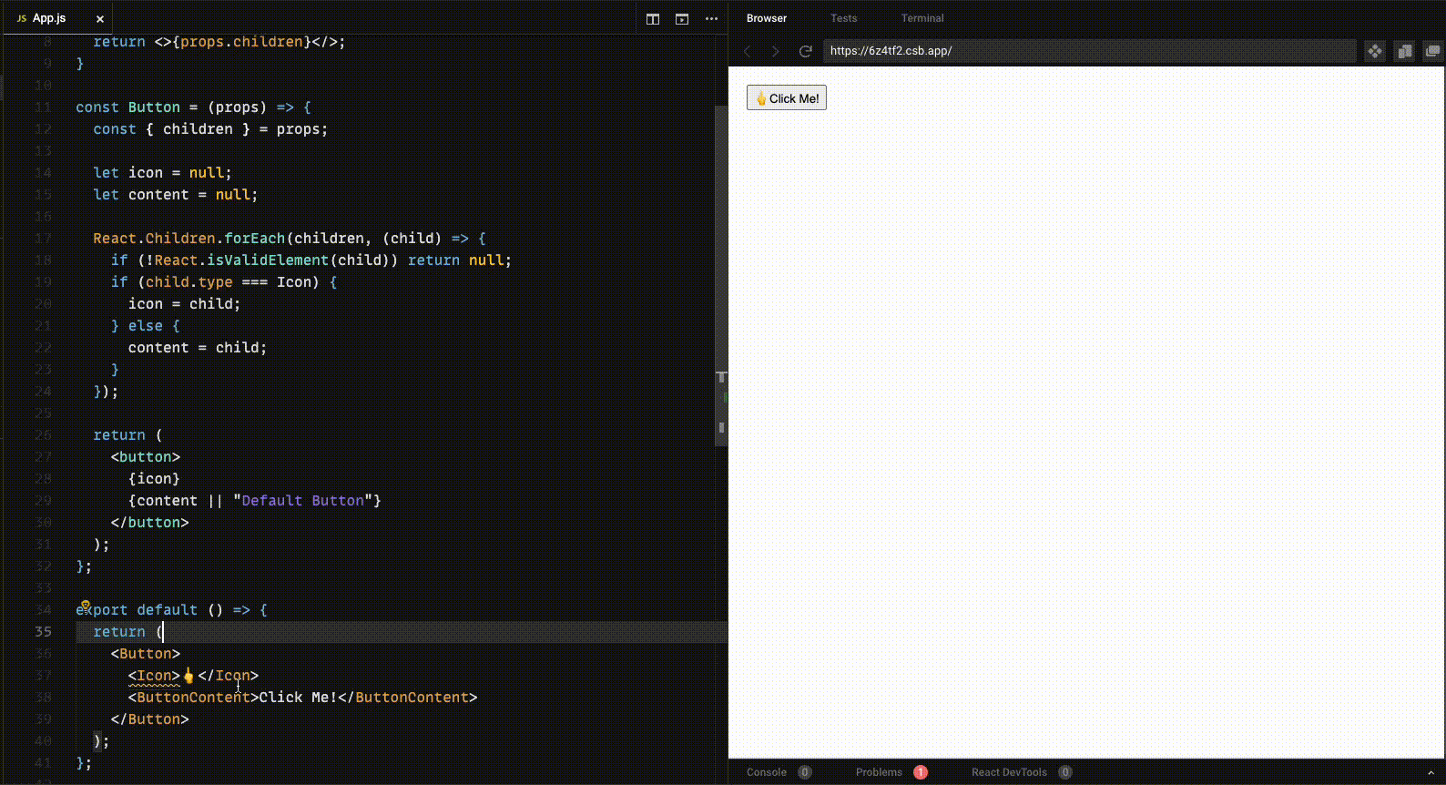
createSlots為了解決上面的問題,可以與組合模式的概念進行結合,並透過遍歷 React Children 的方式找到每個子組件的型別,並且將其放入對應的 Slot 中。
首先使用方式大概會像這樣
<Button>
  <Icon>🖕</Icon>
  <ButtonContent>Click Me!</ButtonContent>
</Button>
而 JSX 會被轉換成以下的結構
{
  type: function Button() {},
  props: {
    children: [
      {
        type: function Icon() {},
        props: {},
      },
      {
        type: function ButtonContent() {},
        props: {
          children: 'Click Me',
        },
      },
    ],
  },
}
再透過這個結構,遍歷 children 來找到每個子組件的型別,並且將其放入對應的 Slot 中。
function ButtonContent(props) {
  return <>{props.children}</>;
}

function Icon(props) {
  return <>{props.children}</>;
}

const Button = (props) => {
  const { children } = props;

  let icon = null;
  let content = null;

  React.Children.forEach(children, (child) => {
    if (!React.isValidElement(child)) return;
    if (child.type === Icon) {
      header = child;
    } else {
      content = child;
    }
  });

  return (
    <button>
      {slot.icon}
      {slot.content || 'Default Button'}
    </button>
  );
};
而從上面的例子中,可以看到我們可以透過 slot 屬性來插入內容,就可以解決 Configuration 模式的痛點,不用再傳入過多的 props 來客製化組件。也可以解決 Composition 模式的痛點,因為開發者可以自由的插入內容,而不用擔心順序的問題。
下一章節我們將介紹如何透過 React 的 Context API 來實現 Slots。

 iThome鐵人賽
 看影片追技術