本系列文章會在筆者的部落格繼續連載!Design System 101 感謝大家的閱讀!
繼前篇提到 Button 的 Spec 之後,本篇將來介紹 Button 組件的 Style 部分,而在下一篇則會提到 FocusRing 這個組件,再來則是將 Button 組件完成!
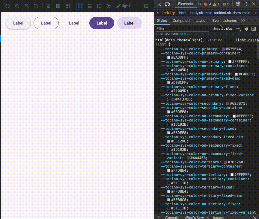
首先先來看看,Material Design 的 Button 組件設計,由於我們先前在 CSS To Token 的章節,已經有先設定好所有 Design Token,並且放在 Storybook 的 preview-head.html 中,這使得實作深淺色的組件時,只需要透過切換 html[data-theme={mode}] 就可以將所有 Design Token 切換主題色。
而為了讓組件顏色隨著主題色變換而改片,我們在實作組件時需要在定義 Component Token 時,將其指向 Design Token,這樣就可以同時換色。
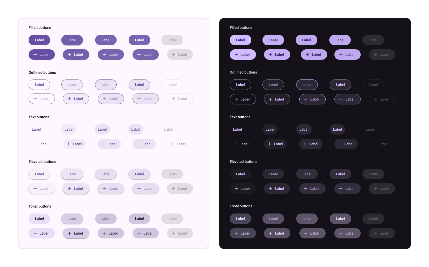
整體在 Storybook 呈現的結果就會是以下:
而當其他開發者在安裝我們的 Design System 時,只需要在其 html 底下,引入其 css 即可
<link href="https://cdn.jsdelivr.net/npm/@tocino-ui/design-tokens/dist/normalize/normalize.css" rel="stylesheet" />
在前面章節中,我們有先將 Storybook 加入 storybook-addon-theme-switcher/theme 的 plugin, 其可以讓我們切換 html[data-theme] 的值,今天就將設定 Storybook 的 preview-head.html 下深淺模式下的背景
// preview-head.html
<style>
  html[data-theme='light'] {
    background-color: #fef7ff;
  }

  html[data-theme='dark'] {
    background-color: #141218;
  }
</style>
接著我們就可以建立 Button CSS,而這時就將 Component Token 參照到 System Token
// button/button.scss
root {
  ... 基本組件元素

  --tocino-elevated-button-shadow: var(--tocino-sys-elevation-level-1);
  --tocino-elevated-button-container-color: var(--tocino-sys-color-surface-container-low);
  --tocino-elevated-button-label-text-color: var(--tocino-sys-color-primary);

  --tocino-filled-button-container-color: var(--tocino-sys-color-primary);
  --tocino-filled-button-label-text-color: var(--tocino-sys-color-on-primary);

  ...
}
而在切換顏色時,我們可以透過 data-variant 的 event 參數判斷現在需要帶入的顏色
// button/button.scss

.tocino-Button {
  ... 基本組件元素

  &[data-variant='elevated'] {
    box-shadow: var(--tocino-elevated-button-shadow);
    background-color: var(--tocino-elevated-button-container-color);

    .tocino-Button__label {
      color: var(--tocino-elevated-button-label-text-color);
    }
  }
以及最後在 Button 組件中,將 variant 傳入 props 再放入 data-variant 這樣就可以根據不同型態給入不同的值
export const Button = React.forwardRef((props) => {
  const { variant, children } = props;
  const btnRef = useRef(null);

  return (
    <button className="tocino-Button" data-variant={variant} ref={btnRef}>
      <span className="tocino-Button__label">{children}</span>
      <Ripple target={btnRef} />
    </button>
  );
});
明天見!

 看影片追技術