昨天學了卡片之後,接下來許多東西都可以用類似的排版,包括今天的設計
這次要達成的效果是三等份卡片+hover
色即是色,空即是空,此次設計稿花不了十分鐘,但hover效果可能需要十年功,直接呈上程式碼,卡片元件不用打
<section class="share animated-line bg-secondary-dark">
<div class="container py-20">
<h3 class="fs-xl-6 fs-5 text-white text-center position-relative mb-20">
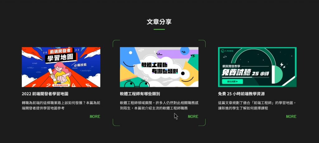
文章分享
</h3>
<div class="row g-10">
<div
class="col-lg-4 d-flex flex-column justify-content-center align-items-center"
>
<div class="card bg-secondary-dark rounded-4">
<div class="card-body text-white p-6">
<div
class="article-info d-flex flex-column justify-content-center align-items-center"
>
<img src="../assets/images/article01.jpg" alt="" />
</div>
<h5 class="card-title fs-5 my-5">2022 前端開發者學習地圖</h5>
<p class="card-text fs-4 fw-lighter">
轉職為前端的這條職業路上該如何發展?本篇為前端開發者提供學習地圖參考
</p>
<a href="#" class="font-azeret-mono text-primary-green text-end"
>MORE</a
>
</div>
</div>
</div>
<div
class="col-lg-4 d-flex flex-column justify-content-center align-items-center"
>
<div class="card bg-secondary-dark rounded-4">
<div class="card-body text-white p-6">
<div
class="article-info d-flex flex-column justify-content-center align-items-center"
>
<img src="../assets/images/article02.jpg" alt="" />
</div>
<h5 class="card-title fs-5 my-5">軟體工程師有哪些類別</h5>
<p class="card-text fs-4 fw-lighter">
軟體工程師領域廣闊,許多人仍然對此相關職務感到陌生,本篇就介紹主流的軟體工程師職務
</p>
<a href="#" class="font-azeret-mono text-primary-green text-end"
>MORE</a
>
</div>
</div>
</div>
<div
class="col-lg-4 d-flex flex-column justify-content-center align-items-center"
>
<div class="card bg-secondary-dark rounded-4">
<div class="card-body text-white p-6">
<div
class="article-info d-flex flex-column justify-content-center align-items-center"
>
<img src="../assets/images/article03.jpg" alt="" />
</div>
<h5 class="card-title fs-5 my-5">免費 25 小時前端教學資源</h5>
<p class="card-text fs-4 fw-lighter">
這篇文章規劃了適合「前端工程師」的學習地圖,讓新進的學生了解如何選擇課程
</p>
<a href="#" class="font-azeret-mono text-primary-green text-end"
>MORE</a
>
</div>
</div>
</div>
</div>
</div>
</section>
這樣就完成了,感覺可以設計一個component library專門用來存模板
但是! 這個hover效果我就不會做了,於是我直接問claude AI,這種完全沒想法的問題就要直接問
<html lang="en">
<head>
    <meta charset="UTF-8">
    <meta name="viewport" content="width=device-width, initial-scale=1.0">
    <title>Hover Border Effect</title>
    <style>
        .image-container {
            position: relative;
            display: inline-block;
            overflow: hidden;
        }
        .image-container img {
            display: block;
            max-width: 100%;
            height: auto;
        }
        .image-container::before,
        .image-container::after {
            content: '';
            position: absolute;
            width: 100%;
            height: 100%;
            border: 2px solid transparent;
            transition: all 0.3s ease;
        }
        .image-container::before {
            top: -2px;
            left: -2px;
            border-top-color: #00ff00;
            border-left-color: #00ff00;
        }
        .image-container::after {
            bottom: -2px;
            right: -2px;
            border-bottom-color: #00ff00;
            border-right-color: #00ff00;
        }
        .image-container:hover::before,
        .image-container:hover::after {
            width: calc(100% + 4px);
            height: calc(100% + 4px);
        }
    </style>
</head>
<body>
    <div class="image-container">
        <img src="/api/placeholder/400/300" alt="Placeholder image">
    </div>
</body>
</html>
然後他給了我半成功的程式碼,因為他的想法是用偽元素(我也覺得只能這樣做),不過只有before、after,因此做的四不像,而且效果不太好看,後來我根據他的邏輯去改一改,做不出設計稿的效果卻沒想到誤打誤撞出現更棒的東西,
.share {
  .card::before,
  .card::after {
    content: "";
    position: absolute;
    width: 6%;
    height: 1%;
    border: 2px solid transparent;
    border-radius: 20px;
    background: #09acf5;
    transition: all 0.3s ease;
  }
  .card::before {
    top: -2px;
    left: -2px;
    border-top-color: #09acf5;
    border-left-color: #09acf5;
  }
  .card::after {
    bottom: -2px;
    right: -2px;
    border-bottom-color: #09acf5;
    border-right-color: #09acf5;
  }
  .card:hover::before,
  .card:hover::after {
    width: calc(100% + 4px);
    height: calc(100% + 4px);
    background: transparent;
  }
}
我稱之為量子卡片hover,這個比原本的炫多了,所以想說紀錄一下,雖然自己改設計稿是不對的,但我找不到設計師一起討論,就把這個當作是薛丁格的切版吧,介於切成功跟切失敗之間
另外footer.ejs也順便完成了,也就只寫一行,因為footer通常都是滿版的,因此不需要特地用容器包,不過也會有複雜的footer,基本上就會用到footer.scss
今天是 Claude.AI 的笑話時間
一位程序員去超市買東西。他的妻子叮囑他:「親愛的,買一瓶牛奶,如果他們有雞蛋的話,就買六個。」
程序員回到家,帶著六瓶牛奶。
妻子困惑地問:「你怎麼買了六瓶牛奶?」
程序員回答:「因為他們有雞蛋。」


 iThome鐵人賽
 看影片追技術