目前正在做KNN的作業,在畫圖出來這塊遇到問題,
按照我理解的,
前面
plt.pcolormesh(xx, yy, Z, cmap=cmap_light)
可以依據我的dataset的xy座標跟預測結果畫出分類圖(淺色的密集點),
下面
plt.scatter(X_test[:, 0], X_test[:, 1], c=y_test, cmap=cmap_bold, edgecolor='k', s=20)
可以依據我的測試資料的xy座標畫出顏色比較深的點
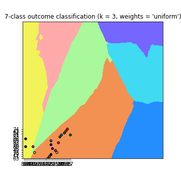
但是我的測試資料居然只有一部分在分類圖上面,有很多都超出去,需要把
plt.xlim(xx.min(), xx.max())
plt.ylim(yy.min(), yy.max())
拿掉才看的到
可是我的test資料是包含在dataset裡的,到底是哪邊出問題才會超出去?
以下為我的code
from sklearn.model_selection import train_test_split
from sklearn.neighbors import KNeighborsClassifier
import numpy as np
import matplotlib.pyplot as plt
from matplotlib.colors import ListedColormap
from pylab import rcParams
dataset = []
label = []

path = 'dataset/'
#讀1~7的txt
for i in range(0, 7):
    f = open(path+str(i+1)+'.txt', 'r')
    print('Read file: ', path+str(i+1)+'.txt')
    lines = f.readlines()
    for line in lines:
        line = line.split()
        dataset.append(line)
        label.append(i)
        #print('line: ',line, 'label: ', i)
    f.close()

dataset = np.array(dataset)
print('\ndataset len: ', len(dataset))
label = np.array(label)
print('label len: ', len(label))

def accuracy(k, X_train, y_train, X_test, y_test):
    print('K: ', k)
    print('Train: ', len(X_train), 'Label: ', len(y_train))
    print('Test: ', len(X_test), 'Label: ', len(y_test))

    #compute accuracy of the classification based on k values

    # instantiate learning model and fit data
    knn = KNeighborsClassifier(n_neighbors=k)
    knn.fit(X_train, y_train)

    # predict the response
    pred = knn.predict(X_test)

    # evaluate and return  accuracy
    return accuracy_score(y_test, pred)

def classify_and_plot(X, y, k):
    '''
    split data, fit, classify, plot and evaluate results
    '''
    # split data into training and testing set
    X_train, X_test, y_train, y_test = train_test_split(X, y, test_size = 0.33, random_state = 41)

    # init vars
    n_neighbors = k
    h           = .02  # step size in the mesh

    # Create color maps            red         blue      yellow     green       cyan      orange      pink
    cmap_light = ListedColormap(['#FFAAAA', '#248EFF', '#F1F358', '#A9F89B', '#40DAF2', '#F39153', '#7566FF'])
    cmap_bold  = ListedColormap(['#FF0000', '#0000FF', '#C8C20E', '#006B07', '#0065B8', '#943F0A', '#0B006B'])

    rcParams['figure.figsize'] = 5, 5
    for weights in ['uniform', 'distance']:
        # we create an instance of Neighbours Classifier and fit the data.
        clf = KNeighborsClassifier(n_neighbors, weights=weights)
        clf.fit(X_train, y_train)

        # 確認訓練集的邊界
        # Plot the decision boundary. For that, we will assign a color to each
        # point in the mesh [x_min, x_max]x[y_min, y_max].
        x_min, x_max = int(min(X[:, 0])) - 1, int(max(X[:, 0])) + 1
        y_min, y_max = int(min(X[:, 1])) - 1, int(max(X[:, 1])) + 1
        print('\nx_min', x_min, 'x_max', x_max, '\ny_min', y_min, 'y_max', y_max)

        #xx = x座標值 yy=y座標值
        xx, yy = np.meshgrid(np.arange(x_min, x_max, h),
                             np.arange(y_min, y_max, h))

        #np.c_ 以column的方式拼接兩個array
        #ravel() 拉平為 1d-array
        Z = clf.predict(np.c_[xx.ravel(), yy.ravel()])
        # Put the result into a color plot 畫出分類圖(淺色)
        #z=預測結果,會繪製成對應的cmap值顏色
        Z = Z.reshape(xx.shape)
        fig = plt.figure()
        plt.pcolormesh(xx, yy, Z, cmap=cmap_light)


        # Plot also the training points, x-axis = 'Glucose', y-axis = "BMI"
        plt.scatter(X_test[:, 0], X_test[:, 1], c=y_test, cmap=cmap_bold, edgecolor='k', s=20)

        plt.xlim(xx.min(), xx.max())
        plt.ylim(yy.min(), yy.max())

        print('xx_min', xx.min(), 'xx_max', xx.max(), '\nyy_min', yy.min(), 'yy_max', yy.max())
        plt.title("7-class outcome classification (k = %i, weights = '%s')" % (n_neighbors, weights))
        plt.show()
        fig.savefig(weights +'.png')
        print('dataset: ', len(X[:, 0]), len(X[:, 1]))
        print('test: ', len(X_train[:, 0]), len(X_train[:, 1]))

        # evaluate
        y_expected  = y_test
        y_predicted = clf.predict(X_test)
        print('預測:', y_predicted)
        print('答案:', y_expected)


        # print results
        print('----------------------------------------------------------------------')
        print('Classification report')
        print('----------------------------------------------------------------------')
        print('\n', classification_report(y_expected, y_predicted))
        print('----------------------------------------------------------------------')
        print('Accuracy = %5s' % round(accuracy(n_neighbors, X_train, y_train, X_test, y_test), 3))
        print('----------------------------------------------------------------------')

classify_and_plot(dataset, label, 3)
已邀請的邦友 {{ invite_list.length }}/5
可是我的test資料是包含在dataset裡的
啊你不是用train_test_split把他切開了?
重點是你沒有標準化OwO,在KNN等距離相關的都需要做標準化,且要記得先分出train data再對他做標準化。
我猜應該是要把電腦預測時把點映射至圖的哪裡,而不是把原本的測試資料直接丟進去。舉個簡單的例子,做完標準化後資料會介於1~-1之間,但你的測試資料想當然爾不在這裡面。
可能要看一下別人的code。
我的邊界還是使用整個dataset去找x,y的最大最小值
所以plt.pcolormesh出來,test的點還是在這個範圍的
我看其他人的code都大同小異,也沒在做標準化,暫時束手無策
    Z = clf.predict(np.c_[xx.ravel(), yy.ravel()])

    # Put the result into a color plot
    Z = Z.reshape(xx.shape)
    plt.figure(figsize=(8, 6))
    plt.contourf(xx, yy, Z, cmap=cmap_light)
他是先放進去才畫。(P.S不想標準化隨便你,反正作業而已準確度沒差)
...標準化後不僅顯示出來的點分布狀態不一樣,跑的速度也大幅提升,
完全無法理解這種狀況,太神奇了
總之非常感謝你,我已經困在這邊兩天了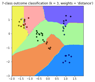
code貼一下
你有改用plt.contourf嗎?至於速度提升是因為標準化可以提升收斂速度。
貌似沒有太大的差異,我其他都沒動,只有改這行而已
plt.contourf
plt.pcolormesh
感謝尼>w<,下面那張美化過的圖比較好看!所以你是先丟進去在畫出來嗎?我想驗證一下我的猜測。
        clf = KNeighborsClassifier(n_neighbors, weights=weights)
        clf.fit(X_train, y_train)

        # 確認訓練集的邊界
        # Plot the decision boundary. For that, we will assign a color to each
        # point in the mesh [x_min, x_max]x[y_min, y_max].
        x_min, x_max = int(min(X[:, 0])) - 1, int(max(X[:, 0])) + 1
        y_min, y_max = int(min(X[:, 1])) - 1, int(max(X[:, 1])) + 1
        print('\nx_min', x_min, 'x_max', x_max, '\ny_min', y_min, 'y_max', y_max)

        #xx = x座標值 yy=y座標值
        xx, yy = np.meshgrid(np.arange(x_min, x_max, h),
                             np.arange(y_min, y_max, h))

        #np.c_ 以column的方式拼接兩個array
        #ravel() 拉平為 1d-array
        Z = clf.predict(np.c_[xx.ravel(), yy.ravel()])
        # Put the result into a color plot 畫出分類圖(淺色)
        #z=預測結果,會繪製成對應的cmap值顏色
        Z = Z.reshape(xx.shape)
        fig = plt.figure()
        plt.pcolormesh(xx, yy, Z, cmap=cmap_light)
        #plt.contourf(xx, yy, Z, cmap=cmap_light)


        # Plot also the training points, x-axis = 'Glucose', y-axis = "BMI"
        plt.scatter(X_test[:, 0], X_test[:, 1], c=y_test, cmap=cmap_bold, edgecolor='k', s=20)

        plt.xlim(xx.min(), xx.max())
        plt.ylim(yy.min(), yy.max())

        print('xx_min', xx.min(), 'xx_max', xx.max(), '\nyy_min', yy.min(), 'yy_max', yy.max())
        plt.title("7-class outcome classification (k = %i, weights = '%s')" % (n_neighbors, weights))
        plt.show()
        fig.savefig(weights +'.png')

 iThome鐵人賽