您好:
程式碼如下:
想請問一下,該如何有LABLE對照表,與顏色對應
比如 台積電 blue
鴻海 green 顏色顯示於LABLE
謝謝
from bokeh.plotting import figure, output_file, show
from bokeh.plotting import ColumnDataSource
from bokeh.models import CategoricalColorMapper, Legend, LegendItem
import pandas as pd
# 匯入CSV格式的檔案
df = pd.read_csv("tech_stocks_2017.csv", encoding="utf8")
output_file("Ch16_4_3d.html")
tech_stocks = ["台積電", "鴻海", "廣達", "聯發科", "和碩"]
c_map = CategoricalColorMapper(
factors=tech_stocks,
palette=["blue","green","red","yellow","gray"])
data = ColumnDataSource(data={
"close": df["Close"],
"volume": df["Volume"],
"name": df["Name"]
})
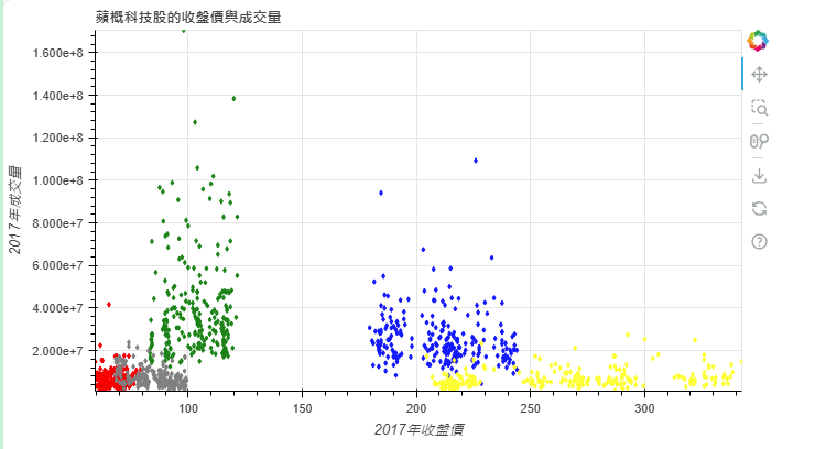
p = figure(title="蘋概科技股的收盤價與成交量",
height=400, width=700,
x_range=(min(df.Close), max(df.Close)),
y_range=(min(df.Volume), max(df.Volume))
)
p.diamond(x="close", y="volume", source=data,
color={"field": "name", "transform": c_map } )
p.xaxis.axis_label = "2017年收盤價"
p.yaxis.axis_label = "2017年成交量"
show(p)
已邀請的邦友 {{ invite_list.length }}/5
試試:
from bokeh.plotting import figure, output_file, show
from bokeh.plotting import ColumnDataSource
from bokeh.models import CategoricalColorMapper, Legend, LegendItem
import pandas as pd

# 匯入CSV格式的檔案
df = pd.read_csv("tech_stocks_2017.csv", encoding="utf8")

output_file("Ch16_4_3d.html")

tech_stocks = ["台積電", "鴻海", "廣達", "聯發科", "和碩"]

c_map = CategoricalColorMapper(
           factors=tech_stocks,
           palette=["blue","green","red","yellow","gray"])

data = ColumnDataSource(data={
        "close": df["Close"],
        "volume": df["Volume"],
        "name": df["Name"]
        })

p = figure(title="蘋概科技股的收盤價與成交量",
           height=400, width=700,
           x_range=(min(df.Close), max(df.Close)),
           y_range=(min(df.Volume), max(df.Volume)),
           tools="pan,wheel_zoom,box_zoom,reset,save")

# 添加 diamond glyph,並使用 legend_field 自動生成 Legend
p.diamond(x="close", y="volume", source=data,
          color={"field": "name", "transform": c_map},
          legend_field="name",  # 設置 legend_field
          size=10, alpha=0.6)

p.xaxis.axis_label = "2017年收盤價"
p.yaxis.axis_label = "2017年成交量"

# 設置 Legend 的位置和樣式
p.legend.title = "科技股"
p.legend.location = "top_left"
p.legend.background_fill_alpha = 0.6

show(p)
