分享至
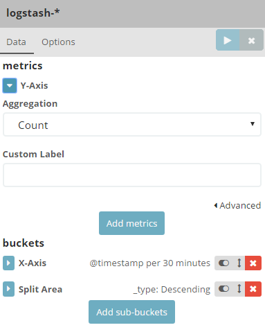
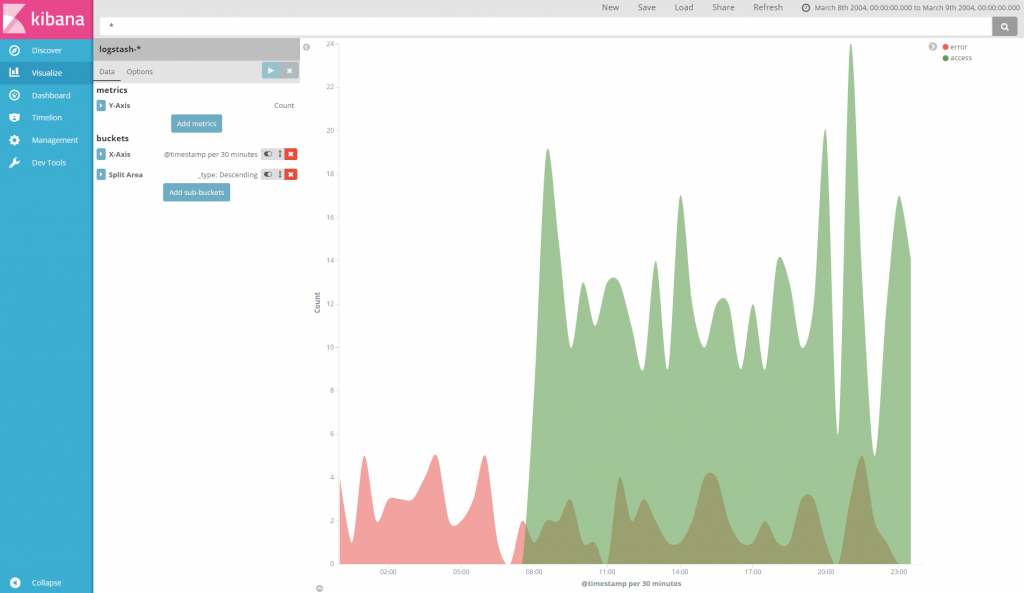
Area chart 基本繪製與 line chart 無異
設定 y軸
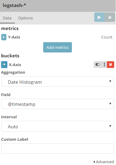
設定 x軸
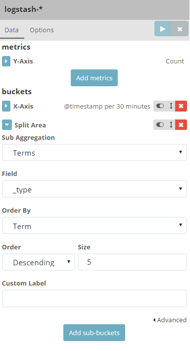
聚合加入欲比較的 field 屬性
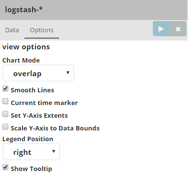
設定 Options 內容,使曲線變平滑且具有重疊透明度
完成
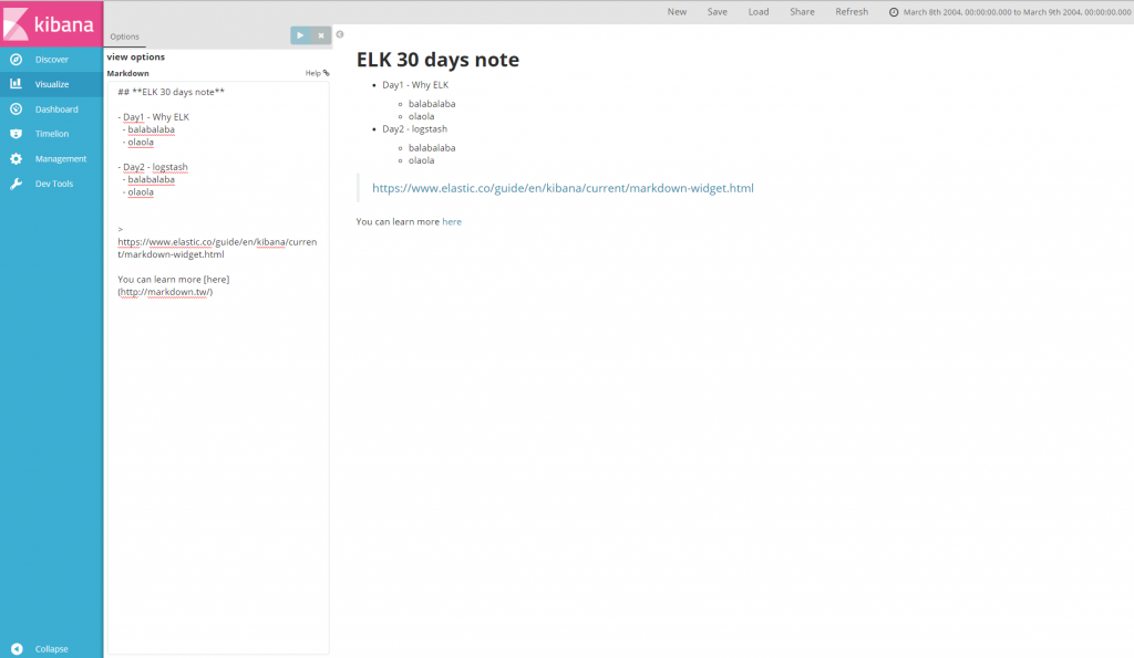
Markdown
使用上與我們在 ithome 鐵人發文上一樣喔,左邊為編輯欄,右邊預覽則是按下 ▶ 後顯示。
Markdown 教學
IT邦幫忙


 iThome鐵人賽