在玩 photoshop 的時候,我時常會使用一個名為「移置」的特效,這個特效說難不難,可以參考我在 2008 年寫的的教學:photoshop:國旗飄揚皺折,在 Photoshop 裏頭這個特效的基本原理,就在於利用 Alpha 色版的深度,讓圖片的像素產生不同的位移情形,在許多的 AfterEffect 特效或 3D 效果裏頭,也都會使用類似的作法,來讓貼圖更吻合表面。( oxxostudio.tw 同步發表:SVG 研究之路 (28) - filter - feDisplacementMap )
同樣的,SVG 裡也有提供這種功能,就叫做 feDisplacementMap,也因為有了這個濾鏡,我們更可以做出許多有趣的變化,現在就讓我們來繼續看下去~
feDisplacementMap 的屬性:
1. scale
2. xChannelSelector
3. yChannelSelector
4. in
5. in2
在解釋這些屬性之前,可以先看到 SVG 裡頭關於每個像素移置的公式:「 P'(x,y) <- P( x + scale * (XC(x,y) - .5), y + scale * (YC(x,y) - .5))」,看起來很難,翻成中文就是:P’(x,y) 是移置過的該像素坐標,公式就是原本的坐標 ( x,y ) 加上振幅比例 ( scale ) 與 xChannelSelector 或 yChannelSelector 的乘積。
好像很難理解?沒關係,我再講的直白一點,簡單來說就是我們提供一張以 R 或 G 或 B 或 A 為主的圖片,目的在作為另外一張圖片的移置參考,會怎麼移置取決了我們提供的圖片內容顏色以及被移置的圖片內容顏色,如果今天以 R ( 紅色 ) 通道為例,越紅移置的比例越高,但如果圖片裡面沒有紅色,則 R 作為移置的效用就不明顯或與其他顏色通道不同。
然而和 Photoshop 最大的不同,SVG 裡頭可以選擇四種通道顏色,也就是 RGBA,換句話說,我們在 HTML 的色彩,寫成 red 或 #f00 其實只描述了 RGB,如果寫成 rgba(255,0,0,1) 就會更容易理解,如果對於這些寫法不容易轉換的話,也可以開啟 photoshop 或繪圖軟體的調色盤,通常都可以看到色彩的數值。( 不明白 rgba 的請參考這篇文章 http://zh.wikipedia.org/wiki/RGBA,這裡就不介紹了 )
上面其實就是在介紹 scale、xChannelSelector 和 yChannelSelector 這三個屬性,至於剩下的 in 和 in2 屬性,in 代表要被套用的圖片 ( 要變形的 ),in2 則是要套用的圖片 ( RGBA 通道使用 ),而要套用的 feImage,則必須要寫上 result,就可以被套用。
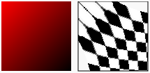
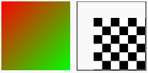
講到這裡非常多的解釋,不如直接來幾張示意圖才比較好理解,下面我先拿一張黑白棋盤圖作為要變形的圖片 ( 通常變形都會拿這種圖來解釋,因為最明顯也最清楚 ),我們先看看套用紅黑漸層移置的效果:
<svg width="250" height="150">
  <defs>
    <filter id="f" filterUnits="objectBoundingBox" primitiveUnits="objectBoundingBox" x="0" y="0" width="1" height="1">
      <feImage result="pict1" xlink:href="#m1" x="0" y="0" width="1" height="1"></feImage>
      <feImage result="pict2" xlink:href="#m2" x="0" y="0"  width="1" height="1"></feImage>
      <feDisplacementMap id="fdm" scale=".5" xChannelSelector="R" yChannelSelector="R" in2="pict2" in="pict1"></feDisplacementMap>
    </filter>
    <linearGradient id="g" x1="0" y1="0" x2="1" y2="1">
      <stop offset="0" stop-color="#f00"></stop>
      <stop offset="1" stop-color="#000"></stop>
    </linearGradient>
    <rect id="m2" x="0" y="0" width="100" height="100" fill="url(#g)"></rect>
    <image id="m1" x="0" y="0" width="100" height="100" xlink:href="http://www.oxxostudio.tw/img/articles/201410/20141009_1_demo.jpg"></image>
  </defs>
  <rect x="0" y="0" width="100" height="100" filter="url(#f)" stroke="#000" transform="translate(110)"></rect>
  <rect x="0" y="0" width="100" height="100" fill="url(#g)"></rect>
  <rect x="110" y="0" width="100" height="100" fill="none" stroke="#000"></rect>
</svg>
再來看看紅綠漸層移置的效果:
    <linearGradient id="g" x1="0" y1="0" x2="1" y2="1">
      <stop offset="0" stop-color="#f00"></stop>
      <stop offset="1" stop-color="#0f0"></stop>
    </linearGradient>
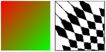
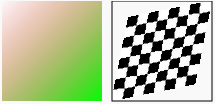
為什麼上面的效果是一樣的呢?原因就是剛剛說的,我們採用紅色通道作為移置的參考,所以紅黑漸層或紅綠漸層,紅色通道的值是固定的,所以出來的效果才會一模一樣,不過這時候如果像下面的範例把通道改為 A,就會發現整張圖往左上角飄移!為什麼呢?
<feDisplacementMap id="fdm" scale=".5" xChannelSelector="A" yChannelSelector="A" in2="pict2" in="pict1"></feDisplacementMap>
因為這個漸層的 A 都是 1 ( 沒有不透明的部分 ),加上我們要用作移置的圖片 Aplha 色板也都是 1,所以在換算之後就整張圖移置了 ( 應該說所有的像素都移置了 ),如果這時候改成 B,就會發現往右下角飄移,因為漸層裏頭 B 的數值是 0 而套用的圖片 B 有數值 ( 白色的區域 B=255 )
<feDisplacementMap id="fdm" scale=".5" xChannelSelector="B" yChannelSelector="B" in2="pict2" in="pict1"></feDisplacementMap>
因此如果真的要精準控制 A,則必須要把漸層顏色加入透明度,你可以使用 stop-opacity 來加入,或是使用 rgba 來加入也可以,下面的範例使用 rgba,當有了透明度,設 A 通道的模式就有作用囉。 ( 不過你會發現出來的結果和經過 A 通道不同,因為被套用的圖片裡,所有像素的 A 都是 1,而對於 R 來說,白色區域的 R=255 )
    <linearGradient id="g" x1="0" y1="0" x2="1" y2="1">
      <stop offset="0" stop-color="rgba(255,0,0,0)"></stop>
      <stop offset="1" stop-color="rgba(0,255,0,1)"></stop>
    </linearGradient>
除了自己畫漸層,也可以直接用別當圖來當作移置的參考:
    <image id="m1" x="0" y="0" width="100" height="100" xlink:href="http://www.oxxostudio.tw/img/articles/201410/20141009_1_demo.jpg"></image>
    <image id="m3" x="0" y="0" width="100" height="100" xlink:href="http://www.oxxostudio.tw/img/articles/201410/20141009_1_demo2.jpg"></image>
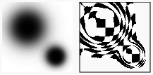
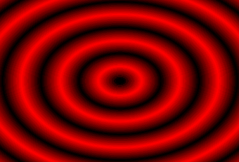
了解原理之後,我們做一個放射漸層看看效果,那就再來一個多層的放射漸層,整個就變成水波了!( 不過由於範例的 primitiveUnits 設定為 objectBoundingBox,所以很多是比例的換算,比較麻煩且複雜 )
<svg width="340" height="231">
  <defs>
    <filter id="f" filterUnits="objectBoundingBox" primitiveUnits="objectBoundingBox" x="0" y="0" width="1.1" height="1.1">
      <feImage result="pict1" xlink:href="#m1" x="0" y="0" width="1.1" height="1.1"></feImage>
      <feImage result="pict2" xlink:href="#m2" x="0" y="0" width="1.1" height="1.1"></feImage>
      <feDisplacementMap id="fdm" scale=".1" xChannelSelector="R" yChannelSelector="R" in2="pict2" in="pict1"></feDisplacementMap>
    </filter>
    <radialGradient id="g" cx=".6" cy=".6" r=".05" spreadMethod="reflect">
      <stop offset="0" stop-color="#000"></stop>
      <stop offset="1" stop-color="#fff"></stop>
    </radialGradient>
    <rect id="m2" x="-10" y="0" width="410" height="300" fill="url(#g)"></rect>
    <image id="m1" x="0" y="0" width="400" height="300" xlink:href="http://www.oxxostudio.tw/img/articles/201410/20141009_1_demo3.JPG"></image>
  </defs>
  <rect x="0" y="0" width="400" height="300" filter="url(#f)" transform="translate(-60 -60)"></rect>
</svg>
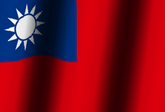
同樣的效果也可以應用在國旗上噢!
<svg width="340" height="231">
  <defs>
    <filter id="f" filterUnits="objectBoundingBox" primitiveUnits="objectBoundingBox" x="0" y="0" width="1.1" height="1.1">
      <feImage result="pict1" xlink:href="#m1" x="0" y="0" width="1.1" height="1.1"></feImage>
      <feImage result="pict2" xlink:href="#m2" x="0" y="0" width="1.1" height="1.1"></feImage>
      <feDisplacementMap id="fdm" scale=".05" xChannelSelector="A" yChannelSelector="A" in2="pict2" in="pict1"></feDisplacementMap>
    </filter>
    <linearGradient id="g" x1="0" y1="0" x2=".2" y2=".02" spreadMethod="reflect">
      <stop offset="0" stop-color="rgba(0,0,0,.8)"></stop>
      <stop offset=".2" stop-color="rgba(0,0,0,.7)"></stop>
      <stop offset=".6" stop-color="rgba(0,0,0,.1)"></stop>
      <stop offset="1" stop-color="rgba(0,0,0,0)"></stop>
    </linearGradient>
    <linearGradient id="g2" x1="0" y1="0" x2=".2" y2=".02" spreadMethod="reflect">
      <stop offset="0" stop-color="rgba(0,0,0,.8)"></stop>
      <stop offset=".2" stop-color="rgba(0,0,0,.7)"></stop>
      <stop offset=".6" stop-color="rgba(0,0,0,.1)"></stop>
      <stop offset="1" stop-color="rgba(0,0,0,0)"></stop>
    </linearGradient>
    <rect id="m2" x="-10" y="0" width="410" height="300" fill="url(#g)"></rect>
    <image id="m1" x="0" y="0" width="400" height="300" xlink:href="http://www.oxxostudio.tw/img/articles/201410/20141009_1_demo4.jpg"></image>
  </defs>
  <rect x="0" y="0" width="400" height="300" filter="url(#f)" transform="translate(-50 -30)"></rect>
  <rect x="0" y="0" width="400" height="300" fill="url(#g2)" transform="translate(-50 -30)"></rect>
</svg>
在我們深入認識了 feDisplacementMap 這個濾鏡之後,也做出了水波和國旗皺褶的效果,再來要同場加映補充說明,繼續針對 feDisplacementMap 做一些補充,同時也利用 SVG 的 animte 來做出水波的動畫,畢竟水波就是要會動才逼真呀!( oxxostudio.tw 繼續發表:SVG 研究之路 (29) - filter - 水波效果 )
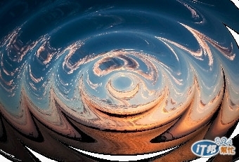
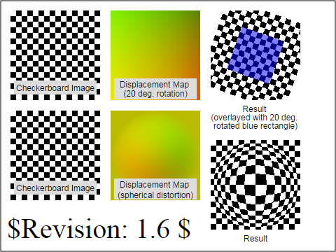
說是補充其實也只是上面少講了這個 W3C 的範例 ( 看下圖 ),裏頭同樣是使用黑白的棋盤圖來做移置,不過作為移置的參考漸層圖是有設計過的漸層,可以讓整體的移置剛好旋轉 20 度,而且如果是以 png 作為漸層移置參考,就不會有鋸齒狀的效果。
OK 補充完了,繼續來看一下這篇的主題:水波效果,在上一篇我使用的漸層,是利用漸層本身的重複性 spreadMethod="reflect" 來做重複的漸層,但如果應用在漸層的動畫上,就會有些問題了,因為漸層的重複性很多層面取決於 r 的大小,所以無法做出由內而外不斷重複的動畫,於是換個角度思考,直接從製作的漸層顏色 stop-offset 著手,製作出許多的漸層環,搭配動畫的時間差,就可以讓漸層看起來完全連接在一起。
先看看漸層動畫:
<svg width="340" height="231">
  <defs>
    <radialGradient id="r" cx=".5" cy=".5" r=".8">
      <stop offset="0" stop-color="#000">
        <animate attributeName="offset" to=".2" dur="1s" repeatCount="indefinite"></animate>
      </stop>
      <stop offset=".1" stop-color="#f00">
        <animate attributeName="offset" to=".3" dur="1s" repeatCount="indefinite"></animate>
      </stop>
      <stop offset=".2" stop-color="#000">
        <animate attributeName="offset" to=".4" dur="1s" repeatCount="indefinite"></animate>
      </stop>
      <stop offset=".3" stop-color="#f00">
        <animate attributeName="offset" to=".5" dur="1s" repeatCount="indefinite"></animate>
      </stop>
      <stop offset=".4" stop-color="#000">
        <animate attributeName="offset" to=".6" dur="1s" repeatCount="indefinite"></animate>
      </stop>
      <stop offset=".5" stop-color="#f00">
        <animate attributeName="offset" to=".7" dur="1s" repeatCount="indefinite"></animate>
      </stop>
      <stop offset=".6" stop-color="#000">
        <animate attributeName="offset" to=".8" dur="1s" repeatCount="indefinite"></animate>
      </stop>
      <stop offset=".7" stop-color="#f00">
        <animate attributeName="offset" to=".9" dur="1s" repeatCount="indefinite"></animate>
      </stop>
      <stop offset=".8" stop-color="#000">
        <animate attributeName="offset" to="1" dur="1s" repeatCount="indefinite"></animate>
      </stop>
      <stop offset=".9" stop-color="#f00">
        <animate attributeName="offset" to="1.1" dur="1s" repeatCount="indefinite"></animate>
      </stop>
    </radialGradient>
  </defs>
  <rect x="0" y="0" width="340" height="231" fill="url(#r)"></rect>
</svg>
套用移置率鏡後的效果,這樣的 gif 動畫只有一兩秒,檔案大小高達 600KB,SVG 只有 2KB,你也可以直接打開 SVG 預覽,看不到就表示你的瀏覽器不支援喔~:

<svg width="340" height="231">
  <defs>
    <filter id="f" filterUnits="objectBoundingBox" x="20" y="20" width="390" height="280">
      <feImage xlink:href="#MyImage1" result="pict1"></feImage>
      <feImage xlink:href="#MyImage2" result="pict2"></feImage>
      <feDisplacementMap id="fdm" scale="50" xChannelSelector="R" yChannelSelector="R" in2="pict2" in="pict1"></feDisplacementMap>
    </filter>
    <radialGradient id="r" cx=".5" cy=".5" r=".8">
      <stop offset="0" stop-color="#000">
        <animate attributeName="offset" to=".2" dur="1s" repeatCount="indefinite"></animate>
      </stop>
      <stop offset=".1" stop-color="#f00">
        <animate attributeName="offset" to=".3" dur="1s" repeatCount="indefinite"></animate>
      </stop>
      <stop offset=".2" stop-color="#000">
        <animate attributeName="offset" to=".4" dur="1s" repeatCount="indefinite"></animate>
      </stop>
      <stop offset=".3" stop-color="#f00">
        <animate attributeName="offset" to=".5" dur="1s" repeatCount="indefinite"></animate>
      </stop>
      <stop offset=".4" stop-color="#000">
        <animate attributeName="offset" to=".6" dur="1s" repeatCount="indefinite"></animate>
      </stop>
      <stop offset=".5" stop-color="#f00">
        <animate attributeName="offset" to=".7" dur="1s" repeatCount="indefinite"></animate>
      </stop>
      <stop offset=".6" stop-color="#000">
        <animate attributeName="offset" to=".8" dur="1s" repeatCount="indefinite"></animate>
      </stop>
      <stop offset=".7" stop-color="#f00">
        <animate attributeName="offset" to=".9" dur="1s" repeatCount="indefinite"></animate>
      </stop>
      <stop offset=".8" stop-color="#000">
        <animate attributeName="offset" to="1" dur="1s" repeatCount="indefinite"></animate>
      </stop>
      <stop offset=".9" stop-color="#f00">
        <animate attributeName="offset" to="1.1" dur="1s" repeatCount="indefinite"></animate>
      </stop>
    </radialGradient>
    <rect id="MyImage2" x="0" y="0" width="390" height="281" fill="url(#r)"></rect>
    <image id="MyImage1" x="-20" y="-140" width="450" height="400" xlink:href="http://www.oxxostudio.tw/img/articles/201410/20141010_1_demo.jpg"></image>
  </defs>
  <use filter="url(#f)" x="-50" y="-50"></use>
</svg>
以上就是 SVG 的 feDisplacementMap 濾鏡,希望大家也能做出許多有趣的應用喔!


 iThome鐵人賽
 看影片追技術