上一篇介紹了 D3.js 的基礎,這篇會邊繪製圖表邊介紹繪製的方法,我們會使用到 SVG,還不熟悉 SVG 也可以參考下面的文章哦
SVG - 基礎圖形與樣式
SVG - 進階功能介紹
因為 D3 實在有太多方法了,這邊我們只介紹比例尺與座標軸的繪製,如果想了解所有方法可以參考這裡
繪製圖表時,資料常常有大有小,而比例尺就是將資料等比例轉換到某個幅度內
d3.min():取陣列最小值
d3.max():取陣列最大值
d3.scaleLinear():建立一個比例尺
domain():定義資料範圍
range():定義圖表資料範圍
rangeRound():同 range,但會將結果四捨五入
clamp(true):將超過範圍的值設為最大值 or 最小值,預設為 false
unknown:將 undefined 或 NaN 轉為指定數值
ticks:將圖表資料分為數個區間
const dataset = [0, 33, 65, 199.9, 454, 887.5, 1000]

const min = d3.min(dataset) // 0
const max = d3.max(dataset) // 1000

const scale = d3
  .scaleLinear()
  .domain([min, max])
  .range([0, 100])

console.log(scale(99))   // 9.9,若使用 rangeRound 則為 10
console.log(scale(500))  // 50
console.log(scale(1001)) // 0
console.log(scale(-1))   // 0
console.log(scale(NaN))  // 母湯亂輸入
座標軸可以讓資料與圖表更容易檢視,另外也需要用到上面說到的比例尺~
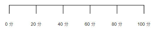
d3.axisTop:建立上方座標軸d3.axisRight:建立右方座標軸d3.axisBottom:建立下方座標軸d3.axisLeft:建立左方座標軸ticks:指定資料的區間數量,預設為 10tickValues:顯示特定座標值,需傳入陣列tickSize:調整刻線長度tickPadding:調整刻線與數值的距離tickFormat:可傳入函式自訂數值格式const dataset = [0, 33, 69, 59, 100]
const chart = d3
.select('.chart')
.attr('width', 400)
.attr('height', 400);
const scale = d3
.scaleLinear()
.domain([0, d3.max(dataset)])
.range([0, 100])
const axis = d3
.axisBottom(scale)
.ticks(5)
.tickSize(20)
.tickPadding(20)
.tickFormat(item => item + '分');
chart.append('g').call(axis)
// axis(chart.append('g'))
// 上面的方法與 call 效果相同,皆是將坐標軸繪製出來
上面介紹了許多基本技巧,接下來就要使用上面學到的來畫各式各樣的圖囉,html 如下
<body>
  <svg class="chart"></svg>
</body>
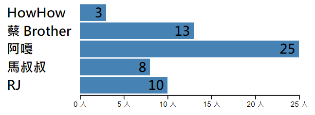
// 以下七胖團員的朋友人數,當然是我掰的XD
 const sevenFat = [
  { name: 'HowHow', friend: 3 },
  { name: '蔡 Brother', friend: 13 },
  { name: '阿嘎', friend: 25 },
  { name: '馬叔叔', friend: 8 },
  { name: 'RJ', friend: 10 }
]

// 設定 svg 的寬高
const chart = d3
  .select('.chart')
  .attr('width', 500)
  .attr('height', 500);

// 選取所有的 g 群組
const group = chart
  .selectAll('g')
  .data(sevenFat)
  .enter()
  .append('g');

// 取比例尺
const scale = d3
  .scaleLinear()
  .domain([0, d3.max(sevenFat.map(item => item.friend))])
  .range([0, 300]);

// 繪製長條圖
group
  .append('rect')
  .attr('x', 100)
  .attr('y', (item, i) => i * 25)
  .attr('width', item => scale(item.friend))
  .attr('height', 25 - 2)
  .attr('fill', 'steelblue');

// 顯示名字
group
  .append('text')
  .attr('x', 0)
  .attr('y', (item, i) => i * 25 + 18)
  .style('fill', 'black')
  .style('font-size', '18px')
  .style('font-weight', 'bold')
  .text(item => item.name);

// 顯示朋友數量
group
  .append('text')
  .attr('x', (item, i) => 95 + scale(item.friend))
  .attr('y', (item, i) => i * 25 + 18)
  .attr('text-anchor', 'end')
  .style('fill', 'black')
  .style('font-size', '18px')
  .style('font-weight', 'bold')
  .text(item => item.friend);

// 顯示坐標軸
const axis = d3
  .axisBottom(scale)
  .ticks(5)
  .tickFormat(item => item + '人');

chart
  .append('g')
  .call(axis)
  .attr('transform', 'translate(100,125)');
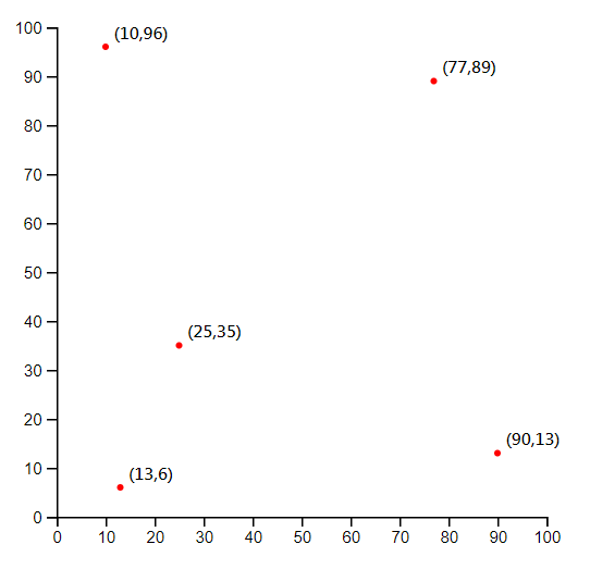
// 以下小弟打靶成績,中心點為 (50, 50)
 const shot = [
  { x: 10, y: 96 },
  { x: 90, y: 13 },
  { x: 77, y: 89 },
  { x: 25, y: 35 },
  { x: 13, y: 6 }
];

// 設定 svg 的寬高
const chart = d3
  .select('.chart')
  .attr('width', 500)
  .attr('height', 500);

// 選取所有的 g 群組
const group = chart
  .selectAll('g')
  .data(shot)
  .enter()
  .append('g');

// 取 X 軸比例尺
const scaleX = d3
  .scaleLinear()
  .domain([0, 100])
  .range([0, 300]);

// 顯示 X 坐標軸
const axisX = d3.axisBottom(scaleX);
chart
  .append('g')
  .call(axisX)
  .attr('transform', 'translate(30,330)');

// 取 Y 軸比例尺
const scaleY = d3
  .scaleLinear()
  .domain([100, 0])
  .range([0, 300]);

// 顯示 Y 坐標軸
const axisY = d3.axisLeft(scaleY);
chart
  .append('g')
  .call(axisY)
  .attr('transform', 'translate(30,30)');

// 繪製座標點
group
  .append('circle')
  .attr('cx', item => scaleX(item.x))
  .attr('cy', item => scaleY(item.y))
  .attr('r', '2px')
  .attr('height', 25 - 2)
  .attr('fill', 'red')
  .attr('transform', 'translate(30,30)');

// 顯示座標
group
  .append('text')
  .attr('x', item => scaleX(item.x))
  .attr('y', item => scaleY(item.y))
  .style('fill', 'black')
  .style('font-size', '10px')
  .style('font-weight', 'bold')
  .text(item => `(${item.x},${item.y})`)
  .attr('transform', 'translate(35,25)');
折線圖就要多介紹到一些繪製 path 的方法啦~
d3.line:定義一個線段x:傳入一個涵式,定義 x 座標y:傳入一個涵式,定義 y 座標curve:將路徑更改為曲線,詳細可參考這裡
// 前公司每個月產品的產量
const report = [
  { month: 1, quantity: 8561 },
  { month: 2, quantity: 9347 },
  { month: 3, quantity: 10335 },
  { month: 4, quantity: 9900 },
  { month: 5, quantity: 12012 },
  { month: 6, quantity: 10300 },
  { month: 7, quantity: 13020 },
  { month: 8, quantity: 15300 },
  { month: 9, quantity: 17210 },
  { month: 10, quantity: 13400 },
  { month: 11, quantity: 11059 },
  { month: 12, quantity: 9900 }
];

// 設定 svg 的寬高
const chart = d3
  .select('.chart')
  .attr('width', 500)
  .attr('height', 500);

// 選取所有的 g 群組
const group = chart
  .selectAll('g')
  .data(report)
  .enter()
  .append('g');

// 取 X 軸比例尺
const scaleX = d3
  .scaleLinear()
  .domain([0, d3.max(report.map(item => item.month))])
  .range([0, 300]);

// 顯示 X 坐標軸
const axisX = d3.axisBottom(scaleX);
chart
  .append('g')
  .call(axisX)
  .attr('transform', 'translate(50,330)');

// 取 Y 軸比例尺
const scaleY = d3
  .scaleLinear()
  .domain([d3.max(report.map(item => item.quantity)), 0])
  .range([0, 300]);

// 顯示 Y 坐標軸
const axisY = d3.axisLeft(scaleY);
chart
  .append('g')
  .call(axisY)
  .attr('transform', 'translate(50,30)');

// 定義線段
const line = d3
  .line()
  .x(item => scaleX(item.month))
  .y(item => scaleY(item.quantity))
  .curve(d3.curveBasis);

// 將線段繪製出來
group
  .append('path')
  .attr('d', line(report))
  .attr('transform', 'translate(50,30)')
  .attr('stroke', 'black')
  .attr('stroke-width', 1)
  .attr('fill', 'none');
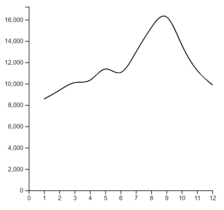
這篇畫了三種基本的圖表,分別為長條圖、散佈圖與折線圖,簡單的使用了 D3 提供的方法來繪製,其實畫起來並不難,D3 幫我們處理掉許多底層的部分,接下來只要夠了解 SVG 就能夠輕易的畫出漂亮的圖了,那就祝大家畫圖表愉快拉~
 Ares
Ares

 iThome鐵人賽