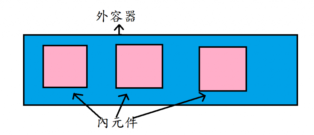
Flex 的外容器與內元件
主軸與交錯軸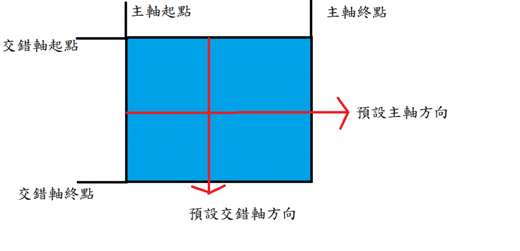
圖中軸的開始和結束是以預設為主
不過這裡先說Flex外容器的屬性
display:這裡的內容要宣告為flex才能使用
flex-flow:這裡包含了兩個屬性flex-direction及flex-wrap所以只要在這寫上相應的值即可
flex-direction:這個屬性改變得就是軸線的方向
row和row-reverse改變主軸方向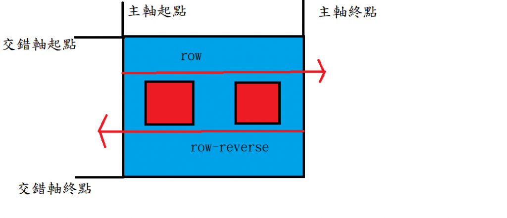
column和column-reverse改變交錯軸方向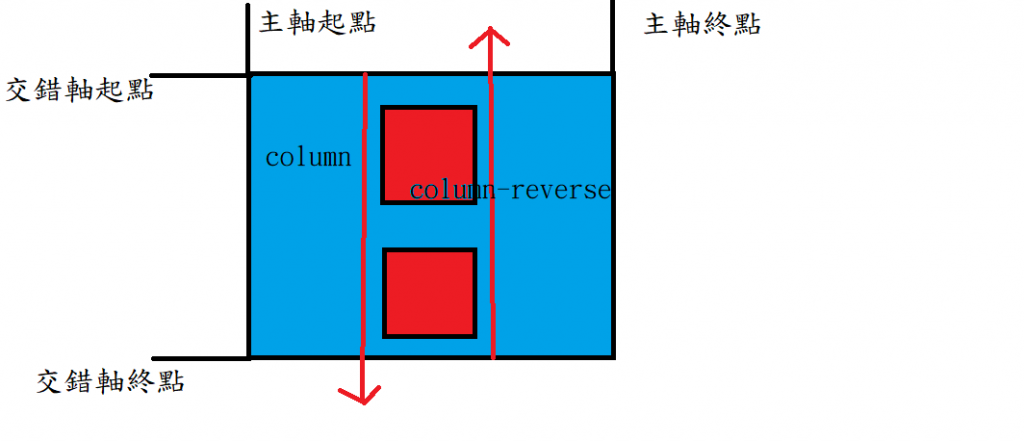
既然會改變軸的方向所以軸的開始和結束也會跟著改變
flex-wrap:這裡要注意一下flex屬性是不會換行的,如果要換行就要使用flex-wrap。
nowrap :不換行
wrap:換行
wrap-reverse:換行反轉
justify-content: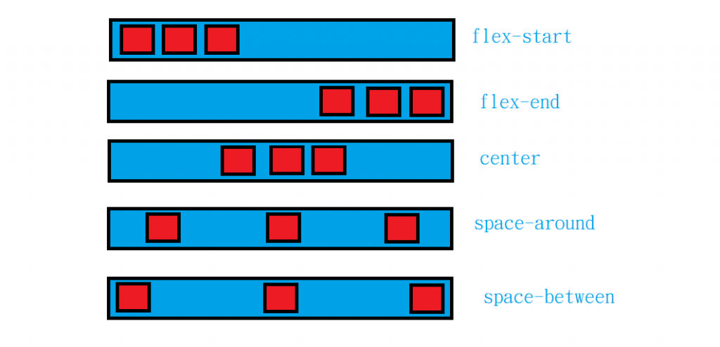
這裡對齊要依主軸而定因此在使用前要把主軸與交錯軸搞懂就能輕鬆使用了
flex-start:預設,是從主軸起點排起
flex-end:是從主軸終點排起
center :是從主軸中央排起
space-between:物件跟物件間都有一個間距,而這個間距是依物件排完後剩餘的空間所平均分配
    <div  class="flexbox a">
        <div class="flex-item b"></div>
        <div class="flex-item b"></div>
        <div class="flex-item b"></div>
    </div>
      .a{
          display: flex;
          justify-content: space-between;
         background-color:aqua;
         width: 500px;
      }
      .b{
          background-color: rebeccapurple;
          width: 100px;
          height: 100px;
      }
其結果:
space-around:物件跟物件間都有一個間距,物件跟外框間還有一個間距,這些間距依然是物件排完後剩餘的空間所分配
align-items: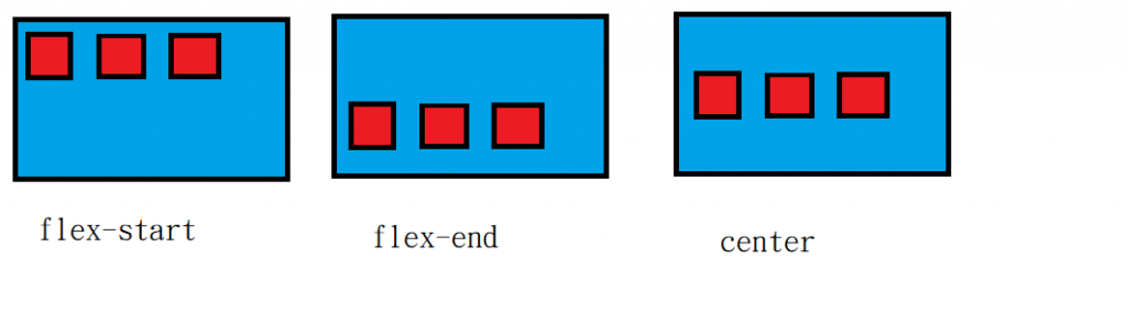
這裡只介紹flex-start flex-end center 三種屬性因為這個我較常用
注意!align-items這個屬性是對齊交錯軸的喔
flex-start :是從交錯軸起點排起
flex-end :是從交錯軸終點排起
center:是從交錯軸中間排起
align-content:就是align-items得多行版本


 iThome鐵人賽
 看影片追技術