    <div  class="flexbox a">
        <div class="flex-item b"></div>
        <div class="flex-item c"></div>
        <div class="flex-item d"></div>
    </div>
以下例子都是由上述的程式碼更改CSS即可。
flex:flex-grow flex-shrink flex-basis 這三個屬性的縮寫,因此使用上要依序填上這些屬性的值
flex-grow:預設是0,代表著不延伸。填入數字(無單位)代表要延伸,而所謂的延伸其實就是分配剩餘的空間給擁有這一屬性的物件。
.a{
          display: flex;

         background-color:aqua;
         justify-content: center;
         width: 400px;
         height: 200px;

      }
      .b{
          background-color: rebeccapurple;
          width: 100px;
          height: 100px;

      }
      .c{
        background-color: red;
          width: 100px;
          height: 100px;
          flex-grow:1;
      }
      .d{
        background-color: green;
          width: 100px;
          height: 100px;
          flex-grow:3;

      }
外容器的寬為400px,而內元件寬總和為300px,剩下100px給擁有flex-grow屬性的元件去分配。
紅色的能分配到1/4 也就是 25px,而綠色能分配到3/4 也就是 75px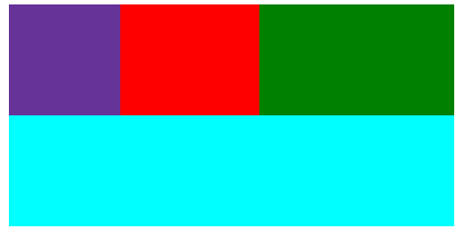
flex-shrink:預設是1,代表著縮減。填入數字(無單位)代表要縮減,而0代表不縮減,
而所謂的縮減其實就是將缺少的空間依比例分配給擁有這一屬性的物件。
.a{
          display: flex;

         background-color:aqua;
         justify-content: center;
         width: 200px;
         height: 200px;

      }
      .b{
          background-color: rebeccapurple;
          width: 100px;
          height: 100px;
          flex-shrink:1;
      }
      .c{
        background-color: red;
          width: 100px;
          height: 100px;
          flex-shrink:2;
      }
      .d{
        background-color: green;
          width: 100px;
          height: 100px;
          flex-shrink:1;

      }
外容器的寬為200px,而內元件寬總和為300px,缺少的100px給擁有flex-shrink屬性的元件去分配縮減多少。
而綠色能分配到1/4 也就是減少 25px,紅色的能分配到2/4 也就是減少 50px,而綠色能分配到1/4 也就是減少 25px
flex-basis:更改主軸的屬性就如同主軸是水平即會更改width屬性
 .a{
          display: flex;

         background-color:aqua;
         justify-content: center;
         width: 400px;
         height: 200px;

      }
      .b{
          background-color: rebeccapurple;
          width: 100px;
          height: 100px;

      }
      .c{
        background-color: red;
          width: 100px;
          height: 100px;

      }
      .d{
        background-color: green;
          width: 100px;
          height: 100px;
          flex-basis: 150px;

      }

這裡需要注意的是如果主軸是水平的flex-basis會把width屬性給覆蓋掉。
.a{
          display: flex;

         background-color:aqua;
         justify-content: center;
         width: 400px;
         height: 400px;
         flex-direction: column;
      }
      .b{
          background-color: rebeccapurple;
          width: 100px;
          height: 100px;

      }
      .c{
        background-color: red;
          width: 100px;
          height: 100px;

      }
      .d{
        background-color: green;
          width: 100px;
          height: 100px;
          flex-basis: 150px;

      }
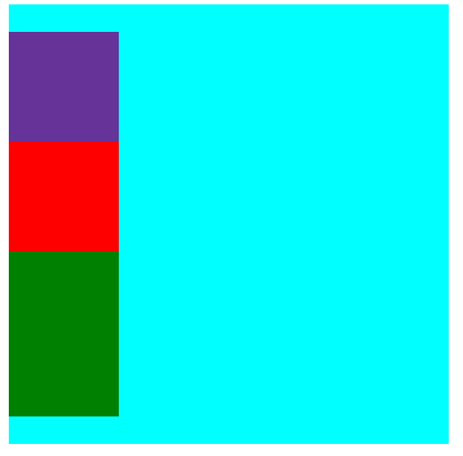
這裡需要注意的是如果主軸是垂直的flex-basis會把height屬性給覆蓋掉。
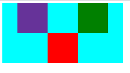
order:這個是可以變換元件的排序其中預設是每個元件都為0,可接受負值。
.a{
          display: flex;

         background-color:aqua;
         justify-content: center;
         width: 400px;
         height: 200px;
      }
      .b{
          background-color: rebeccapurple;
          width: 100px;
          height: 100px;
      }
      .c{
        background-color: red;
          width: 100px;
          height: 100px;
      }
      .d{
        background-color: green;
          width: 100px;
          height: 100px;
      }

.a{
          display: flex;
         background-color:aqua;
         justify-content: center;
         width: 400px;
         height: 200px;
      }
      .b{
          background-color: rebeccapurple;
          width: 100px;
          height: 100px;
          order: 1;
      }
      .c{
        background-color: red;
          width: 100px;
          height: 100px;
          order: -1;
      }
      .d{
        background-color: green;
          width: 100px;
          height: 100px;
      }

align-self:可個別改動元件交錯軸的位置
.a{
          display: flex;
         background-color:aqua;
         justify-content: center;
         width: 400px;
         height: 200px;
      }
      .b{
          background-color: rebeccapurple;
          width: 100px;
          height: 100px;
      }
      .c{
        background-color: red;
          width: 100px;
          height: 100px;
          align-self: flex-end;
      }
      .d{
        background-color: green;
          width: 100px;
          height: 100px;
      }


 iThome鐵人賽
 看影片追技術