我在學習 flexbox 時,發現有好多容易混肴的排版屬性值,例如:
start, flex-start, self-start
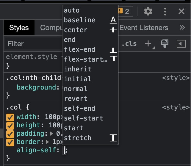
在 Chrome 的 DevTools 上面測試樣式時,常常可以在自動完成的選單看到這些屬性值。
每次看到卻沒有徹底理解,心裡總是有種不踏實的感覺,
所以是時候該花點時間釐清一下這些屬性值的差異了 !
display: flex 時,依照 direction 與 flex-direction 處理後的方向決定從哪裡開始排在說明之前,必須要先理解 CSS direction 這個屬性的用法。
The direction CSS property sets the direction of text, table columns, and horizontal overflow. Use rtl for languages written from right to left (like Hebrew or Arabic), and ltr for those written from left to right (like English and most other languages).
根據 MDN 的說明,direction 可以控制文字、表單欄位、橫向溢出的方向。依照語言的閱讀方向可以設定成 ltr 由左至右或 rtl 由右至左顯示。
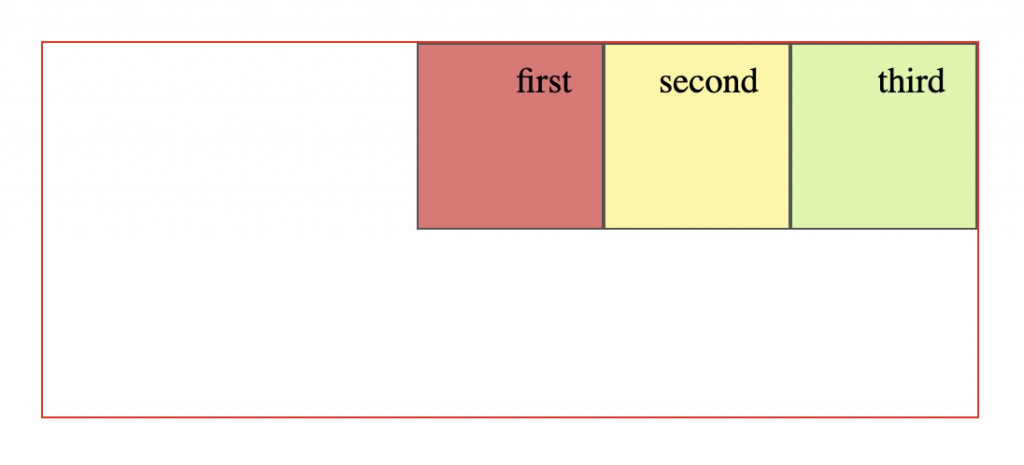
參考以下 HTML (Haml) 與 CSS,.col 設成 inline-block、長寬都是 100px,.box 寬度設成 250px 剛好讓第三個正方形溢出換行。
.box
  .col
    first
  .col
    second
  .col
    third
* {
  box-sizing: border-box;
}
body {
  padding: 1rem;
}
.box {
  width: 250px;
  height: 200px;
  outline: 1px solid red;
  font-size: 1.2rem;
}
.col {
  display: inline-block;
  width: 100px;
  height: 100px;
  padding: .5rem 1rem;
  border: 1px solid #555;
}
.col:nth-child(1) {
  background: #e57373;
}
.col:nth-child(2) {
  background: #fff59d;
}
.col:nth-child(3) {
  background: #daf7a6;
}
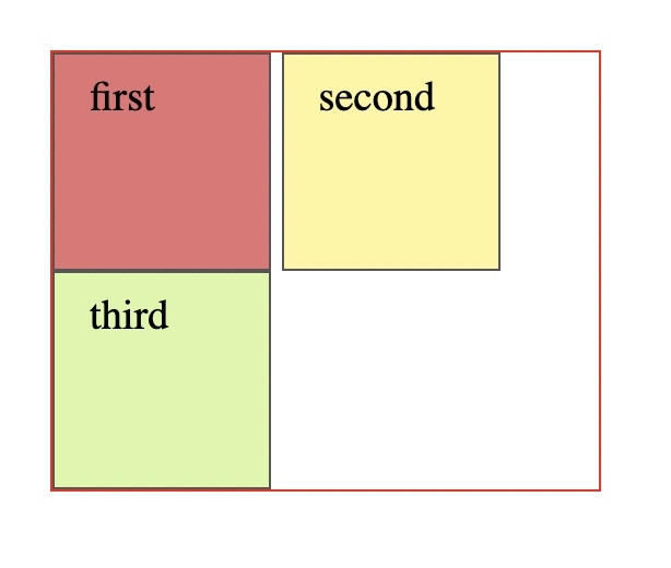
因為 direction 不設定時,預設是 ltr,所以 .col 排序與溢出的方向都是由左至右,第三個正方形從第二行的左邊開始排。
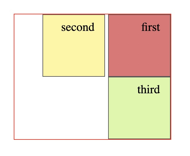
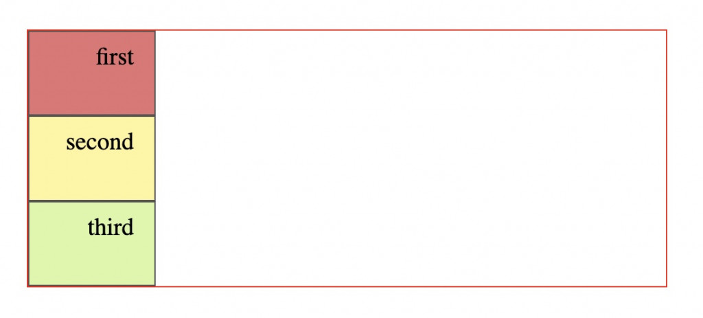
.box direction 設定為 rtl 時,則反過來。
從這裡可以看出,在還沒有套用 flexbox 前,容器就有它自己的橫向排版方向。
在 .box 加上一些 flexbox 相關的屬性:
.box {
  display: flex;
  direction: rtl;
  flex-direction: row-reverse;
  justify-content: flex-start;
  // 以下省略
}
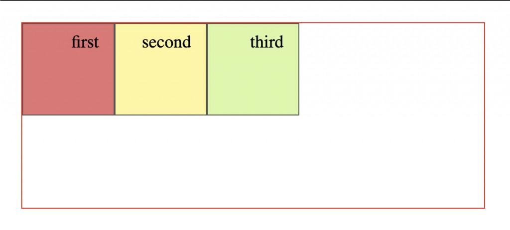
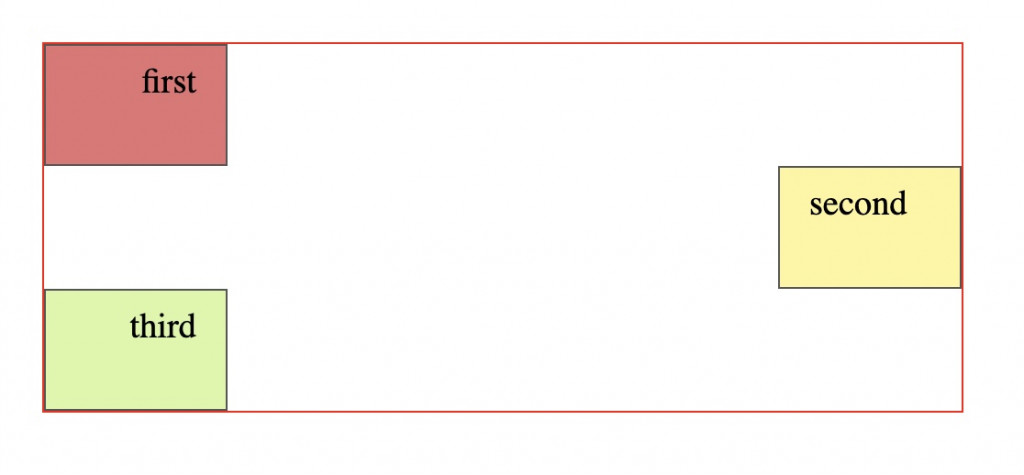
如下圖,當 direction 與 flex-direction 同時設定時,direction: rtl 會先將正方形由右至左排,flex-direction: row-reverse 再把順序顛倒回來,正方形雖然經過兩次反向變回原來的方向,但文字還是因為 direction 設定 rtl 的關係向右靠了。justify-content: flex-start 會依照 direction 與 flex-direction 處理後的方向顯示。
把 justify-content 改成 start 時,排版則 忽略 flex-direction 的設定呈現。
所以下面只有 direction: rtl 的效果。
.box 改成以下設定
.box {
  display: flex;
  direction: rtl;
  flex-direction: column;
  align-items: flex-end;
  // 以下省略
}
如上圖,因為 direction: rtl 的關係,正方形先往右靠,加上 flex-direction: column 與 align-items: flex-end 的效果,所以正方形又跑到左邊。
把第二個正方型加上與容器不一樣的 direction 設定
.col:nth-child(2) {
  direction: ltr;
  align-self: self-end;
  // 以下省略
}
可以看到 ltr 是從左至右,左邊是開始、右邊是結束。指定 self-end 就讓正方形跑到右邊去了。
建議讀者可以參考本文的說明動手寫一下 CSS,對於這部分的理解會比較印象深刻 : )
https://csslayout.news/whats-the-difference-between-the-alignment-values-of-start-flex-start-and-self-start/
https://developer.mozilla.org/en-US/docs/Web/CSS/direction
https://drafts.csswg.org/css-align-3/#positional-values
 kmsheng

 看影片追技術