要建立一個包含 TextField、Button 和 Picker 的互動式 UI 控件,可以使用 SwiftUI 中的基本組件。以下是這些控件的範例程式碼:
import SwiftUI

struct InteractiveUI: View {
    @State private var textFieldInput: String = ""
    @State private var selectedOption: String = "Option 1"
    @State private var pickerSelection: Int = 0

    let pickerOptions = ["Option 1", "Option 2", "Option 3"]

    var body: some View {
        VStack(alignment: .leading, spacing: 20) {
            // TextField for user input
            TextField("Enter text here", text: $textFieldInput)
                .textFieldStyle(RoundedBorderTextFieldStyle())
                .padding()

            // Button to perform an action
            Button(action: {
                // Action to perform on button tap
                print("Button tapped with input: \(textFieldInput) and selection: \(selectedOption)")
            }) {
                Text("Submit")
                    .padding()
                    .background(Color.blue)
                    .foregroundColor(.white)
                    .cornerRadius(8)
            }

            // Picker to select an option
            Picker("Select an option", selection: $pickerSelection) {
                ForEach(0..<pickerOptions.count) { index in
                    Text(pickerOptions[index])
                }
            }
            .pickerStyle(SegmentedPickerStyle())
            .padding()

            // Displaying the selected option
            Text("Selected option: \(pickerOptions[pickerSelection])")
                .padding(.top)
        }
        .padding()
    }
}

struct InteractiveUI_Previews: PreviewProvider {
    static var previews: some View {
        InteractiveUI()
    }
}
TextField:
@State 修飾的變數 textFieldInput 來綁定 TextField 的內容。TextField 使用 RoundedBorderTextFieldStyle() 來進行樣式設定。Button:
Button 觸發的動作定義在 action 閉包中,這裡使用 print 來輸出目前的輸入和選擇。Picker:
Picker 綁定到 @State 修飾的 pickerSelection 變數,來追蹤目前選擇的選項。SegmentedPickerStyle() 使選擇器顯示為分段控件。pickerOptions 陣列來提供選項。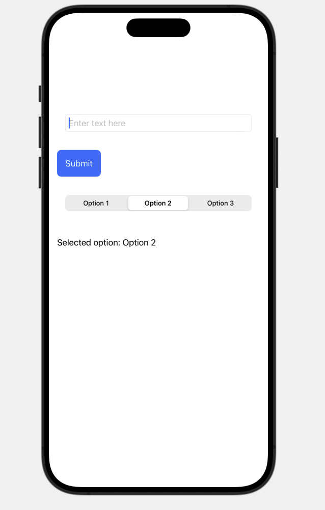


 看影片追技術