上一篇,我們將整體專案做好了初始化,TypeScript 與 ESLint 都能夠正常運作了😌。那麼接下來就要迎接新篇章 — 起大厝。不是哦 不是這樣哦,我們的建案得稍微改一下流程,在起大厝之前,我們先來「安裝房門」。本篇會聊聊 Tailwind 今年的大轉變,並簡單介紹一下會使用到的函式庫套件,以及建立 Tailwind 純樣式登入頁。
本篇重點整理:
照慣例,先簡單介紹一下樣式工具,再講述 Tailwind 版本差異與初始化。
Tailwind 在今年年初公布了這一次 4.0 版本,與上篇的 ESLint 一樣,優化了絕大部分初始化的設定,並與 Vite 整合良好👍。
Tailwind 3.x
postcss.config.js
@tailwind base、@tailwind components、@tailwind utilities 三個指令tailwind.config.js 為主要設定檔/** @type {import('tailwindcss').Config} */
export default {
content: ["./index.html", "./src/**/*.{js,ts,jsx,tsx}"],
theme: { extend: {} },
plugins: [],
}
Tailwind 4.x
tailwind.config.js,可直接在 .css 撰寫設定@import "tailwindcss";
@theme {
/* 自訂主題變數 */
}
官方文檔說明:您可以直接在 CSS 檔案中匯入 Tailwind 所有的自訂配置項,而不用使用 tailwind.config.js 文件,從而在專案中減少一個需要擔心的文件
下載 tailwind 等相關套件
npm install tailwindcss @tailwindcss/vite
將 @tailwindcss/vite 加入到 vite.config.ts 裡
import { defineConfig } from "vite";
import react from "@vitejs/plugin-react";
import tailwindcss from "@tailwindcss/vite";

// https://vite.dev/config/
export default defineConfig({
  plugins: [react(), tailwindcss()],
});
在 index.css 引入底下程式碼就完成了🎉
@import "tailwindcss";
🔰本篇會是以製作樣品頁(React + Tailwind)為主,功能 / 生態系的部分會再往後的篇章慢慢說明。
首先,如果想創造與上面的登入樣本頁具有現代感的話,不仿再讓我介紹兩樣東西:
這邊的引入就不再贅述,詳情請至官方文件檔查詢😌
Tailwind 的語法相當直覺,只要有寫過 CSS,就能很快上手。它的特色在於:
/* Tailwind 語法          對應的 CSS / 解釋   */
flex                |     display: flex
m-4                 |     margin: 16px
h-full              |     height: 100%
text-blue-500       |     color: #3b82f6
bg-red-500          |     background-color: #ef4444
rounded             |     border-radius: 4px /* 小型圓角 */
/* Tailwind 語法          對應的 CSS / 解釋   */
w-1/2               |     width: 50%
pt-4                |     padding-top: 16px
mr-2                |     margin-right: 8px
px-4                |     padding-left: 16px; padding-right: 16px /* 橫向 */
text-xl             |     font-size: 20px
rounded-lg          |     border-radius: 8px /* 中型圓角 */
/* Tailwind 語法          對應的 CSS / 解釋   */
md:block            |     display: block /* 在 螢幕 ≥ 768px 時執行 */
lg:text-xl          |     font-size: 20px /* 在 螢幕 ≥ 1024px 時執行 */
sm:w-full md:w-1/2  |     /* 手機:100% 寬度;平板以上:50% 寬度 */
/* Tailwind 語法          對應的 CSS / 解釋   */
items-center        |     align-items: center
justify-between     |     justify-content: space-between
rounded-full        |     border-radius: 999px /* 完全圓角 */
shadow-lg           |     box-shadow: ... /*大型陰影*/
hover:bg-gray-200   |     :hover { background-color: #e5e7eb; }
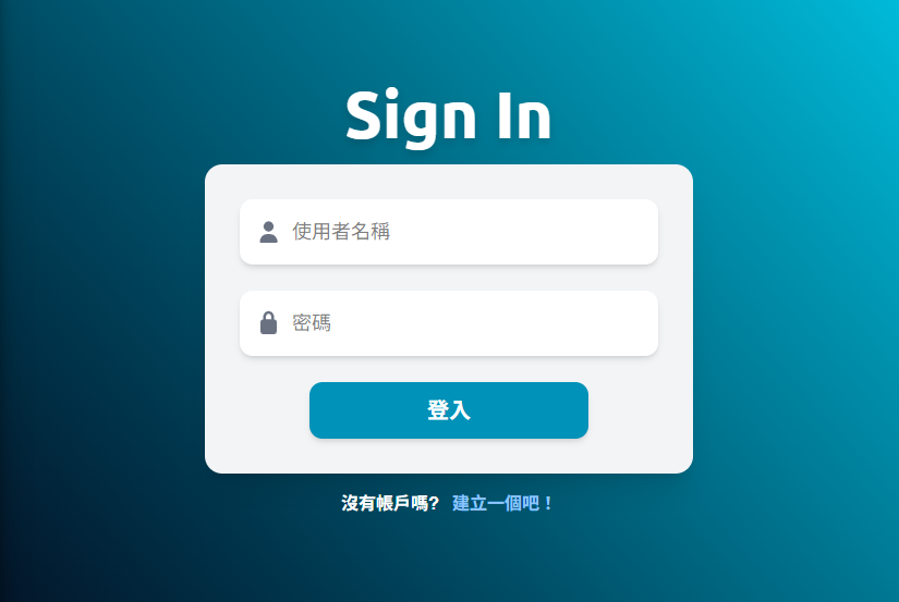
LoginPage.tsx
import { Link } from "react-router-dom";
import { FontAwesomeIcon } from "@fortawesome/react-fontawesome";

import "../../lib/fontawesome.ts";

export default function LoginPage() {
  return (
    <div className="h-screen flex flex-col items-center justify-center space-y-4 bg-gradient-to-bl from-primary-light to-slate-950">
      <p className="text-6xl text-white font-extrabold font-en-title drop-shadow-lg">
        Sign In
      </p>
      <div className="w-md p-8 rounded-2xl bg-gray-100 shadow-xl">
        <form className="flex flex-col space-y-6">
          {/* 使用者名稱 */}
          <div className="w-full">
            <label htmlFor="username">
              <span className="sr-only">使用者名稱</span>
              <FontAwesomeIcon
                icon="user"
                className="absolute mt-5 ml-3.5 text-xl text-gray-500"
              />
            </label>
            <input
              id="username"
              name="username"
              type="text"
              placeholder="使用者名稱"
              className="w-full py-4 pl-12 rounded-xl text-lg bg-white shadow-md focus:outline-none focus:ring-2 focus:ring-primary transition duration-200"
              required
            />
          </div>

          {/* 密碼 */}
          <div className="w-full">
            <label htmlFor="password">
              <span className="sr-only">密碼</span>
              <FontAwesomeIcon
                icon="lock"
                className="absolute mt-5 ml-3.5 text-xl text-gray-500"
              />
            </label>
            <input
              id="password"
              name="password"
              type="password"
              placeholder="密碼"
              className="w-full py-4 pl-12 rounded-xl text-lg bg-white shadow-md focus:outline-none focus:ring-2 focus:ring-primary transition duration-200"
              required
            />
          </div>

          {/* 登入按鈕 */}
          <div className="flex justify-center">
            <button
              type="submit"
              className="w-3xs py-3 rounded-xl bg-primary-dark text-white text-xl font-bold hover:bg-primary focus:outline-none focus:ring-2 focus:ring-primary focus:ring-opacity-50 shadow-md transition duration-200"
            >
              登入
            </button>
          </div>
        </form>
      </div>
      <p className="font-bold text-white">
        沒有帳戶嗎?
        <Link to="/register" className="text-blue-300 hover:underline ml-3">
          建立一個吧!
        </Link>
      </p>
    </div>
  );
}
index.css
@import "tailwindcss";

@theme {
  --font-en-title: "Ubuntu", serif;
  --font-zh-content: "LXGW WenKai TC", sans-serif;

  --color-primary: oklch(0.715 0.143 215.221); /* cyan 500 */
  --color-primary-light: oklch(0.789 0.154 211.53); /* cyan 400 */
  --color-primary-dark: oklch(0.609 0.126 221.723); /* cyan 600 */
}

body {
  font-family: var(--font-zh-content);
}
參考資料 & 文章分享:
Tailwind 官方文檔
iThome 鐵人賽 — 掌握 Master CSS 優化開發體驗


 iThome鐵人賽
 看影片追技術