此專案會使用 vuetify UI 套件去改寫各個元件,今天要做的元件是 Header。
官方文件:https://vuetifyjs.com/en/components/app-bars/#anatomy
我在 /components 中建立一個 header.vue ,並且在 /pages/index.vue (父元件)中引用 header (子元件)。
// pages/index.vue

<template>
  <v-app>
    <Header></Header>
  </v-app>
</template>

<script setup>
import Header from '@/components/header.vue';
</script>

<style scoped></style>
// components/header.vue
<template>
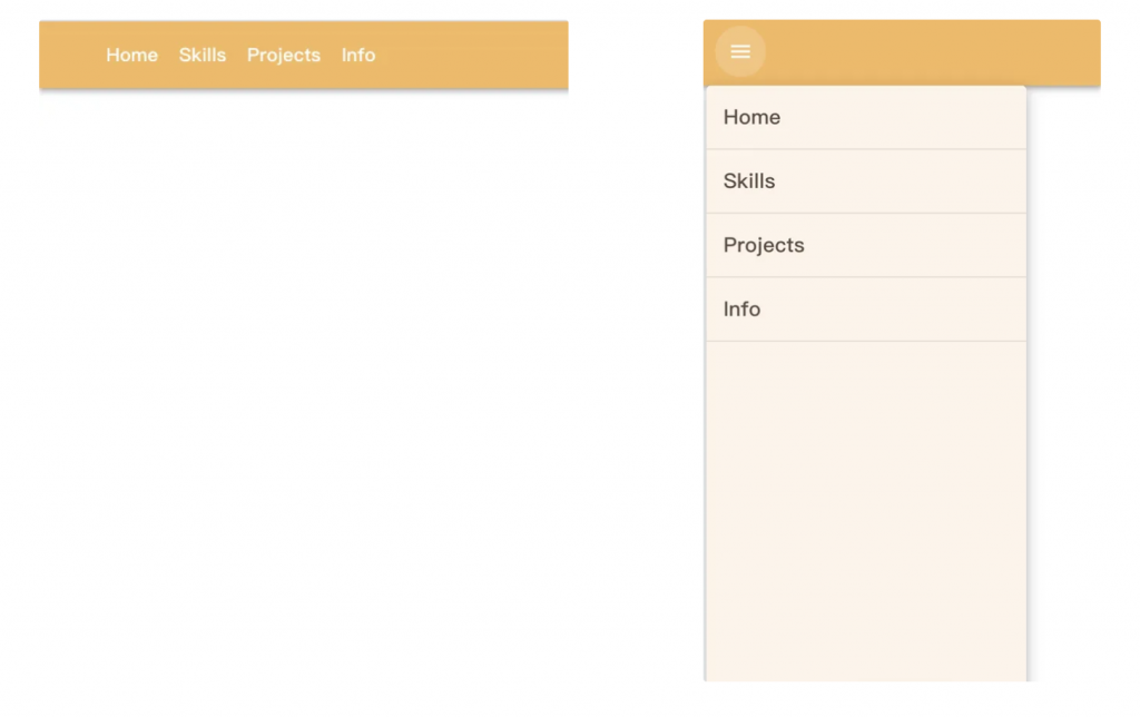
<v-app-bar class="bg-yellow px-lg-16 px-3">
<div class="d-none d-lg-flex align-center justify-center">
<span class="text-white text-h6-semi-bold pr-5">Home</span>
<span class="text-white text-h6-semi-bold pr-5">Skills</span>
<span class="text-white text-h6-semi-bold pr-5">Projects</span>
<span class="text-white text-h6-semi-bold pr-5">Info</span>
</div>
<v-menu
class="d-flex d-lg-none"
transition="slide-x-transition"
>
<template v-slot:activator="{ props }">
<v-app-bar-nav-icon
class="d-flex d-lg-none"
color="white" v-bind="props">
</v-app-bar-nav-icon>
</template>
<v-list class="bg-light-yellow custom-menu">
<v-list-item
v-for="(item, i) in state.items"
:key="i"
:value="i"
class="custom-list-item"
>
<v-list-item-title class="text-brown">{{ item.title }}</v-list-item-title>
</v-list-item>
</v-list>
</v-menu>
</v-app-bar>
</template>
<script setup>
import { reactive } from 'vue';
const state = reactive({
items: [
{ title: 'Home' },
{ title: 'Skills' },
{ title: 'Projects' },
{ title: 'Info' },
],
});
</script>
<style lang="scss" scoped> // scoped 限定樣式範圍,只會作用在當前元件
:deep(.custom-menu) { // :deep 加上後直接更改底層的css
min-height: calc(100vh - 64px);
width: 300px;
position: fixed;
top: 8px;
left: -8px;
z-index: 1000;
border-radius: 0;
padding-top: 0px;
padding-bottom: 0px;
}
:deep(.custom-list-item) {
padding-left: 24px;
min-height: 60px;
border-bottom: 1px solid rgba(0,0,0,0.1);
}
:deep(.custom-list-item .v-list-item-title) {
font-size: 1.2rem;
font-weight: 500;
}
</style>
<style lang="scss" **scoped**> 要幹麻?代表這個 SCSS 樣式只會作用在當前元件,當編譯完,會在 html 標籤上隨機生成屬性 (data-v-xxxx),不會影響到其他元件。
.title { color: red; } -> .title[data-v-abc123] { color: red; }
注意:在開發過程中要同時思考手機版的設計。電腦版的 Navbar 採用全展開呈現;而在手機版則會隱藏選單,並加入漢堡選單(hamburger icon),方便使用者點擊後展開功能。
恩~~這個 Navbar 好像有點點兒醜醜,改天再來更新一個漂亮的Q


 看影片追技術