今天的目標是完成 技能區塊 (Skills Section) 的設計,呼應 Intro 中「故事 + 技能」的定位,讓讀者能更快掌握我的專業輪廓。
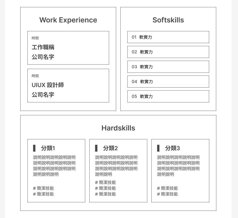
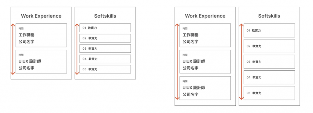
有一個特別注意的細節是:會希望讓左右兩個區塊(Work Experience、Softskills)保持相同的高度,即使內容數量不同,也能維持整體視覺的平衡感,提升版面結構感,讓內容看起來像是一個整體模組,而不是兩塊不協調的區塊。
(圖為 Vuetify Breakpoint 斷點的設定)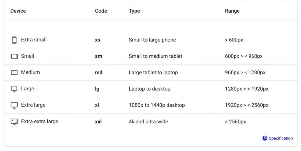
可以熟讀 Vuetify 的 Grid. Flex. Spacing 建立好的 class 來加快切版速度。
參考:
https://vuetifyjs.com/en/components/grids/#usage
https://vuetifyjs.com/en/styles/flex/#usage
https://vuetifyjs.com/en/styles/spacing/#usage
// components/skills/skills.vue

<v-row class="px-md-12 px-lg-16 px-5" align="stretch">
   <v-col cols="12" sm="12" md="6" lg="6" >
      <div
        class="d-flex flex-column align-center justify-start bg-light-orange fill-height"
        :class="isDesktop ? 'pa-10 custom-rounded-lg': 'pa-4 custom-rounded-md'"
      >
        <div
          class="text-white"
          :class="isDesktop ? 'text-h3-semi-bold': 'text-h4-semi-bold'"
        >
          Work Experience
        </div>
        <div
          class="w-100 d-flex flex-column fill-height"
          :class="isDesktop ? 'mt-6 ga-5': 'mt-3 ga-3'"
        >
          <div class="d-flex flex-grow-1" v-for="value in experience" :key="value.time">
            <div
              class="bg-white d-flex flex-column w-100 justify-space-between align-start"
              :class="isDesktop ? 'flex-grow-1 pa-6 custom-rounded-md': 'pa-4 custom-rounded-sm'"
            >
              <div
                class="text-brown"
                :class="isDesktop ? 'text-h5-regular': 'text-h6-regular'"
              >
                {{ value.time }}
              </div>
              <div
                 class="text-orange"
                 :class="isDesktop ? 'text-h3-semi-bold': 'text-h4-semi-bold '"
              >
                 {{ value.position }}
              </div>
              <div
                 class="text-brown"
                 :class="isDesktop ? 'text-h3-semi-bold': 'text-h4-semi-bold '"
              >
                 {{ value.company }}
              </div>
           </div>
         </div>
       </div>
     </div>
   </v-col>
</v-row>
這段切版卡最久的其實是 <div> 之間的間距問題。我原本使用 <v-row> 搭配 <v-col cols="12" md="6" lg="6">,但發現沒有出現預期的間距。嘗試加上 ga-3 雖然能拉開距離,但會導致排版跑掉甚至換行。
最後才發現關鍵在 <v-col> 本身:不要加上多餘的自訂 class,因為這會破壞 Vuetify 框架內建的 grid 系統。只要把多餘的 class 拿掉,間距就能正確呈現了。
還得個別調整手機版字體、間距、圓角,也花上了一些時間,所以說啊,讓使用者看得舒服的介面,背後其實都是UIUX設計師和前端工程師的血與淚啊,每個細節都不能馬虎。
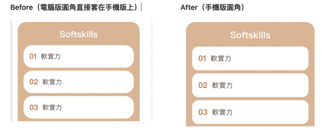
圓角的大小看起來是真的有差吧!


 看影片追技術