一、學習目標
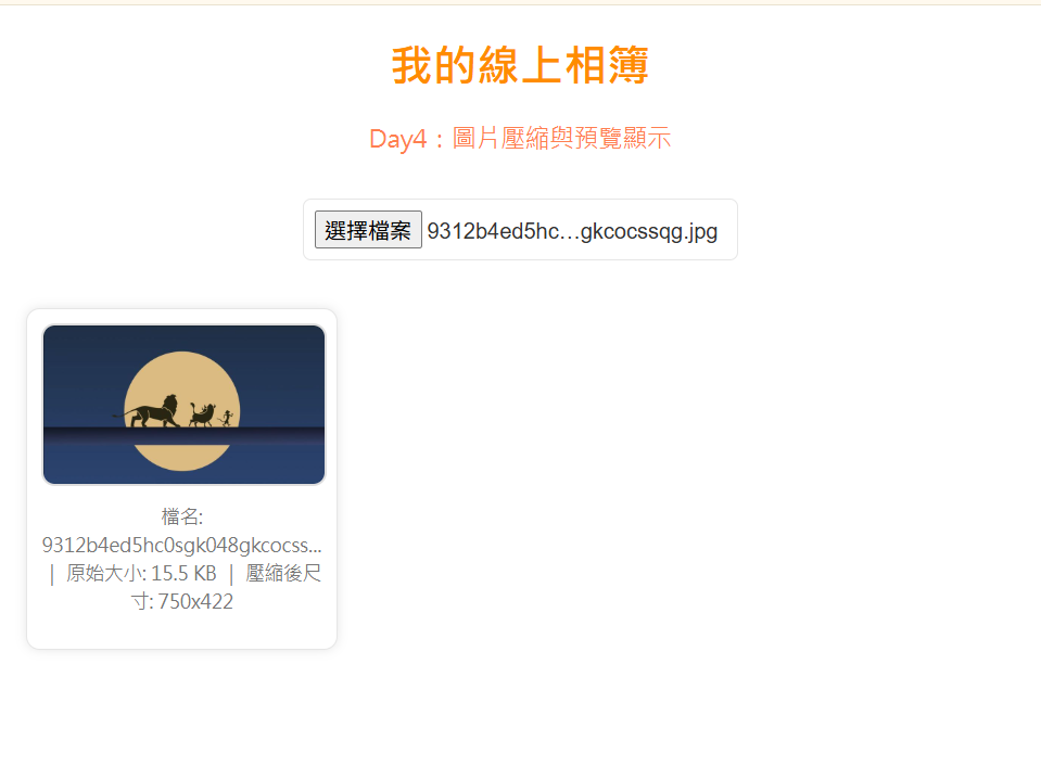
今天的任務是讓使用者上傳的圖片自動壓縮成合適大小,以提升載入速度並節省儲存空間。這對線上相簿的效能非常關鍵。
二、學習過程與方法
我透過 HTML5 的 <canvas> 元素進行圖片縮放,根據寬高比例設定最大尺寸限制。接著使用 toDataURL("image/jpeg", 0.8) 轉換為壓縮格式,並即時預覽壓縮後的結果。
三、實作成果
上傳大圖時,系統會自動縮小尺寸並保留清晰度。這樣不僅減少了圖片大小,也讓展示速度明顯提升。是性能與體驗之間的平衡點。
四、主要程式碼區塊
<!DOCTYPE html>
<html lang="zh-Hant">
<head>
  <meta charset="UTF-8">
  <title>Day4 - 圖片壓縮功能</title>

  <style>
    /*統一主題配色*/
    :root {
      --bg: #ffffff;
      --primary: darkorange;
      --accent: coral;
      --text: #333;
      --muted: #777;
      --border: #e6e6e6;
      --btn: #ff8c42;
      --btn-hover: #ff6a00;
      --card-bg: #fff;
    }

    /*網頁基本設定*/
    body {
      background-color: var(--bg);
      font-family: "Microsoft JhengHei", Arial, sans-serif;
      margin: 20px;
      text-align: center;
      color: var(--text);
    }

    h1 {
      color: var(--primary);
    }

    p {
      color: var(--accent);
      font-size: 18px;
    }

    /*上傳按鈕*/
    input[type="file"] {
      margin: 15px 0;
      padding: 8px;
      border-radius: 6px;
      border: 1px solid var(--border);
      font-size: 16px;
      cursor: pointer;
    }

    /*相簿展示區*/
    #gallery {
      display: grid;
      grid-template-columns: repeat(auto-fill, minmax(200px, 1fr));
      gap: 20px;
      margin-top: 20px;
    }

    .photo-card {
      background: var(--card-bg);
      border: 1px solid var(--border);
      border-radius: 10px;
      padding: 10px;
      box-shadow: 0 0 8px rgba(0, 0, 0, 0.1);
      text-align: center;
    }

    .photo-card img {
      width: 100%;
      border-radius: 10px;
      border: 2px solid #ddd;
    }

    .info {
      font-size: 14px;
      color: var(--muted);
      margin-top: 8px;
      line-height: 1.5;
      word-wrap: break-word;
      overflow-wrap: anywhere;
    }
  </style>
</head>

<body>
  <h1>我的線上相簿</h1>
  <p>Day4:圖片壓縮與預覽顯示</p>

  <!--圖片上傳-->
  <input type="file" id="upload" accept="image/*">

  <!--圖片展示區-->
  <div id="gallery"></div>

  <script>
    const upload = document.getElementById("upload");
    const gallery = document.getElementById("gallery");

    upload.addEventListener("change", function() {
      gallery.innerHTML = ""; // 清空舊內容
      const file = this.files[0];
      if (!file) return;

      const reader = new FileReader();
      reader.onload = function(e) {
        const img = new Image();
        img.onload = function() {
          // 設定最大尺寸
          const maxWidth = 800;
          const maxHeight = 800;
          let width = img.width;
          let height = img.height;

          // 按比例縮小
          if (width > maxWidth || height > maxHeight) {
            if (width > height) {
              height = Math.round((maxWidth / width) * height);
              width = maxWidth;
            } else {
              width = Math.round((maxHeight / height) * width);
              height = maxHeight;
            }
          }

          // 建立 Canvas 壓縮圖片
          const canvas = document.createElement("canvas");
          canvas.width = width;
          canvas.height = height;
          const ctx = canvas.getContext("2d");
          ctx.drawImage(img, 0, 0, width, height);

          // 轉為壓縮後的 Data URL
          const compressedDataUrl = canvas.toDataURL("image/jpeg", 0.8);

          // 建立圖片卡片
          const card = document.createElement("div");
          card.classList.add("photo-card");

          const newImg = document.createElement("img");
          newImg.src = compressedDataUrl;

          const shortName = file.name.length > 25 ? file.name.slice(0, 25) + "..." : file.name;

          // 顯示壓縮資訊
          const info = document.createElement("p");
          info.classList.add("info");
          info.textContent =
            `檔名: ${shortName} | 原始大小: ${(file.size / 1024).toFixed(1)} KB | 壓縮後尺寸: ${width}x${height}`;

          card.appendChild(newImg);
          card.appendChild(info);
          gallery.appendChild(card);
        };
        img.src = e.target.result;
      };
      reader.readAsDataURL(file);
    });

    console.log("Day4:圖片壓縮與顯示完成");
  </script>
</body>
</html>
 yuuuun

 看影片追技術