背景設定
css
.bg-examples {
  background-color: #ecf0f1
}
html
<div class="bg-examples">
  <p>這個區塊有淺灰色背景</p>
</div>
背景圖片:
css
.hero-section {
  background-image: url("https://images.unsplash.com/photo-1507525428034-b723cf961d3e");/*圖片網址*/
  background-size: cover;/*覆蓋整個容器*/
  background-position: center;/*居中顯示*/
  background-repeat: no-repeat;/*不重複*/
  background-attachment: fixed;/* 背景固定在視窗,滾動時不移動(視差效果) */
  height: 100vh;/* 高度等於整個螢幕高 */
  display: flex;/* 用 Flexbox 排版 */
  align-items: center;/* 垂直置中內容 */
  justify-content: center;/* 水平置中內容 */
}
html
<div class="hero-section">
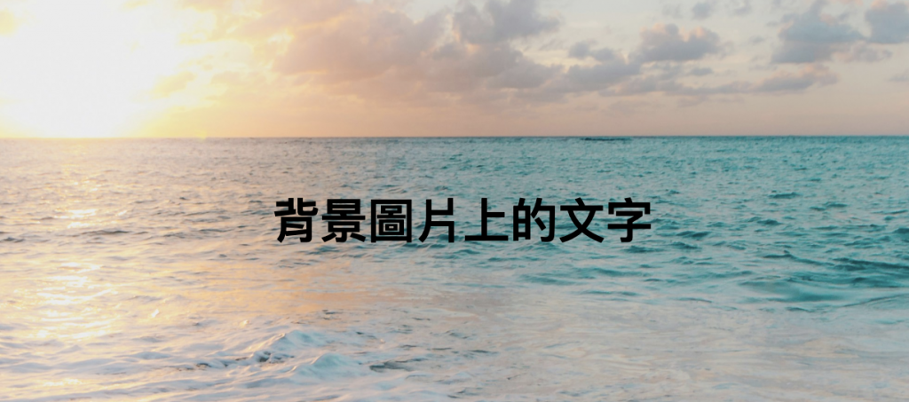
<h1>背景圖片上的文字</h1>
</div>
背景漸層:
css
.gradient-bg {
  background: linear-gradient(135deg,#bebeb7 0%, #ffb8c6 100%);
  /* 背景是線性漸層:從左上角到右下角 (135 度),
     起點是灰米色 (#bebeb7),終點是粉紅色 (#ffb8c6) */
  color:  white;
  /* 區塊裡的文字顏色設為白色,避免和背景撞色 */
  padding: 40px;
  /* 內距 40px,讓內容不會貼邊,留出空間 */
  text-align: center;/* 文字水平置中 */
}
html
<div class="gradient-bg">
  <h2>漸層背景效果</h2>
  <p>從灰色到粉色的漸層</p>
</div>

漸層背景2:
css
.sunset-gradient {
  background: linear-gradient(to right,#ff7e5f, #feb47b);
  /* 背景是線性漸層,方向向右。
     從左邊的橘紅 (#ff7e5f) 漸變到右邊的橘黃 (#feb47b),
     看起來像日落的顏色。 */

  padding: 30px;
  border-radius: 10px;
  text-align: center;
  color:white;
}
html
<div class="sunset-gradient">
  <p>日落色調的漸層背景</p>
</div>

漸層背景效果:
css
.ocean-gradient {
  height: 100vh;/* 區塊高度 = 整個螢幕高 */
  display: flex;/* 使用 Flexbox 排版 */
  align-items: center;/* 垂直置中內容 */
  justify-content: center;/* 水平置中內容 */
  color: white;
  font-size: 2rem;
  background: linear-gradient(45deg,#667eea, #191970, #667eea);
  /* 做一個 45 度角的線性漸層,藍 → 紫 → 藍,看起來像海洋色 */
  background-size: 400% 400%;
  animation: gradientShift 8s ease infinite;
  /* 啟動動畫:名稱 gradientShift,8 秒循環一次,平滑移動,無限次 */
}
  @keyframes gradientShift {
    0% { background-position: 0% 50%; }
    /* 開始:在左邊 */
    50% {background-position: 100% 50%; }
    /* 中間:移到右邊 */
    100% {background-position: 0% 50%; }
  }
html
<div class="ocean-gradient">
  <p>動態海洋漸層(需要配合動畫)</p>
</div>


 iThome鐵人賽
 看影片追技術