在表單設計裡,輸入框是最常出現的元件,但它同時也有許多變化,例如文字、數字、日期、多行文字等等。如果每一種情境都獨立寫一份程式碼,不僅會造成重複,更難以維護。這也是為什麼要有 Base Input 元件設計,透過 props 與彈性設置,將各種輸入型態統一管理。
參考文件:https://vuetifyjs.com/en/components/inputs/#usage
<template>
    <div class="text-h5-medium mb-3">
        {{ props.label }}
        <span v-if="props.required" style="color: red;">*</span>
    </div>

    <!-- 一般輸入框 -->
    <v-text-field
        v-if="props.type === 'text'"
        v-model="inputVal"
        variant="outlined"
        :placeholder="props.placeholder"
        :required="props.required"
        :rules="props.rules"
        :disabled="props.disabled"
        hide-details="auto"
        rounded="pill"
    ></v-text-field>

    <!-- 多行輸入框 -->
    <v-textarea
        v-if="props.type === 'textarea'"
        v-model="inputVal"
        variant="outlined"
        :required="props.required"
        :disabled="props.disabled"
        rows="4"
        rounded="xl"
    >
    </v-textarea>
</template>

<script setup>
const props = defineProps({
		modelValue: {          // 父元件傳進來
        type: String,
        default: '',
        required: false,
    },
    type: {                 // 種類:text, textarea
        type: String,
        default: 'text',
        required: false,
    },
    label: {                // 欄位名
        type: String,
        default: '',
        required: true
    },
    placeholder: {          // 輸入前的提示文字
        type: String,
        default: '',
        required: false,
    },
    required: {             // 是否必填
        type: Boolean,
        default: false,
        required: false,
    },
    disabled: {             // disabled 狀態
        type: Boolean,
        default: false,
        required: false,
    },
    rules: {                // 有關錯誤提示的規則
        type: Array,
        default: () => [],
        required: false,
    }
});

const emit = defineEmits(['update:modelValue']);

const inputVal = computed({
  get: () => props.modelValue,
  set: (val) => {
    return emit('update:modelValue', val);
  },
});

</script>
在表單的設計裡,父元件與子元件之間需要保持資料的 雙向同步。以這個案例來說,Contact(父元件)引用了 CustomInput(子元件):
contact.vue 中輸入資料,值會先傳遞到 custom-input.vue。custom-input.vue 再將更新後的值回傳給父元件 contact.vue。contact.vue 就能取得完整的輸入內容,並呼叫 API 進行送出。這樣的資料流設計,確保了父子元件之間的狀態一致性,同時讓表單邏輯更清晰、可控。
在 Vue 裡,v-model 是一個語法糖(shorthand syntax),用來處理 父子元件之間的雙向綁定。
它其實就是在做:
:model-value="值" 把資料傳給子元件。emit('update:modelValue', 新值) 把資料回傳給父元件。<CustomInput v-model="username" />
其實就是:
<CustomInput
  :model-value="username"
  @update:model-value="username = $event"
/>
**v-model = :model-value + @update:model-value,**就是 Vue 幫你省略寫法,讓父子元件雙向同步變得直觀。
接著就把之前所有有用到 v-text-field 的地方,置換成 CustomInput~
<CustomInput
  v-model="state.form.name"     // 把輸入的內容寫進state裡
  label="姓名"                   // 欄位名
  :placeholder="'請輸入您的姓名'"
  :required="true"              // 必填
  :rules="[v => !!v || '必填']"  // 依據規則顯示錯誤提示
/>
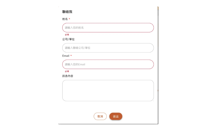
另外,在送出按鈕的互動設計中,我希望能加上驗證限制,如果使用者未填寫必填欄位時,點按送出按鈕即會提示必填訊息(如圖),而不觸發 api 請求,這樣的行為溝通時會說是“前端阻擋" XD。若必填都有正確填寫,才會發送 api ,並將填寫內容記錄在state.form,作為 payload 送給後端。
可以用 formRef 搭配 <v-form>做驗證,當使用者按下送出按鈕時,會先呼叫 formRef.value.validate(),若驗證未通過則直接 return,確保表單完整,程式碼如下:
<template>
	<v-form ref="formRef">
		....表單欄位內容
	<v-form>
</template>

<script setup>
const formRef = ref(null);

const send = async () => {
  const { valid } = await formRef.value.validate()
  if (!valid) return;

  state.dialog = false;
  console.log(state.form);
  console.log('send');
}
</scrpipt>
累死,今天就到這!


 看影片追技術