css
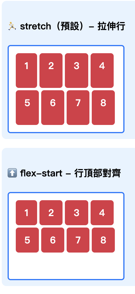
.content-stretch {
  display: flex;
  flex-wrap: wrap;/*允許換行*/
  align-content: stretch;/*拉伸每一行間距*/
  height: 100px;/*固定高度*/
  width: 250px;
  background: #f0f8ff;
  border: 2px solid #007bff;
  gap: 10px;/*子元素之間的間距10px*/
}

.flex-item {
  display: flex;

  background: #4caf50;
  color: white;
  height: 20px;
  width: 50px;
  align-items: center;/* 垂直方向置中內容 */
  justify-content: center;/* 水平方向置中內容 */
  border-radius: 4px;
 }
html
 <div class="content-stretch">
   <div class="flex-item">1</div>
   <div class="flex-item">2</div>
   <div class="flex-item">3</div>
   <div class="flex-item">4</div>
   <div class="flex-item">5</div>
   <div class="flex-item">6</div>
   <div class="flex-item">7</div>
   <div class="flex-item">8</div>
   <div class="flex-item">9</div>
 </div>
css
.content-start {
display: flex;
flex-wrap: wrap;
align-content: flex-start;
height: 200px;
width: 250px;
background: #f0f8ff;
border: 2px solid #007bff;
gap: 10px;
}
.flex-item {
display: flex;

background: #4caf50;
color: white;
height: 20px;
width: 50px;
align-items: center;/* 垂直方向置中內容 */
justify-content: center;/* 水平方向置中內容 */
border-radius: 4px;
}
html與stretch相同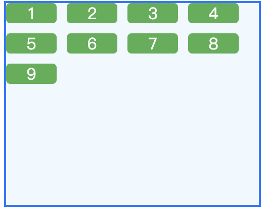
css
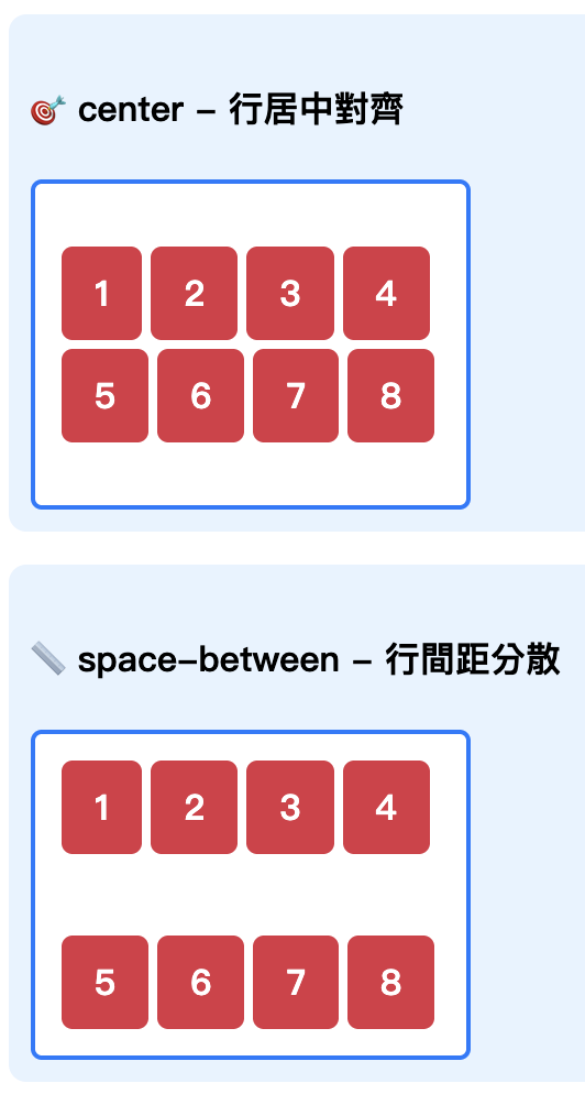
.content-center {
display: flex;
flex-wrap: wrap;
align-content: center;
height: 200px;
width: 250px;
background: #f0f8ff;
border: 2px solid #007bff;
gap: 10px;
}
.flex-item {
display: flex;
background: #4caf50;
color: white;
height: 20px;
width: 50px;
align-items: center;
justify-content: center;
border-radius: 4px;
}
html與stretch相同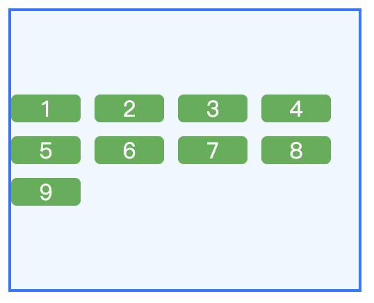
css
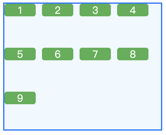
.content-between {
 display: flex;
 flex-wrap: wrap;
 align-content: space-between;
 height: 200px;
 width: 250px;
 background: #f0f8ff;
 border: 2px solid #007bff;
 gap: 10px;
}
.flex-item {
 display: flex;
 background: #4caf50;
 color: white;
 height: 20px;
 width: 50px;
 align-items: center;
 justify-content: center;
 border-radius: 4px;
}
html與stretch相同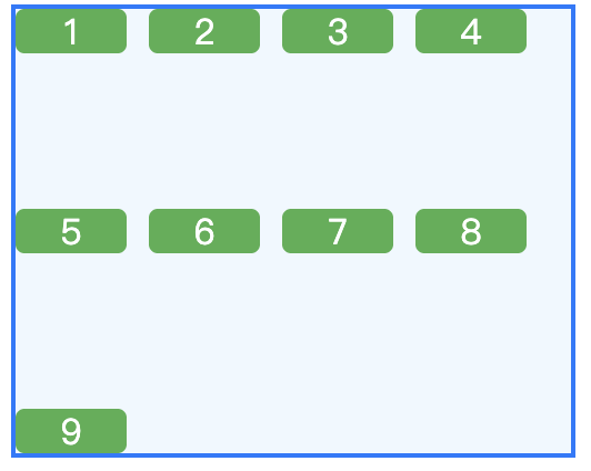


 iThome鐵人賽
 看影片追技術