- 改善待辦清單的視覺呈現
• 將原本單純的 ListTile 改為使用 Card 包裝,讓每個待辦項目有明顯的立體感與間距
• 為完成的項目增加淡灰色背景與刪除線效果,未完成的則維持正常文字顏色
• 增加圖示以增強辨識度:
完成項目使用 Icons.check_circle(綠色)
未完成項目使用 Icons.radio_button_unchecked(灰色)
• 調整列表邊距與間距,使整體介面更具一致性與閱讀性
ListView.builder(
 itemCount: todos.length,
 itemBuilder: (context, index) {
   final todo = todos[index];
   return Card(
     margin: const EdgeInsets.symmetric(horizontal: 12, vertical: 6),
     child: ListTile(
       leading: Icon(
         todo.isDone ? Icons.check_circle : Icons.radio_button_unchecked,
         color: todo.isDone ? Colors.green : Colors.grey,
       ),
       title: Text(
         todo.title,
         style: TextStyle(
           decoration: todo.isDone
               ? TextDecoration.lineThrough
               : TextDecoration.none,
           color: todo.isDone ? Colors.grey : Colors.black,
         ),
       ),
       onTap: () {
         setState(() {
           todo.isDone = !todo.isDone;
         });
       },
     ),
   );
 },
);
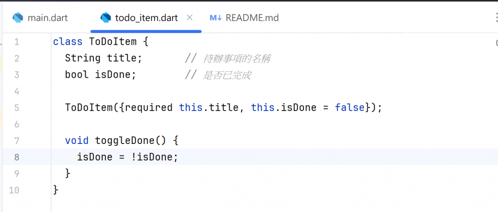
- 重構程式結構:將 Todo 模型與元件分離
• 建立一個 todo_item.dart 檔案,專門存放 Todo 類別
• 將待辦清單 UI 抽離成一個獨立的 Widget,命名為 TodoListView
• 這樣做的目的:
提升可維護性與可重用性
讓主頁程式 main.dart 更乾淨,只需負責邏輯與狀態控制
- 改善整體使用者體驗
• 點擊完成項目時加入短暫動畫或顏色變化,讓操作更有回饋感
• 保持捲動位置不會在新增項目後重置
• 調整整體配色方案,使 App 更柔和、易讀,例如:
主色(PrimaryColor):深藍或藍灰
輔助色(AccentColor):綠色(代表完成),透過 ThemeData 統一樣式,方便未來主題切換
 hsin_9
