
今天會進入視覺化的重頭戲:透過前端輕量級圖表套件 Chart.js,在「統計」頁面畫出各類別的消費比例圓餅圖。同時即時計算各類別的金額與佔比百分比。
首先,我們在 HTML 的 中引入 Chart.js 的 CDN,並在統計頁面(stats-page)中利用 Flexbox排版,設計出左側放圖表、右側放明細表格的結構:
<!-- 引入 Chart.js CDN -->
<script src="https://cdn.jsdelivr.net/npm/chart.js"></script>

<!-- 統計頁面佈局:左圖右表 -->
<div id="stats-page" class="page-view">
    <div class="section-box">
        <h3>消費比例統計圖表</h3>
        <p id="stats-total-text" style="font-size: 18px; font-weight: bold; color: #333; margin-bottom: 20px;">總支出:$ 0</p>

        <div style="display: flex; gap: 30px; align-items: center; flex-wrap: wrap;">
            <!-- 左側:圓餅圖畫布 -->
            <div style="flex: 1; min-width: 280px; max-width: 350px; margin: 0 auto;">
                <canvas id="expense-chart"></canvas>
            </div>
            <!-- 右側:詳細金額與百分比清單 -->
            <div id="category-stats-list" style="flex: 1; min-width: 280px; display: flex; flex-direction: column; gap: 10px;"></div>
        </div>
    </div>
</div>
在 script.js 中,我們編寫了 renderChart() 函式。每次新增或刪除消費時,它會自動加總各個類別的金額,計算出精確的百分比,並透過 Chart.js 重新渲染圓餅圖:
const ctx = document.getElementById('expense-chart').getContext('2d');
let expenseChart = null;

function renderChart() {
    let categoryTotals = { food: 0, transport: 0, entertainment: 0, clothes: 0, other: 0 };
    let totalExpenseSum = 0;

    expenses.forEach(item => {
        const amount = Number(item.amount) || 0;
        totalExpenseSum += amount;
        if (categoryTotals.hasOwnProperty(item.category)) {
            categoryTotals[item.category] += amount;
        } else {
            categoryTotals.other += amount;
        }
    });

    document.getElementById('stats-total-text').textContent = `總支出:$ ${totalExpenseSum}`;

    const categoriesInfo = [
        { key: 'food', name: '吃的喝的', color: '#efd1c5' },
        { key: 'transport', name: '交通', color: '#c6d5e8' },
        { key: 'entertainment', name: '娛樂', color: '#dac6e8' },
        { key: 'clothes', name: '買買買', color: '#e8c6da' },
        { key: 'other', name: '其他', color: '#d4d8dd' }
    ];

    // 動態產生右側明細表格與百分比
    const statsListContainer = document.getElementById('category-stats-list');
    statsListContainer.innerHTML = '';

    categoriesInfo.forEach(cat => {
        const amount = categoryTotals[cat.key];
        const percentage = totalExpenseSum > 0 ? ((amount / totalExpenseSum) * 100).toFixed(1) : 0;

        const itemDiv = document.createElement('div');
        itemDiv.style.display = 'flex';
        itemDiv.style.justifyContent = 'space-between';
        itemDiv.style.alignItems = 'center';
        itemDiv.style.padding = '12px 16px';
        itemDiv.style.backgroundColor = '#ffffff';
        itemDiv.style.borderRadius = '8px';
        itemDiv.style.border = '1px solid #eee';
        itemDiv.style.borderLeft = `5px solid ${cat.color}`;

        itemDiv.innerHTML = `
            <span style="font-size: 15px; font-weight: 500; color: #333;">${cat.name}</span>
            <span style="font-size: 15px; color: #555;">$${amount} <strong style="color: #1967d2; margin-left: 10px;">(${percentage}%)</strong></span>
        `;
        statsListContainer.appendChild(itemDiv);
    });

    // 建立 Chart.js 圓餅圖
    if (expenseChart) {
        expenseChart.destroy();
    }

    expenseChart = new Chart(ctx, {
        type: 'pie',
        data: {
            labels: categoriesInfo.map(cat => cat.name),
            datasets: [{
                data: categoriesInfo.map(cat => categoryTotals[cat.key]),
                backgroundColor: categoriesInfo.map(cat => cat.color),
                borderWidth: 1
            }]
        },
        options: {
            responsive: true,
            plugins: {
                legend: { position: 'bottom' }
            }
        }
    });
}
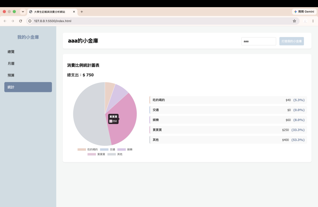
明天見!

 rong824

 iThome鐵人賽
 看影片追技術