各位大大好
小弟近期在學習 R ggplot2
目前我想試著繪出下面這張圖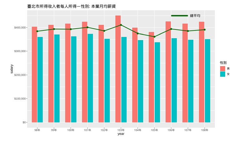
但自己試了蠻久的,畫出來結果都會變成這樣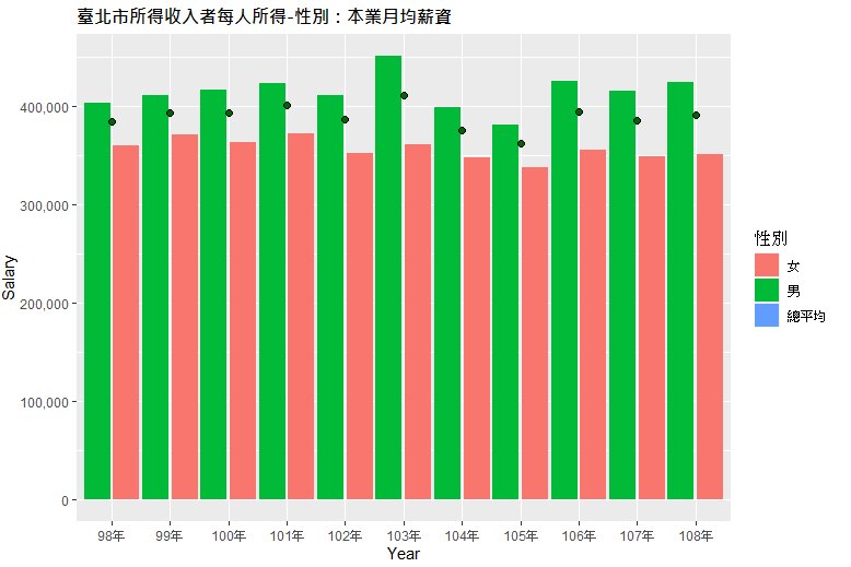
主要卡點在於不太清楚如何把「總平均」獨立出來,以及Legend 自己獨立一個,即使自己已經分成兩個 DataFrame 了,好像也沒比較好
我的Code 如下:
library("ggplot2")
library("scales")
library("readxl")
windowsFonts(A=windowsFont("微軟正黑體"))

df <- read_excel("./data/fi00128y2a2021523591831.xlsx")
# 資料表處理
df <- df[2:5]
df <- df[complete.cases(df), ]
colnames(df) <- c('年份', '總平均', '男', '女')
df[2:4] <- sapply(df[2:4], as.numeric)


new_df <- cbind(stack(df[, -1]), 年份=df$年份)
new_df$年份 <- factor(new_df$年份, levels = unique(new_df$年份))

(new_df.sex <- new_df[new_df$ind != '總平均',])
(new_df.avg <- new_df[new_df$ind == '總平均',])

# 繪圖
ggplot(new_df.sex, aes(x=年份, y=values, fill=ind)) +
    geom_bar(stat='identity', position= position_dodge(width=1)) +
    geom_line(data=new_df.avg, aes(x=年份, y=values), stat='identity', size=0.5) +
    geom_point(data=new_df.avg, aes(x=年份, y=values), colour="black", size=2, shape=21, fill="darkgreen", group=2) +
    labs(x='Year', y='Salary', title='臺北市所得收入者每人所得-性別:本業月均薪資', fill='性別') +
    scale_y_continuous(labels=comma) +
    theme(plot.title=element_text(face="bold",size=12,family="A",color="black",hjust=0))
new_df 資料集內容:
> new_df

values    ind  年份
1  384362 總平均  98年
2  393629 總平均  99年
3  392977 總平均 100年
4  400942 總平均 101年
5  385983 總平均 102年
6  410951 總平均 103年
7  375280 總平均 104年
8  361584 總平均 105年
9  393979 總平均 106年
10 385462 總平均 107年
11 391033 總平均 108年
12 402699     男  98年
13 411193     男  99年
14 416253     男 100年
15 423614     男 101年
16 411311     男 102年
17 450542     男 103年
18 398453     男 104年
19 380512     男 105年
20 425123     男 106年
21 415879     男 107年
22 424414     男 108年
23 359864     女  98年
24 370662     女  99年
25 363163     女 100年
26 372351     女 101年
27 352162     女 102年
28 360714     女 103年
29 347342     女 104年
30 337038     女 105年
31 354855     女 106年
32 348949     女 107年
33 351266     女 108年
希望有熟悉 R 繪圖的大大可以協助,感恩
已邀請的邦友 {{ invite_list.length }}/5
ggplot()+
  geom_bar(data = new_df[new_df$ind != '總平均',],aes(年分, values,fill = ind),stat='identity', position= position_dodge(width=1))+
  geom_point(data = new_df[new_df$ind == '總平均',],aes(年分, values))+
  geom_line(data = new_df[new_df$ind == '總平均',],aes(年分, values,group = 1))
不要一開始就把資料塞進ggplot()裡面去
在繪圖時再分別指定資料即可
其餘細節再自己調整囉
謝謝 大大 後來自己在研究的時候也發現這件事情XD
不過另外想請教的是
像例圖這樣將兩種 geom 圖拆成兩個 legend 顯示
這到底該怎麼實作呢?
自己後來的硬做解法如下:(右上圖例是硬畫出來的XD)
new_df.sex <- new_df[new_df$ind != '總平均',]
(new_df.avg <- new_df[new_df$ind == '總平均',])
avg <- data.frame(avg.x = new_df.avg$年份[1:length(new_df.avg$年份)-1],
                  avg.y = new_df.avg$values[1:length(new_df.avg$values)-1],
                  avg.xend = new_df.avg$年份[2:length(new_df.avg$年份)],
                  avg.yend = new_df.avg$values[2:length(new_df.avg$values)])

# 繪圖
ggplot(new_df.sex, aes(x=年份, y=values)) +
    geom_bar(stat='identity', position= position_dodge(width=1), aes(fill=ind)) +
    geom_segment(data=avg, mapping=aes(x=avg.x, y=avg.y, xend=avg.xend, yend=avg.yend), size=1, color="darkgreen") +
    geom_segment(data=avg, mapping=aes(x=c('106年'), y=c(450000), xend=c('107年'), yend=c(450000)), size=2, color="darkgreen") +
    geom_text(x=c('108年'), y=c(450000), label='總平均', family="A") +
    geom_point(data=new_df.avg, aes(x=年份, y=values), colour="black", size=2, shape=21, fill="darkgreen", group=2) +
    labs(x='Year', y='Salary', title='臺北市所得收入者每人所得-性別:本業月均薪資', fill='性別') +
    scale_y_continuous(labels=dollar) +
    theme(plot.title=element_text(face="bold",size=12,family="A",color="black",hjust=0))
畫出來的圖: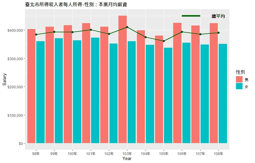
ggplot()+
  geom_bar(data = df[df$ind != '總平均',],aes(年分, values,fill = ind),stat='identity', position= position_dodge(width=1))+
  geom_point(data = df[df$ind == '總平均',],aes(年分, values))+
  geom_line(data = df[df$ind == '總平均',],aes(年分, values,color = ind,group = 1))+
  scale_fill_manual(values = c("#CB9498", "#D8AD48"), labels = c("男男", "女女"))+
  scale_color_manual(values = "#AC9D98", labels = "總平均")
一個用scale_fill_manual
一個用scale_color_manual
這樣就有兩個圖例
可以參考這篇
https://ggplot2.tidyverse.org/reference/scale_manual.html

 iThome鐵人賽