影片教學請點選下圖連結↓

使用With Layout讓版型同時存在兩種以上的Grid
在講第七、八章的時候,
各位可以看出我都是將Grid在RWD 斷點的時候修改它的狀態,
但這個章節我主要是要來分享,
如果你的網頁同時要存在兩種以上的Grid時,
該如何透過suys2的With Layout Mixin來實作,
程式碼連結
susy2 - With Layout mixin
susy2 - Gallery mixin
sassmeister-程式碼範例
With Layout
格式:with-layout($layout, $clean) { @content }
$layout就是放進你自訂的Sass Maps設定, 在預設下,with-layout會覆蓋全域$susy的變數,
如果開啟$clean的話意思則是不倚賴susy設定,
從零開始設定, 但原則上只要你$layout有設定完全,
是可以不用管$clean這個變數,
@content的意思就程式碼寫在裡面,
設計一版型以上有兩種以上的Grid
如果你都沒設定Sass maps的話,
他就會吃到susy的Global Defaults設定,
但今天在版型上需同時要有另外一種Grid在上面時,
你就可以這樣寫:
//新增Grid的Sass Map
$content:(
  column-width:60px,
  gutters:1/3,
  columns: 6,
  gutter-position: after,
  debug:(image:show)
);
//使用with-layout把在這個Grid以下的class都寫在`@content`裡面。
@include with-layout($content){
    .content{
        @include container;
    }
}
這樣子做的話,
裡面的code就不會被susy2預設的Sass Maps所污染,
當然你在這個Grid裡面還是可以繼續用susy-breakpoint寫RWD,
只要再套入RWD的$layout變數進去就可以了:
$content:(
  column-width:60px,
  gutters:1/3,
  columns: 6,
  gutter-position: after,
  debug:(image:show)
);
//新增RWD Sass maps設定
$content-desktop:(
    columns:12
);
//desktop 斷點
$desktop: 1024px;
//使用with-layout把在這個Grid以下的class都寫在`@content`裡面。
@include with-layout($content){
    .content{
        @include container;
        @include susy-breakpoint($desktop,$content-desktop){
            @include container;
        }
    }
}
看到上面的程式碼,
你可能會懷疑如果我單純只有寫columns:12,
難道其他的變數不會被susy2的Sass Maps覆蓋掉嗎?
其實是不會的,
因為我的Grid都被with-layout包裹起, 所以他會優先去找with-alyout的$layout設定來覆蓋。
看到這邊相信你已經了解了,
如果你今天在版型上要兩種以上的Grid,
都不要吃到susy2預設的Sass Maps,
你就都把他包在with-layout的Mixin裡面就可以了。
範例程式碼
這個範例程式碼在最上面連結有提供,主要是在實作上面是正常的Grid,
下面無縫圖片牆的Grid在mobile時是固定寬度,
當他超過1024px以上時,該Grid就會變成滿版, 而這兩個Grid都沒用到susy2預設的Sass Maps,
但在實作上,我是建議你預設版型用$susy原本的Sass Maps,
當你版型上需要有新的Grid時,再新增自訂的Sass Maps,然後再用with-layout把他包裹起來就ok了。
@import 'susy';
@import 'breakpoint';
img{
max-width: 100%;
height: auto;
vertical-align: middle; //解決img在div有margin-bottom 3px問題
}
//$content上面的Grid、$content-pad是他的斷點
$content:(
column-width:60px,
gutters:1/3,
columns: 6,
gutter-position: after,
debug:(image:show)
);
$content-pad:(
columns: 14,
);
//$photo是下面圖片牆的Grid、$content-pad是他的斷點所載入的$layout,當他在平板解析度以上時,
//就變成滿版無縫圖片牆,所以gutters改為0,column-width:false則是會讓版型變成100%滿版來設計。
$photo:(
column-width:60px,
gutters:1/3,
columns: 6,
output:isolate,
gutter-position: after,
debug:(image:show)
);
$photo-pad:(
column-width:false,
gutters:0,
columns: 12,
);
$desktop: 1024px;
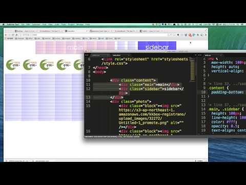
.content{
padding-bottom: 20px;
}
.main,.sidebar{
height: 100px;
line-height:100px;
color: #fff ;
opacity: 0.5;
text-align: center;
font-size: 50px;
}
@include with-layout($content){
.content{
@include container;
@include susy-breakpoint($desktop,$content-pad){
@include container;
}
};
.main{
background:pink;
@include span(6);
@include susy-breakpoint($desktop,$content-pad){
@include span(8);
}
}
.sidebar {
background:blue;
@include span(6);
@include susy-breakpoint($desktop,$content-pad){
@include span(4 last);
}
}
};
@include with-layout($photo){
.photo{
height: 500px;
@include container;
@include susy-breakpoint($desktop,$photo-pad){
@include container;
}
}
//gallery很像susy1的Isolation,是使用isolate來排版,但會自己算欄數,自動依序往下排列。
.block{
@include gallery(2);
margin-bottom: gutter(6);
@include susy-breakpoint($desktop,$photo-pad){
@include gallery(1);
margin-bottom: 0;
}
}
}


 看影片追技術