「當你迷惘的時候,就回到原點想一想」-中華一番 蘭飛鴻
網頁前端新手村系列文章,宗旨並不在技術本身的教導,重點放在技術與技術之間的脈胳關係。讓零碎的網頁前端技術的關鍵字,成為比較有系統性的視野。
讓一開始接觸網頁前端的新手們,有一個比較友善的系統來架構你的學習,至於技術本身的深入探討,就留給其它的高手們吧。
Position 定位呼!花了五天介紹 CSS 的 Selector!!介紹完 Selector 之後,來介紹常用的 position 吧!
在 CSS 中,有三種可控制的方式,放置 box [1]
float 排列[3]position 定位語法
position: 定位方法
top: 數字
bottom: 數字
left: 數字
right: 數字
left = -right, top = -bottom
原本畫面上的 box 會依照 Normal flow 排列。
position: staic 是每個 HTML element 的預設值。position 設定成這個值時, top, left, bottom, right 將不會有任何作用。原本畫面上的 box 會依照 Normal flow 排列。
假設有個叫 box 的HTML element 設定 position: relative 會有什麼影響
原本畫面上的 box 會依照 Normal flow 排列。
假設有個叫 box 的HTML element 設定 position: absolute 會有什麼影響
position: static 」的位置position: absolute 的都與 box 相關可視區的絕對定位,唸起來很呦口。我也不知道怎麼翻才好。
這是一種類似絕對定位的定位方式。唯一的區別在於偏移量參考點
在內容捲動時,被 fixed 的元素會固定不移動。類似固定背景的效果
有 Media Query 時,有用到 paged 類型,要注意重複的情況。
每個頁面固定放置簽名,是個很有效的做法。
在介紹 sticky 之前,先說說一個實例
在此這個頁面,在內容向上捲動時,希望 menu 離開頁面時,會固定在最上面,一直到 menu 上面的部份再出現時,menu 再跟著頁面往下捲動。(如下圖)

但是
理想與現實之間
是有的差距的(如下圖)!!!
常見的實作bug,有「內容跳動」的情況。
當 menu 要變成 fixed 時,由於從佔 normal flow 空間改成不佔空間的定位方式。跳動的現象,就是後面的元素因為 normal flow 的排列往前排造成的。
過去的做法
用 JavaScript 加上/移除 CSS 的方式。[5]
:root {
 --menu-height: 100px;
}

.fixMenu {
    position: fixed;
    top: 0;
    left: 0;
}

.fixMenu + * {
    padding-top: var(--menu-height)
}
用純 CSS 的做法
只需要將 menu 加上這個 css,它就會在可視區 top: 0 和 left: 0 的範圍內,隨內容滾動,在範圍以外,固定在邊界。
.stickyMenu {
    position: sticky;
    top: 0;
    left: 0;
}
看似很符合需求,sticky 卻不只是可以這樣。
名詞解釋: sticky-constraint rectangle
容器或 viewport,裡面的div之類的區塊中,其中一個包含著設定position: sticky的元素。
<div class="container">
 <div class="sticky-constraintrectangle">
  <div class="sticky-element"></div>
 </div>
</div>
sticky 是一種類似 relative 的定位方式,偏移量是參考有 scroll 的容器或者是 可視區 (viewport)。
sticky 元素的活動範圍界於 sticky-constraint rectangle 四邊裡面與容器四邊裡面,若之間的空間小於sticky 元素,則sticky 元素被捲出容器四邊千言萬語,先看例子就知道
sticky 定位效果與捲動容器邊界之間的關係。sticky 定位效果與自身容器(sticky-constraint rectangle)之間的關係。<div class="container">
Lorem Ipsum
"Neque porro quisquam est qui dolorem ipsum quia dolor sit amet, consectetur, adipisci velit..."
<div class="sticky-constraintrectangle">
<div class="sticky-element">"There is no one who loves pain itself, who seeks after it and wants to have it, simply because it is pain..."</div>
</div>
Lorem ipsum dolor sit amet, consectetur adipiscing elit. Nam vel tellus ornare, vehicula nulla non, luctus mauris. Etiam venenatis massa vitae eros vestibulum, elementum feugiat lectus rhoncus. Integer tincidunt justo id laoreet facilisis. Praesent tristique malesuada ipsum, id tincidunt felis mattis eu. Aliquam interdum id tortor nec varius. Etiam hendrerit, dolor nec luctus rhoncus, magna magna sagittis sem, a faucibus ex erat sed metus. Praesent pretium lacinia nisl nec elementum. Morbi varius finibus turpis ac facilisis.
</div>
.sticky-element {
 position: sticky;
 top: 0;
 left: 0;
 color: red;
}

.sticky-constraintrectangle {
 height: 50px;
}

.container {
 height: 100px;
 overflow: auto;
}
例子1: 容器設 relative 給後代元素做 absolute 的偏移參考
<div class="container">
 <div class="box"></div>
 <div class="box"></div>
 <div class="box"></div>
 <div class="box"></div>
 <!--   很多的 box    -->
</div>
.container {
  position: relative;
}
.container .box {
  position: absolute;
}
例子2: box 置中
新手常遇到的問題,是置中很難處理。
其實絕對定位可以完美的將 box 置中
<div class="container">
 <div class="centerbox"></div>
</div>
* {
 margin: 0;
 padding: 0;
}

.container {
 width: 100vw;
 height: 100vh;
 outline: 1px solid;

 position: relative;
}

.centerbox {
 position: absolute;
 top: 0;
 bottom: 0;
 left: 0;
 right: 0;
 margin: auto;

 height: 100px;
 width: 100px;
 background-color: #f00;
 border: 1px solid red;
}
因為 fixed 和 absolute 要符上這個公式[6]
'left' + 'margin-left' + 'border-left-width' + 'padding-left' + 'width' + 'padding-right' + 'border-right-width' + 'margin-right' + 'right' = width of containing block
由於 position 會造成 HTML element 互疊,甚至是內容遮蔽,所以在此必須使用 z-index 調整前景與背景的關係。
在未使用 z-index 時,HTML element 的層級順序,同層是由 html 檔排列順序(由上而下),下面的 html 會渲染在前景。
看個例子
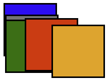
<div class="blue">
 <div class="gray"></div>
 <div class="green"></div>
</div>
<div class="red">
 <div class="orange"></div>
</div>
div {
 height: 100px;
 width: 100px;
 border: solid;
 position: absolute;
}

.blue   { top: 10px;             background-color: blue;   }
.gray   { top: 20px;             background-color: gray;   }
.green  { top: 30px;             background-color: green;  }
.red    { top: 40px; left: 50px; background-color: red;    }
.orange { top: 50px; left: 50px; background-color: orange; }
[1]: 6. Positioning schemes - w3.org
[2]: 前端新手村 Block 和 Inline 排版
[3]: 前端新手村 橫向排列 & 實現純手工 RWD
[4]: 6.5. Choosing a positioning scheme: position property - w3.org
[5]: 來聊聊一些個人切版的經驗與個人切版技巧吧! - LiveCoding.tw
[6]: 8. Sizing and positioning details - w3.org


 iThome鐵人賽
 看影片追技術