
今天我們來講Angular CDK中兩個跟版面配置有關的功能,分別是Bidirectionality、Layout。
Bidirectionality主要是用來調整LTR(Left To Right)跟RTL(Right To Left)配置及偵測的工具。
而Layout則是用來偵測瀏覽器可用的寬度與高度,來判斷目前網站使用在什麼樣的平台上,如果不使用任何其他的RWD工具,Layout可是Angular CDK中實現RWD不可或缺的幫手哩!
要使用Bidirectionality(之後簡稱為bidi),需要加入BidiModule:
import { BidiModule } from '@angular/cdk/bidi';

@NgModule({
  exports: [
    BidiModule
  ]
})
export class SharedMaterialModule {}
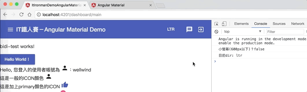
Bidi模組提供了一個 dir 的directive,方便我們改變排列方式,也就是LTR和RTL的狀態,舉個例子,我們在目前畫面的toolbar加上兩個按鈕,來切換LTR和RTL的狀態:
<button mat-button *ngIf="bidiMode === 'ltr'" (click)="bidiMode = 'rtl'">LTR</button>
<button mat-button *ngIf="bidiMode === 'rtl'" (click)="bidiMode = 'ltr'">RTL</button>
畫面如下:
當然,這時候按下去還沒有任何反應,只是切換一個變數的資料而已,接著我們在需要改變排列方式,例如
<mat-sidenav-content  [dir]="bidiMode">
  ...
</mat-sidenav-content>
這時候<mat-sidenav-content>裡面的內容就可以依照我們想要的去做配置啦!
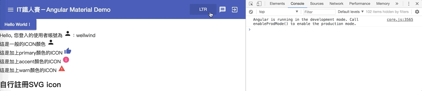
使用dir這個directive之後,會為我們的元件擴充一個dirChange事件,我們可以透過這個事件得知目前bidi狀態的改變
<mat-sidenav-content [dir]="bidiMode" (dirChange)="logDirChange($event)">
結果如下:
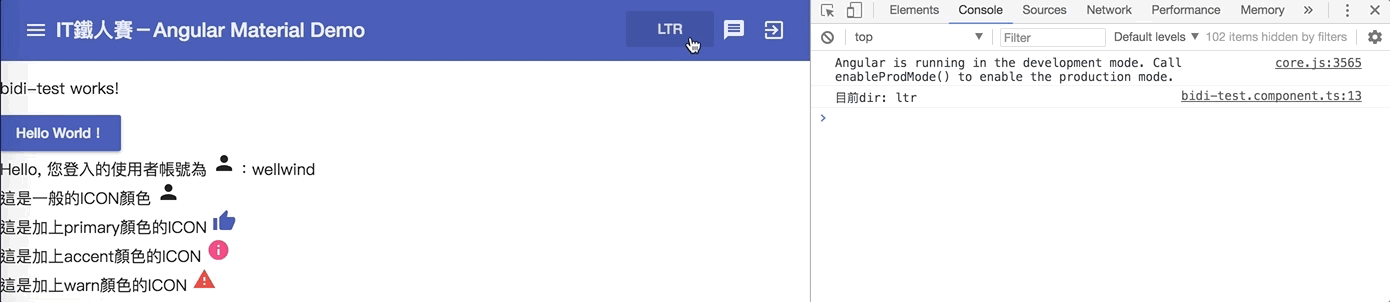
Directionality是bidi提供的一個service,它的功能非常簡單,當某個component注入這個service後,我們就能夠過它來知道目前component的排列是LTR還是RTL,當排列方現變更時,也能夠過change事件得知;我們先加入一個BidiTestComponent來試試看:
<mat-sidenav-content [dir]="bidiMode" (dirChange)="logDirChange($event)">
  <app-bidi-test></app-bidi-test>
  ...
</mat-sidenav-content>
接著在BidiTestComponent中注入Directionality,並偵測變化
@Component({ })
export class BidiTestComponent implements OnInit {
  constructor(private directionality: Directionality) {}

  ngOnInit() {
    console.log(`目前dir: ${this.directionality.value}`);
    this.directionality.change.subscribe((dir: Direction) => {
      console.log(`component的dir被改變了: ${dir}`);
    });
  }
}
結果如下:
Layout可以幫助我們偵測瀏覽器大小的變化,進而讓我們能依照不同的螢幕大小給予不同的呈現方式,我們須先加入LayoutModule
import { LayoutModule } from '@angular/cdk/layout';

@NgModule({
  exports: [
    LayoutModule
  ]
})
export class SharedMaterialModule {}
BreakpointObserver是一個類似media query的螢幕大小偵測器。有兩個主要的方法。
我們能使用isMatched()並傳入與media query一樣的語法,來判斷目前的螢幕是否與media query符合:
export class DashboardComponent implements OnInit {
  constructor(private breakpointObserver: BreakpointObserver) {}
  ngOnInit() {
    const isSmallScreen = breakpointObserver.isMatched('(max-width: 599px)');
  }
}
結果如下:
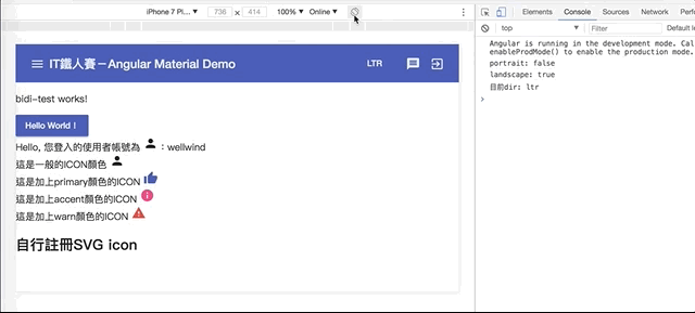
當我們螢幕比較大時,isSmallScreen會是false,而當把螢幕拉小重新整理後,就會看到isSmallScreen變成true啦!
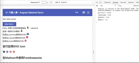
上面使用isMatch()雖然方便,但有時候我們的螢幕大小是動態的,這時候我們就可以使用observe()來判斷,我們可以加入多組的media query,當其中一個判斷結果改變,就會得到目前狀態:
this.breakpointObserver.observe('(orientation: portrait)').subscribe(result => {
  console.log(`{portrait: ${result.matches}`);
});

this.breakpointObserver.observe('(orientation: landscape)').subscribe(result => {
  console.log(`{landscape: ${result.matches}`);
});
結果如下:
Material Design已經有訂出一些基本的breakpoints,而Angular Material也有把這些breakpoints也都考量進來了,包含了以下幾個breakpoints:
我們可以直接用這些已經設定好的breakpoints,節省我們寫media query的時間,如下:
this.breakpointObserver.observe([Breakpoints.HandsetLandscape, Breakpoints.HandsetPortrait])
  .subscribe(result => {
    console.log(`Handset: ${result.matches}`);
  });
結果如下:
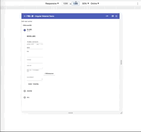
透過這種方式,我們就能夠針對不同大小的裝置,來決定畫面該如何呈現了,例如我們之前曾經介紹過的Datepicker元件,我們可以在行動裝置時,開啟Touch UI模式;非行動裝置的大小時就直接顯示,這樣在不同的畫面上,都能以比較適合的方式呈現:
export class SurveyComponent implements OnInit, AfterViewInit {
  isHandeset$: Observable<boolean>;

  constructor(private breakpointObserver: BreakpointObserver) {}

  ngOnInit() {
    this.isHandset$ = this.breakpointObserver.observe(Breakpoints.Handset).map(match => match.matches);
  }
}
畫面上則針對isHandset$來設定touchUi屬性:
<mat-form-field>
  <input type="text" name="birthday" matInput placeholder="生日"
         [matDatepicker]="demoDatepicker">
  <mat-datepicker [touchUi]="isHandset$ | async"></mat-datepicker>
</mat-form-field>
結果如下:
透過Layout相關的service,要打造RWD的程式也不再是件難事啦!
今天我們介紹了兩個跟畫面配置有關的功能。
Bidirectionality可以幫助我們設定LTR和RTL模式,也能對於模式的切換加以偵測;對於跨國網站來說,這可能會是影響客戶來源的一大議題!
而Layout則是用來判斷瀏覽器螢幕大小的變化,在不搭配其他library的情況下,善用Layout,可以讓我們的網站符合RWD的精神,在各種不同大小的裝置上都能給予最好的顯示方式,讓網站操作上更加方便!
本日的程式碼GitHub:https://github.com/wellwind/it-ironman-demo-angular-material/tree/day-27-cdk-bidirectionality-layout
分支:day-27-cdk-bidirectionality-layout
不好意思! 想請問一下
看完Layout的文件後,不只有BreakpointObserver還有MediaMatcher,但是有一定需要使用MediaMatcher的場景嗎 ? 感覺用BreakpointObserver就足夠了 
其實 BreakpointObserver 背後用的就是 MediaMatcher (可以翻一下程式碼),所以大多數的情境確實使用 BreakpointObserver 就可以囉!
原來如此,太感謝了! 


 看影片追技術