Hi! 大家好,我是Eric,這次要練習運用R語言中的ggplot2套件完成線圖(line)
緣起 :根據高速公路局2018年2月「春節連假國道重點壅塞路段時段旅行時間倍數表」,我們挑選出旅行時間倍數最高之路段 ─北上頭城坪林(6倍),並找出他的前2年歷史資料,想要知道2016-2018年之間「北上頭城坪林」路段的交通量會如何變化。
方法 :運用[R語言]的[ggplot2]套件。
使用資料 :交通部高速公路局交通資料庫ETC(Electronic Toll Collection )資料─各類車種通行量統計(TDCS_M03A),2016-2018年。
1. 載入所需套件
library(magrittr)
library(ggplot2)
library(ggthemes)
library(RColorBrewer)
2. 載入資料與資料前置處理
setwd("C:/Users/User/Desktop/Eric/data/2016-2018first day")  #設定路徑
FD1618<-do.call(rbind,lapply(list.files(path="C:/Users/User/Desktop/Eric/data/2016-2018first day",pattern="*.csv"),read.table, header=FALSE, sep=","))   #將設定的檔案路徑資料夾中,所有檔名以.csv結尾的檔案載入

names(FD1618)<-c("date time", "o", "NS", "VehicleType", "flow")   #命名欄位名稱
FD1618_TP<-subset(FD1618, o=="05F0287N")  #篩選目標路段
FD1618_TP_31<-subset(FD1618_TP, VehicleType==31)   #篩選目標車種
date<-as.Date(FD1618_TP_31$`date time`)  #轉換成日期格式
FD1618_TP_31<-cbind(FD1618_TP_31,date)   #新增日期欄位
3. 產生x軸時間區間(由於原資料每5分鐘時間間隔區分太細,不利於視覺化呈現,以每30分鐘間隔取代)
示意如下:
| 原5分鐘時間間隔 | 30分鐘時間間隔 |
|---|---|
| 08:00 | 09:00 |
| 08:05 | 09:00 |
| 08:10 | 09:00 |
n1<-seq(100,2400,by=100)   #產生時間區間基礎數字
n2<-seq(0030,2330,by=100)   #產生時間區間基礎數字
t<-c()      #產生空向量,用以儲存時間區間
for (i in 1:48) {
  if(i%%2==0){
    t[i]=n1[i/2]
  }else{
    t[i]=n2[ceiling(i/2)]
  }
}                   #由於24小時每30分鐘間隔將產生48個數字
t2<-c(0000,rep(t[-48],each=6),rep(t[48],each=5))   #原資料為00:00-23:55,最後30分鐘僅有5項(23:35、23:40、23:45、23:50、23:55),故依此規則產生符合的對照時間
time<-rep(t2,3)   #由於分析3年,故每1年各產生1個對照時間

FD1618_1_TP_31<-cbind(FD1618_TP_31,time)  #新增對照時間到原資料上
4. 依照日期與時間群組加總交通量
FD1618_2_TP_31<-aggregate(flow~date+time,FD1618_1_TP_31,mean)
5. 資料視覺化
FD1618_2_TP_31$date<-as.character(FD1618_2_TP_31$date)     #將日期資料轉為字串型態

ggplot(FD1618_2_TP_31,mapping = aes(x=time, y=flow, group=date, colour=date))+
geom_line(linetype = "solid",size=1.5)+
labs(title="Traffic flow of Toucheng to Pinglin  in first day of\n the Chinese Lunar New Year(2016-2018)", x="time", y="flow")+
theme_stata()+
theme(axis.title.x = element_text(size = 15, face = "bold", vjust = 0.5, hjust = 0.5))+
theme(axis.title.y = element_text(size = 15, face = "bold", vjust = 0.5, hjust = 0.5, angle = 360))+
theme(axis.text.y = element_text(angle = 360))+
theme(plot.title = element_text(size=15,face = "bold"))+
scale_color_manual(values =c("#f9c00c","#00b9f1","#7200da"))

#ggplot(mapping=aes())產生空白底圖,mapping指定美學對應,將time對應到x軸、將flow對應到y軸...等,    colour=date依照日期區分顏色;
 geom_line(linetype,size)於底圖上產生線圖,並設定線型與大小;
 labs()設定標題、x軸、y軸名稱;
 theme_stata()設定主題樣式;
 theme(axis,title.x)設定x軸名稱樣式;
 theme(axis,text.x)設定x軸資料文字樣式;
 theme(plot.title)設定標題樣式;
 scale_color_manual()設定線條顏色
6. 大功告成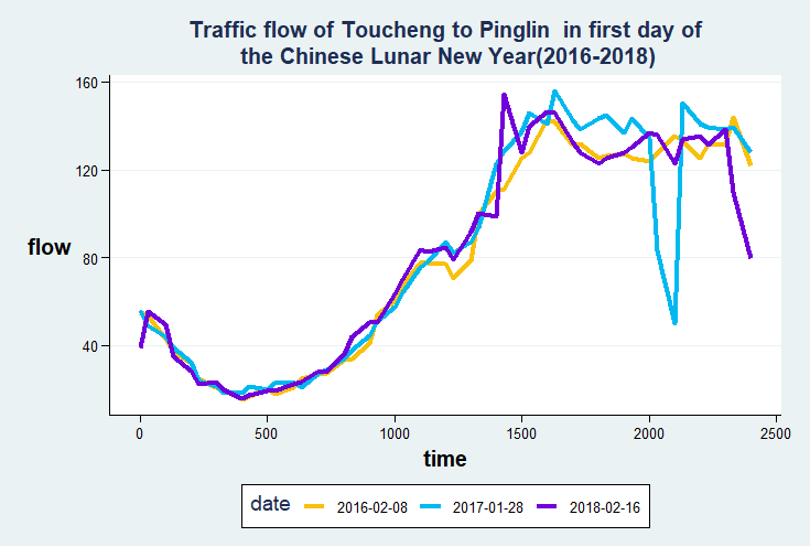
 Eric HSIEH

 iThome鐵人賽