Hi! 大家好,我是Eric,這次要練習運用R語言中的ggplot2套件完成箱型圖(box)!
緣起:臺灣每天有小客車、小貨車、大客車等不同車種的車輛在高速公路上行駛,那他們的行駛速率彼此會是相同嗎?還是差異不大呢?我們這次從高速公路局的108年2月易塞車路段彙整表中,挑選「東湖-內湖」路段進行分析。
方法:運用[R語言]的[ggplot2]套件。
使用資料:交通部高速公路局交通資料庫ETC(Electronic Toll Collection )資料─站間各車種平均行駛車速(TDCS_M05A),108年2月11-15日。
1. 載入所需套件。
 library(dplyr)
 library(magrittr)
 library(ggplot2)
2. 載入資料與前置處理
setwd("C:/Users/User/Desktop/Eric/data/20190211-0215")     #設定檔案路徑

ETCdata_meanspeed<-do.call(rbind,lapply(list.files(path="C:/Users/User/Desktop/Eric/data/20190211-0215",pattern="*.csv"),read.table, header=FALSE, sep=","))     #將設定的檔案路徑資料夾中,所有檔名以.csv結尾的檔案載入

names(ETCdata_meanspeed)<-c("timeinterval","o","d","vehicletype","meanspeed","flow")  #命名欄位名稱

ETCdata_meanspeed$vehicletype<-as.character(ETCdata_meanspeed$vehicletype)   #將車種轉為字串型態(由於我們要分析車種的車速,所以需要將車種轉為類別資料)
3. 將車種代碼替換成中文字。
for (i in 1:length(ETCdata_meanspeed$vehicletype)) {
    if(ETCdata_meanspeed[i,4]==31){
      ETCdata_meanspeed[i,4]<-"小客車"
    }else if(ETCdata_meanspeed[i,4]==32){
      ETCdata_meanspeed[i,4]<-"小貨車"
    }else if(ETCdata_meanspeed[i,4]==41){
      ETCdata_meanspeed[i,4]<-"大客車"
    }else if(ETCdata_meanspeed[i,4]==42){
      ETCdata_meanspeed[i,4]<-"大貨車"
    }else{
      ETCdata_meanspeed[i,4]<-"聯結車"
    }
  }                      #依序判斷每筆資料的車種代碼,並轉為相應的中文字
4. box plot
ggplot(ETCdata_meanspeed,aes(x=vehicletype,y=meanspeed,fill=vehicletype))+
geom_boxplot(width=.5)+
labs(title="Box plot of meanspeed")+
theme(plot.title=element_text(hjust = 0.5,face="bold",size=15))

#ggplot(fill=vehicletype)產生空白底圖,fill為依照車種填滿顏色;
 geom_boxplot(width=.5)於底圖上產生箱型圖,並設定每個箱子的寬度;
 labs(title)加上標題名稱;
 theme(plot.title=element_text(hjust = 0.5,face="bold",size=15)設定標題置中、粗體及大小
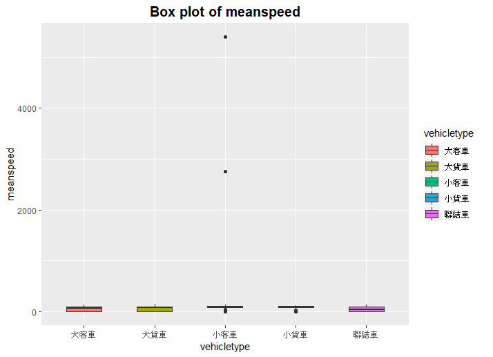
我們發現產生的箱型圖中,由於小客車具有2個明顯的離群值(outliers),所以導致圖示資訊無法正常顯示,所以我們需要將2個離群值替除掉。
5. 再一次box plot
ETCdata_meanspeed2<-ETCdata_meanspeed %>% filter(meanspeed < 150)  #檢視資料後發現除離群值外,各車種車速最高為144km/hr,所以開選出車速<150的資料

ggplot(ETCdata_meanspeed2,aes(x=vehicletype,y=meanspeed,colour=vehicletype))+
geom_boxplot(width=.5,outlier.shape = 1)+
labs(title="Box plot of meanspeed")+
theme(plot.title=element_text(hjust = 0.5,face="bold",size=15))

#ggplot(colour=vehicletype)產生空白底圖,colour為用顏色區分車種,可與fill比較兩者不同;
 geom_boxplot(outlier.shape)設定離群值的形狀
6. 大功告成
可以發現箱型圖變得好看多了!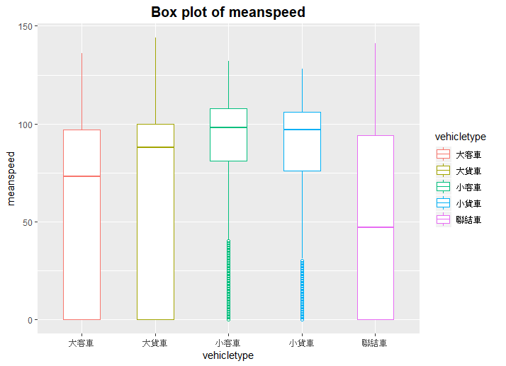
 Eric HSIEH


 iThome鐵人賽