Hi! 大家好,我是Eric,這次要練習R語言中的shiny套件!
shiny是協助我們運用R語言直接作出一個互動式網頁,完成不需要了解網頁語言
緣起:農曆春節為臺灣重要習俗,每逢春節時總是造成國道回堵數公里,難免消磨大家出遊的好心情,而據高速公路局2018年2月「春節連假國道重點壅塞路段時段旅行時間倍數表」,我們挑選出旅行時間倍數最高之路段─北上頭城坪林(6倍),並著重在農曆初一及初二期間,運用R語言重要的互動式圖表套件shiny,產生2016-2019年間的互動式圖表。
方法:運用[R語言]的[shiny]套件。
使用資料:交通部高速公路局交通資料庫ETC(Electronic Toll Collection )資料─各類車種通行量統計(TDCS_M03A),2016-2019年。
1. 載入套件。
library(ggplot2)
library(ggthemes)
library(shiny)
library(dplyr)
2. 載入資料與前置處理。
setwd("C:/Users/User/Desktop/Eric/data/2016-2019")    #設定檔案路徑

Y1619<-do.call(rbind,lapply(list.files(path="C:/Users/User/Desktop/Eric/data/2016-2019",pattern="*.csv"),read.table, header=FALSE, sep=","))    #將設定的檔案路徑資料夾中,所有檔名以.csv結尾的檔案載入

names(Y1619)<-c("date time", "o", "NS", "VehicleType", "flow")  #命名欄位名稱
Y1619_TP_31<-Y1619 %>% filter(o=="05F0287N",VehicleType==31)    #篩選出目標路段與目標車種
date<-as.Date(Y1619_TP_31$`date time`)    #自日期時間資料中取出日期部分
Y1619_TP_31<-cbind(Y1619_TP_31,date)      #將取出的日期部分加入到原資料,變成新欄位
3. 產生每30分鐘時間間隔的時間數字,以及依照日期與時間群組取得平均交通量,最後分別篩選出2016-2019年初一及初二資料,並另存成變數。
n1<-seq(100,2400,by=100)   #產生100-2400,以100為間隔
n2<-seq(0030,2330,by=100)  #產生0030-2330,以100為間隔

t<-c()   #產生空向量,用以儲存稍後的時間區間

for (i in 1:48) {
  if(i%%2==0){
    t[i]=n1[i/2]
  }else{
    t[i]=n2[ceiling(i/2)]
  }
}       #由於24小時每30分鐘間隔將產生48個數字,運用for迴圈將n1、n2分別排列至t向量中

t2<-c(0000,rep(t[-48],each=6),rep(t[48],each=5))     #原資料為00:00-23:55,最後30分鐘僅有5項(23:35、23:40、23:45、23:50、23:55),故依此規則產生符合的對照時間

time<-rep(t2,8)  #由於初一及初二各有4年,總共有8個24小時
Y1619_1_TP_31<-cbind(Y1619_TP_31,time)    #將產生的時間數字加入原資料中,形成一個新欄位

ETCdata<-aggregate(flow~date+time,Y1619_1_TP_31,mean)     #依照日期與時間群組,取得平均交通量
ETCdata$date<-as.character(ETCdata$date)          #將日期轉成字串型態

a1<-filter(ETCdata,date=="2016-02-08")
b1<-filter(ETCdata,date=="2017-01-28")
c1<-filter(ETCdata,date=="2018-02-16")
d1<-filter(ETCdata,date=="2019-02-05")
a2<-filter(ETCdata,date=="2016-02-09")
b2<-filter(ETCdata,date=="2017-01-29")
c2<-filter(ETCdata,date=="2018-02-17")
d2<-filter(ETCdata,date=="2019-02-06")
4. shiny
ui是shiny中定義使用者看到的網頁樣子,fluidPage是表示物件呈現浮動的佈局,較不會因為每個人電腦螢幕的尺寸不同,導致物件錯位:
ui <- fluidPage(

  # shiny的大標題
  titlePanel("ETC data of the first and second day of the Chinese New Year"),

  # 將頁面區分為主區塊及側區塊,分別由mainPanel()與sidebarPanel()函數來控制
  sidebarLayout(

    # 控制輸入的部分
    sidebarPanel(

      # 產生可供勾選的方塊,方塊編號是date;標籤是Date:;可勾選的選項是ETCdata的date欄位的所有資料(不重複計)
      selectInput(inputId = "date",
                  label = "Date:",
                  choices = unique(ETCdata$date))

    ),

    # 控制輸出的部分
    mainPanel(

      # 產生tab的頁面,共有3個子頁面,分別為Plot、Summary及Table
      tabsetPanel(type = "tabs",
                  tabPanel("Plot",plotOutput("ETCPlot")),
                  tabPanel("Summary",verbatimTextOutput("summary")),
                  tabPanel("Table",tableOutput("table"))
      )

    )
  )
)
server是背後的程式碼,負責依照輸入執行程式碼,並將輸出回傳:
註:這邊程式碼我寫的比較冗長,應該會有更好的寫法,還是希望能夠有所幫助,這邊我也把程式碼的格式用的比較易讀一點,所以看起來會更冗長
server <- function(input, output) {

  #ETCPlot為前面ui中的ETCPlot,這邊定義他的功能,用if-eles if判斷日期並使用ggplot2製作線圖(ggplot2至作線圖的解釋請參考我的網站另一篇文章,連結在本文最下面)
  output$ETCPlot <- renderPlot({

     if(input$date=="2016-02-08"){
      ggplot(a1,aes(x=time,y=flow,group = 1))+
      geom_line(linetype = "solid",size=1.5,color="#00CED1")+
      labs(title = paste("Traffic flow in",input$date),x="time",y="flow")+
      theme_stata()+
      theme(axis.title.x = element_text(size = 15, face = "bold", vjust = 0.5, hjust = 0.5))+
      theme(axis.title.y = element_text(size = 15, face = "bold", vjust = 0.5, hjust = 0.5, angle = 360))+
      theme(axis.text.y = element_text(angle = 360))+
      theme(plot.title = element_text(size=15,face = "bold"))
    }else if(input$date=="2017-01-28"){
      ggplot(b1,aes(x=time,y=flow,group = 1))+
      geom_line(linetype = "solid",size=1.5,color="#2E8B57")+
      labs(title = paste("Traffic flow in",input$date),x="time",y="flow")+
      theme_stata()+
      theme(axis.title.x = element_text(size = 15, face = "bold", vjust = 0.5, hjust = 0.5))+
      theme(axis.title.y = element_text(size = 15, face = "bold", vjust = 0.5, hjust = 0.5, angle = 360))+
      theme(axis.text.y = element_text(angle = 360))+
      theme(plot.title = element_text(size=15,face = "bold"))
    }else if(input$date=="2018-02-16"){
      ggplot(c1,aes(x=time,y=flow,group = 1))+
      geom_line(linetype = "solid",size=1.5,color="#FFB90F")+
      labs(title = paste("Traffic flow in",input$date),x="time",y="flow")+
      theme_stata()+
      theme(axis.title.x = element_text(size = 15, face = "bold", vjust = 0.5, hjust = 0.5))+
      theme(axis.title.y = element_text(size = 15, face = "bold", vjust = 0.5, hjust = 0.5, angle = 360))+
      theme(axis.text.y = element_text(angle = 360))+ theme(plot.title = element_text(size=15,face = "bold"))
    }else if(input$date=="2019-02-05"){
      ggplot(d1,aes(x=time,y=flow,group = 1))+
      geom_line(linetype = "solid",size=1.5,color="#EE6363")+
      labs(title = paste("Traffic flow in",input$date),x="time",y="flow")+
      theme_stata()+
      theme(axis.title.x = element_text(size = 15, face = "bold", vjust = 0.5, hjust = 0.5))+
      theme(axis.title.y = element_text(size = 15, face = "bold", vjust = 0.5, hjust = 0.5, angle = 360))+
      theme(axis.text.y = element_text(angle = 360))+ theme(plot.title = element_text(size=15,face = "bold"))
    }else if(input$date=="2016-02-09"){
      ggplot(a2,aes(x=time,y=flow,group = 1))+
      geom_line(linetype = "solid",size=1.5,color="#FF1493")+
      labs(title = paste("Traffic flow in",input$date),x="time",y="flow")+
      theme_stata()+theme(axis.title.x = element_text(size = 15, face = "bold", vjust = 0.5, hjust = 0.5))+
      theme(axis.title.y = element_text(size = 15, face = "bold", vjust = 0.5, hjust = 0.5, angle = 360))+
      theme(axis.text.y = element_text(angle = 360))+
      theme(plot.title = element_text(size=15,face = "bold"))
    }else if(input$date=="2017-01-29"){
      ggplot(b2,aes(x=time,y=flow,group = 1))+
      geom_line(linetype = "solid",size=1.5,color="#008B8B")+
      labs(title = paste("Traffic flow in",input$date),x="time",y="flow")+
      theme_stata()+
      theme(axis.title.x = element_text(size = 15, face = "bold", vjust = 0.5, hjust = 0.5))+
      theme(axis.title.y = element_text(size = 15, face = "bold", vjust = 0.5, hjust = 0.5, angle = 360))+
      theme(axis.text.y = element_text(angle = 360))+
      theme(plot.title = element_text(size=15,face = "bold"))
    }else if(input$date=="2018-02-17"){
      ggplot(c2,aes(x=time,y=flow,group = 1))+
      geom_line(linetype = "solid",size=1.5,color="#90EE90")+
      labs(title = paste("Traffic flow in",input$date),x="time",y="flow")+
      theme_stata()+
      theme(axis.title.x = element_text(size = 15, face = "bold", vjust = 0.5, hjust = 0.5))+
      theme(axis.title.y = element_text(size = 15, face = "bold", vjust = 0.5, hjust = 0.5, angle = 360))+
     theme(axis.text.y = element_text(angle = 360))+ theme(plot.title = element_text(size=15,face = "bold"))
    }else{
      ggplot(d2,aes(x=time,y=flow,group = 1))+
      geom_line(linetype = "solid",size=1.5,color="#008B45")+
      labs(title = paste("Traffic flow in",input$date),x="time",y="flow")+
      theme_stata()+
      theme(axis.title.x = element_text(size = 15, face = "bold", vjust = 0.5, hjust = 0.5))+
      theme(axis.title.y = element_text(size = 15, face = "bold", vjust = 0.5, hjust = 0.5, angle = 360))+
      theme(axis.text.y = element_text(angle = 360))+ theme(plot.title = element_text(size=15,face = "bold"))
    }
  })

  #summary為前面ui中的summary,這邊定義他的功能,用if-eles if判斷日期並使用summary()總結當日交通量
  output$summary<-renderPrint({
    if(input$date=="2016-02-08"){
      summary(a1$flow)
    }else if(input$date=="2017-01-28"){
      summary(b1$flow)
    }else if(input$date=="2018-02-16"){
      summary(c1$flow)
    }else if(input$date=="2019-02-05"){
      summary(d1$flow)
    }else if(input$date=="2016-02-09"){
      summary(a2$flow)
    }else if(input$date=="2017-01-29"){
      summary(b2$flow)
    }else if(input$date=="2018-02-17"){
      summary(c2$flow)
    }else if(input$date=="2019-02-06"){
      summary(d2$flow)
    }
  })

  #table為前面ui中的table,這邊定義他的功能,用if-eles if判斷日期並輸出交通量資料
  output$table <- renderTable({
    if(input$date=="2016-02-08"){
      a1[-1]
    }else if(input$date=="2017-01-28"){
      b1[-1]
    }else if(input$date=="2018-02-16"){
      c1[-1]
    }else if(input$date=="2019-02-05"){
      d1[-1]
    }else if(input$date=="2016-02-09"){
      a2[-1]
    }else if(input$date=="2017-01-29"){
      b2[-1]
    }else if(input$date=="2018-02-17"){
      c2[-1]
    }else if(input$date=="2019-02-06"){
      d2[-1]
    }
  })
}
啟動shiny應用程式
shinyApp(ui, server)
5. 大功告成
首先這是Plot作圖的部分,可由左邊選擇想看的日期,右邊就會自動更新為當日的線圖。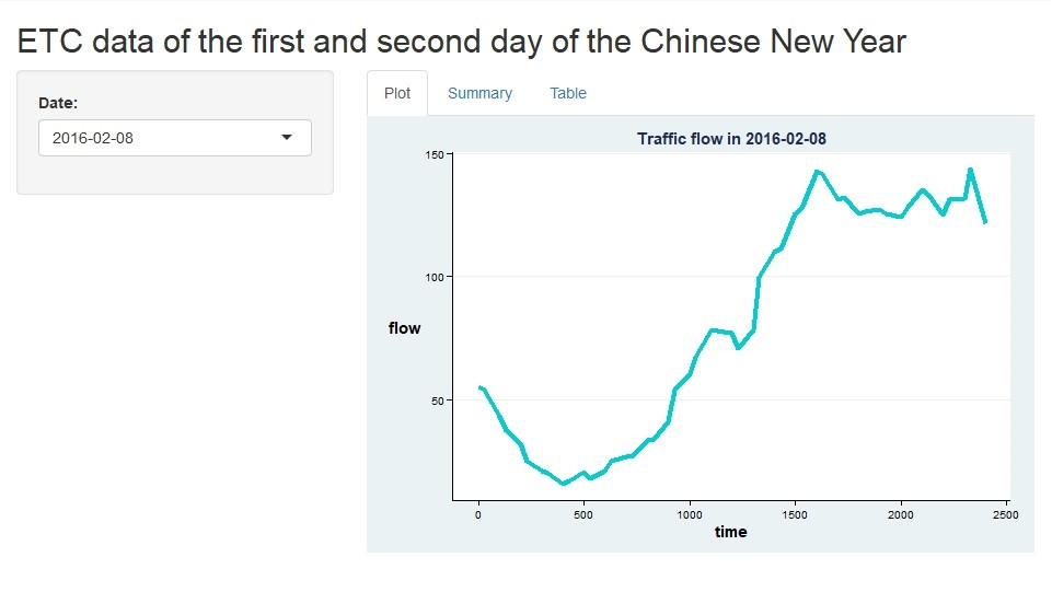
再來是Summary的部分,可由右邊圖表上方3個選項(Plot、Summary及Table)選擇資料呈現方式。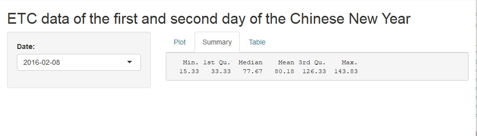
最後是原始資料的呈現,將呈現每日每隔30分鐘的交通量。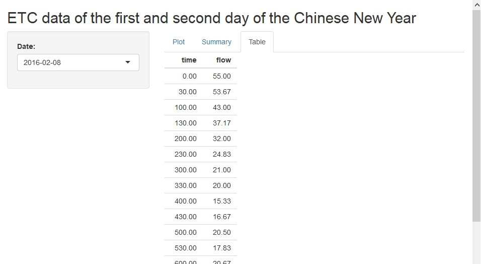
由於這邊只能用靜態的方式呈現,大家可以在自己R語言中互動看看!
6. ggplot2參考資料
[R語言]資料視覺化G01─運用ggplot2完成線圖(line chart)
https://ithelp.ithome.com.tw/articles/10211088
 Eric HSIEH


 iThome鐵人賽