Hi! 大家好,我是Eric,上篇教大家如何用Python畫散布圖,這次來教大家畫圓餅圖。

1. 載入套件。
import pandas as pd               # 資料處理套件
import matplotlib.pyplot as plt   # 資料視覺化套件
2. 載入資料。
accident = pd.read_csv("number of car accident.csv")
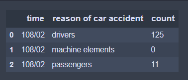
accident.head(3) # 顯示前3筆資料
3. 開始畫圖。
plt.figure(figsize=(6,9))    # 顯示圖框架大小

labels = accident["reason of car accident"]      # 製作圓餅圖的類別標籤
separeted = (0, 0, 0.3, 0, 0.3)                  # 依據類別數量,分別設定要突出的區塊
size = accident["count"]                         # 製作圓餅圖的數值來源

plt.pie(size,                           # 數值
        labels = labels,                # 標籤
        autopct = "%1.1f%%",            # 將數值百分比並留到小數點一位
        explode = separeted,            # 設定分隔的區塊位置
        pctdistance = 0.6,              # 數字距圓心的距離
        textprops = {"fontsize" : 12},  # 文字大小
        shadow=True)                    # 設定陰影


plt.axis('equal')                                          # 使圓餅圖比例相等
plt.title("Pie chart of car accident", {"fontsize" : 18})  # 設定標題及其文字大小
plt.legend(loc = "best")                                   # 設定圖例及其位置為最佳

plt.savefig("Pie chart of car accident.jpg",   # 儲存圖檔
            bbox_inches='tight',               # 去除座標軸占用的空間
            pad_inches=0.0)                    # 去除所有白邊
plt.close()      # 關閉圖表
4. 大功告成。
可以看出91.2%肇事原因皆是來自駕駛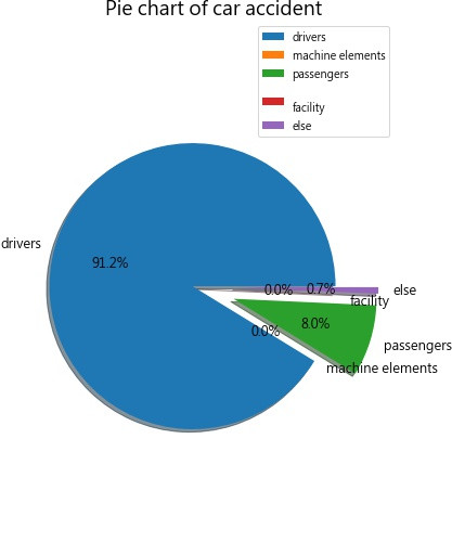
P.S. 本篇程式碼參考plusone團隊-[Day20]Matplotlib資料視覺化進階!,並利用網路實際的開放資料執行
 Eric HSIEH

 iThome鐵人賽