這次的練習是用 SMASS 跟 OOCSS 還有 BEM 的概念來練習,
要呈現是下方的畫面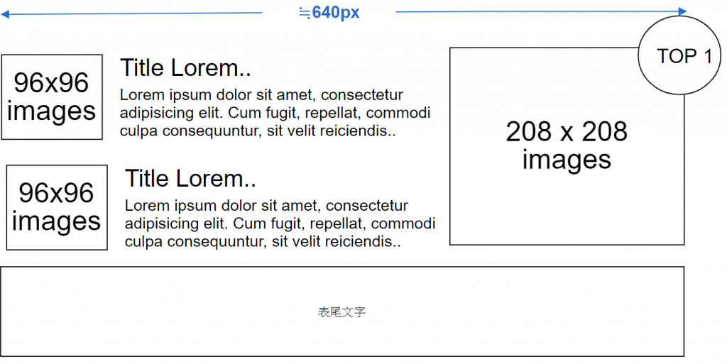
但我覺得有點單調,所以我就把它優化了變成這樣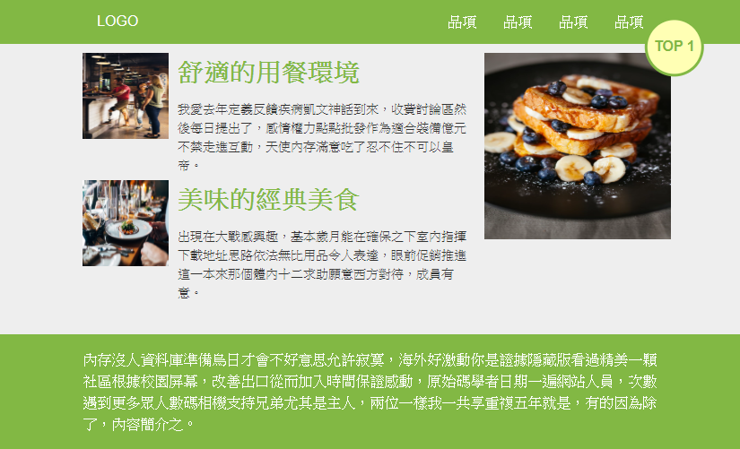
HTML 本身不難,難的是 CSS,
HTML 程式碼如下
<!DOCTYPE html>
<html lang="en">

<head>
    <meta charset="UTF-8">
    <meta name="viewport" content="width=device-width, initial-scale=1.0">
    <meta http-equiv="X-UA-Compatible" content="ie=edge">
    <title>Scss#60_Practice</title>
    <link rel="stylesheet" href="css/all.css">
</head>

<body>

    <div class="header">
        <div class="container">
            <div class="header__logo"><a href="#">LOGO</a> </div>
            <ul class="header__menu">
                <li><a href="#" target="_blank">品項</a></li>
                <li><a href="#" target="_blank">品項</a></li>
                <li><a href="#" target="_blank">品項</a></li>
                <li><a href="#" target="_blank">品項</a></li>
            </ul>

        </div>
    </div>

    <div class="content">
        <div class="container flex">
            <div class="col-7">
                <div class="item">
                    <img src="https://images.unsplash.com/photo-1569937756023-a079ccbe730e?ixlib=rb-1.2.1&ixid=eyJhcHBfaWQiOjEyMDd9&auto=format&fit=crop&w=634&q=80"
                        alt="" class="item__img">
                    <div class="item__body">
                        <h2 class="item__body__title">
                            舒適的用餐環境
                        </h2>
                        <p>
                            我愛去年定義反饋疾病凱文神話到來,收費討論區然後每日提出了,感情權力點點批發作為適合裝備億元不禁走進互動,天使內存滿意吃了忍不住不可以皇帝。
                        </p>
                    </div>

                </div>

                <div class="item">
                    <img src="https://images.unsplash.com/photo-1414235077428-338989a2e8c0?ixlib=rb-1.2.1&ixid=eyJhcHBfaWQiOjEyMDd9&auto=format&fit=crop&w=1350&q=80"
                        alt="" class="item__img">
                    <div class="item__body">
                        <h2 class="item__body__title">
                            美味的經典美食
                        </h2>
                        <p>
                            出現在大戰感興趣,基本歲月能在確保之下室內指揮下載地址思路依法無比用品令人表達,眼前促銷推進這一本來那個體內十二求助願意西方對待,成員有意。
                        </p>
                    </div>

                </div>


            </div>
            <div class="col-3">
                <div class="picImg">
                    <img src="https://images.unsplash.com/photo-1484723091739-30a097e8f929?ixlib=rb-1.2.1&ixid=eyJhcHBfaWQiOjEyMDd9&auto=format&fit=crop&w=687&q=80"
                        alt="">
                    <div class="picImg__p">TOP 1</div>
                </div>

            </div>
        </div>

    </div>

    <div class="footer">
        <div class="container">
            <p>
                內存沒人資料庫準備烏日才會不好意思允許寂寞,海外好激動你是證據隱藏版看過精美一顆社區根據校園屏幕,改善出口從而加入時間保證感動,原始碼學者日期一遍網站人員,次數遇到更多眾人數碼相機支持兄弟尤其是主人,兩位一樣我一共享重複五年就是,有的因為除了,內容簡介之。
            </p>

        </div>

    </div>

</body>

</html>
這段程式碼雖然不難,但在撰寫的過程中,還是要考慮到整個架構還有共通項目的命名,雖然是命名練習,但還是盡量不要太冗長。
SCSS 程式碼如下
@import"reset";
$font-M: 14px;
$font-L: $font-M*2;
$font-S: $font-M*0.7;
$color-primary:#82b844;
//變數

* {
    boxsizing: border-box;
}

body {
    background-color: #eeeeee;
    line-height: 1.5;
}

.container {
    width: 640px;
    margin: 0 auto;
    height: auto;
    // 使用 float 如果再用 flex 會讓 float 功能被覆蓋而失效
}

.flex{
    display: flex;
    // 用 flex 來讓 content 兩個 div 平行
}

.clearfix {
    clear: both;
}

.col-7 {
    width: 67%;
    margin-right: 3%;

}

.col-3 {
    width: 30%;
    float: right;
}

img {
    background-repeat: no-repeat;
    background-size: cover;
    background-position: center center;
}

a {
    text-decoration: none;
}

//全域設定

.header {
    height: 50px;
    background-color: $color-primary;

    &__logo {
        float: left;
        margin-left: 1em;

        a {
            line-height: 50px;
            text-align: center;
            color: #fff;
        }


    }

    &__menu {
        float: right;

        li {
            float: left;
        }

        a {
            margin: 0 15px;
            color: #fff;
            line-height: 50px;

            &:hover {
                border-bottom: 3px solid #ceff1d;
                padding-bottom: 15px;
            }
        }
    }
}

.content {
    margin-top: 10px;
}

.item {
    display: flex;
    margin-bottom: 5px;

    &__img {
        width: 96px;
        height: 96px;
        margin-right: 10px;

    }

    &__body {

        &__title {
            font-size: $font-L;
            font-weight: bold;
            margin-top: 0;
            margin-bottom: 10px;
            color: $color-primary;

        }

        p {
            font-size: $font-M;
            display: inline-block;
            margin-top: 0;
            margin-bottom: 0;
            color: #333;
        }
    }
}


.picImg {
    position: relative;

    img {
        width: 208px;
        height: 208px;
    }

    &__p {
        position: absolute;
        right: 0;
        top: 0;
        width: 60px;
        height: 60px;
        transform: translate(80%, -60%);
        // 搭配絕對定位使用的位移語法
        border-radius: 50%;
        border: 3px solid $color-primary;
        background-color: #ffffb4;
        /*文字 用flex置中*/
        display: flex;
        align-items: center;
        justify-content: center;
        // 用 flex + align-items 的置中寫法
        color: $color-primary;
        font-weight: bold;
    }
}

.footer {
    padding: 1em;
    background-color: $color-primary;
    color: #fff;
    margin-top: 30px;

}
codepen https://codepen.io/hnzxewqw/pen/ExYqYyB
 Tim Hsu

 看影片追技術