這次來要來寫上面的練習,訂房頁面會有的畫面。
先記錄左邊步驟,要寫下方畫面
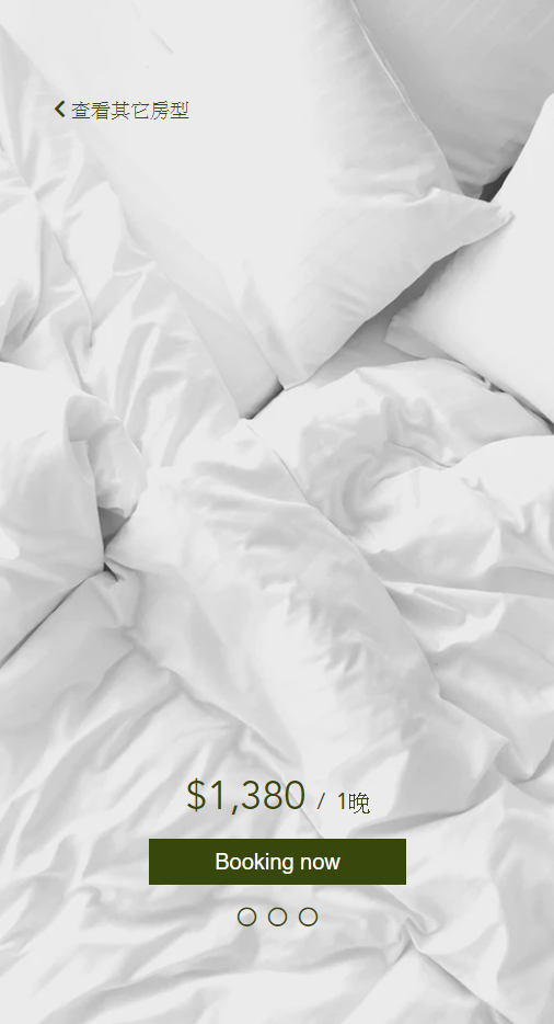
 <div class="room__price">
            <div class="room__price__info">
                <a href="hotel_index.html">
                    <p><i class="fas fa-chevron-left"></i>
                        <span>查看其它房型</span>
                    </p>
                </a>

            </div>

            <div class="room__price__btn">
                <p class="price"><strong>$1,380</strong>
                    <span>/</span>
                    <span>1晚</span>
                </p>
                <button class="btn">
                    <p>Booking now</p>
                </button>

                <div class="change__room__btn">
                    <p><i class="far fa-circle"></i></p>
                    <p><i class="far fa-circle"></i></p>
                    <p><i class="far fa-circle"></i></p>
                </div>
            </div>

        </div>
        <!-- room__price end -->
把之前頁面中的全域設定拿來使用。
@import "_reset";
@import "_boxsizing";
@import "_fontsize";
@import "_media";
@import "_menu-position";


body {
    font-family: Noto Sans CJK TC;

}

$primary-color:#38470B;

.container {
    max-width: 1280px;
    height: auto;
    margin: 0 auto;
    display: flex;

}

a {
    text-decoration: none;
}


//全域設定
vh,RWD 善用百分比會變得比較好思考,也不用一直算 px 值,寫程式已經夠燒腦,還要算數學更燒腦了。background 的相關設定,想把圖片滿版並置中的方法值得記一下,非常好用。flex 的屬性使用,要在同一個 class 裡面才會有效果。.room__price {
width: 40%;
background-image: url(https://images.unsplash.com/photo-1526880792616-4217886b9dc2?ixlib=rb-1.2.1&ixid=eyJhcHBfaWQiOjEyMDd9&auto=format&fit=crop&w=675&q=80);
background-size: cover;
background-position: center center;
height: 100vh;
.room__price__info {
padding-top: 90px;
padding-left: 10%;
a {
color: $primary-color;
}
}
.room__price__btn {
padding-top: 600px;
text-align: center;
color: $primary-color;
.price {
font-size: 36px;
}
span {
font-size: 20px;
}
.btn {
padding: 8.5px 59px;
margin-top: 20px;
background-color: $primary-color;
border: 1px solid $primary-color;
&:hover {
background: darken($primary-color, 10%) // 顏色變深的語法
}
p {
color: #fff;
font-size: 20px;
}
}
.change__room__btn {
display: flex;
text-align: center;
margin-top: 20px;
justify-content: center;
padding-bottom: 20px;
.far {
color: $primary-color;
padding: 0px 5px;
}
}
}
}
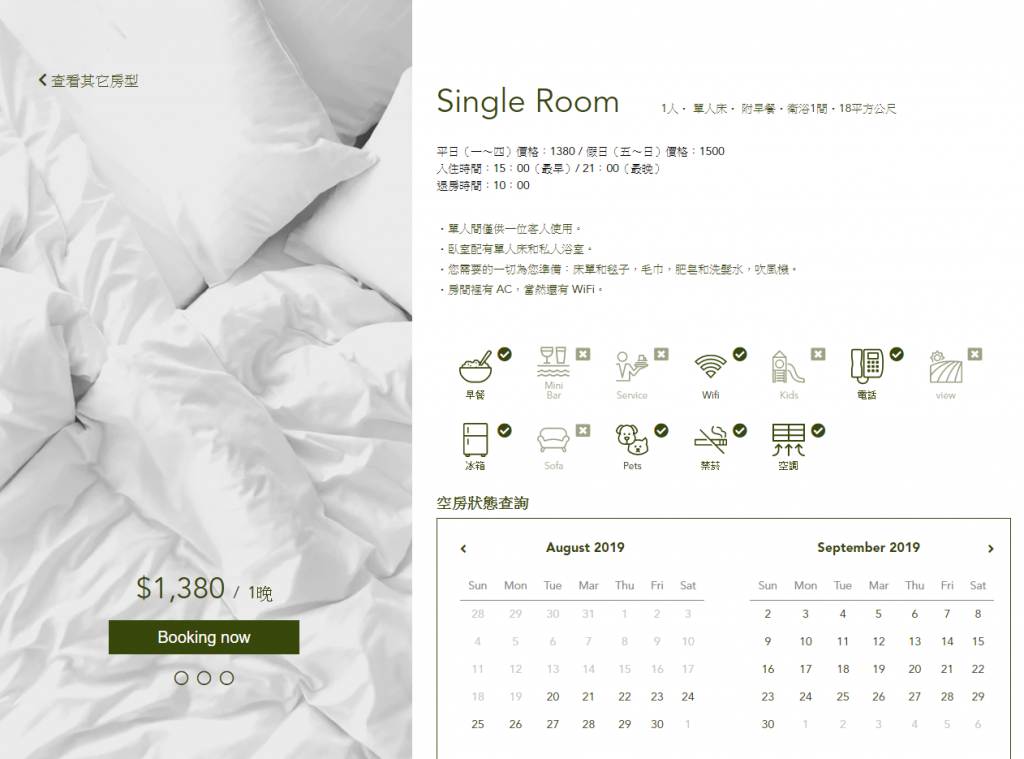
右邊房間資訊內容的寫法跟畫面如下:
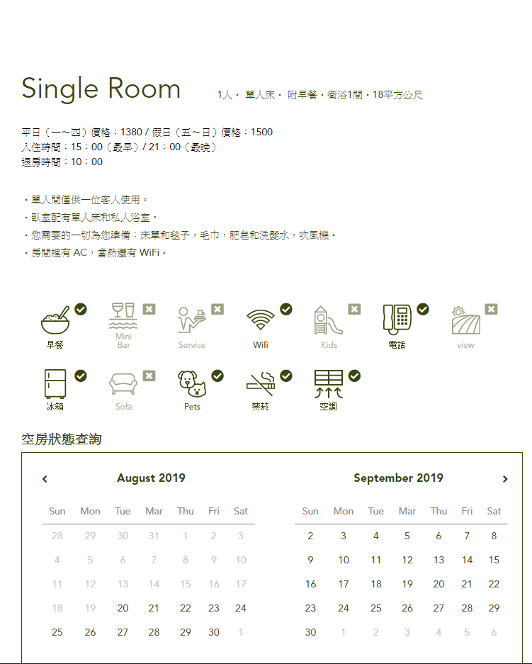
這裡的 HTML 架構應該沒什麼大問題。
但要注意一下因為都是用 class 設定,外面是用 div 包住,所以預設的 display:block 是區塊元素。
<div class="room__content">
            <div class="room__name">
                <h2>Single Room</h2>
                <p>1人・ 單人床・ 附早餐・衛浴1間・18平方公尺</p>

            </div>
            <!-- room__name end -->

            <div class="room__priceInfo">
                <p>平日(一~四)價格:1380 / 假日(五〜日)價格:1500 <br>
                    入住時間:15:00(最早)/ 21:00(最晚)<br> 退房時間:10:00</p>
                <ul class="room__content__info">
                    <li>
                        <p>・單人間僅供一位客人使用。 </p>
                    </li>
                    <li>
                        <p>・臥室配有單人床和私人浴室。</p>
                    </li>
                    <li>
                        <p>・您需要的一切為您準備:床單和毯子,毛巾,肥皂和洗髮水,吹風機。</p>
                    </li>
                    <li>
                        <p>・房間裡有 AC,當然還有 WiFi。</p>
                    </li>
                </ul>
            </div>
            <!-- room__priceInfo -->
因為原屬性是區塊元素,所以在 .room__name 改成 display: inline-flex 屬性,讓其可以有 flex 的效果,就不用使用 float 了,
.room__content {
    width: 60%;
    padding-left: 30px;
    padding-right: 30px;

    .room__name {
        display: inline-flex;

        h2 {
            font-size: 40px;
            color: $primary-color;
            padding-top: 107px;
        }

        p {
            display: inline-block;
            font-size: 14px;
            color: $primary-color;
            padding: 128px 50px 0 50px;
        }

    }

    .room__priceInfo {
        font-size: 14px;
        line-height: 1.5;
        padding-left: 0;
        padding-top: 30px;

    }

    .room__content__info {
        padding-top: 30px;

        li {
            font-size: 14px;
            color: $primary-color;
            line-height: 1.8;
        }
    }
再來是我覺得這個頁面有挑戰的部分之一,icon 的寫法,使用 OOCSS 的寫法,也就是在一個 class 的裡面有一個主要跟次要的名稱,避免結構落落長。 HTML 基本上沒太大問題。
<div class="room__iconInfo">
                <div class="icon breakfast">
                    <img src="img/icon/surface1.svg" alt="">
                    <p>早餐</p>
                    <i class="fas fa-check-circle"></i>
                </div>

                <div class="icon poolside" >
                    <img src="img/icon/icons8-poolside_bar.svg" alt="">
                    <p>Mini Bar</p>
                    <i class="fas fa-window-close"></i>
                </div>

                <div class="icon surface">
                    <img src="img/icon/surface3.svg" alt="">
                    <p>Service</p>
                    <i class="fas fa-window-close"></i>
                </div>

                <div class="icon wifi">
                    <img src="img/icon/surface-wifi.svg" alt="">
                    <p>Wifi</p>
                    <i class="fas fa-check-circle"></i>
                </div>

                <div class="icon kids">
                    <img src="img/icon/kids.svg" alt="">
                    <p>Kids</p>
                    <i class="fas fa-window-close"></i>
                </div>

                <div class="icon telephone">
                    <img src="img/icon/telephone.svg" alt="">
                    <p>電話</p>
                    <i class="fas fa-check-circle"></i>
                </div>

                <div class="icon view">
                    <img src="img/icon/view.svg" alt="">
                    <p>view</p>
                    <i class="fas fa-window-close"></i>
                </div>

                <div class="icon icebox">
                    <img src="img/icon/icebox.svg" alt="">
                    <p>冰箱</p>
                    <i class="fas fa-check-circle"></i>
                </div>

                <div class="icon sofa">
                    <img src="img/icon/sofa.svg" alt="">
                    <p>Sofa</p>
                    <i class="fas fa-window-close"></i>
                </div>

                <div class="icon pets">
                    <img src="img/icon/pets.svg" alt="">
                    <p>Pets</p>
                    <i class="fas fa-check-circle"></i>
                </div>

                <div class="icon nosmoking">
                    <img src="img/icon/nosmoke.svg" alt="">
                    <p>禁菸</p>
                    <i class="fas fa-check-circle"></i>
                </div>

                <div class="icon aircondition">
                    <img src="img/icon/aircondition.svg" alt="">
                    <p>空調</p>
                    <i class="fas fa-check-circle"></i>
                </div>
            </div>
            <!-- room__iconInfo end -->
這裡有遇到幾個之前沒遇到的方法,紀錄一下
display:flex 讓其橫排排列,再使用 flex-direction: column,變垂直排列,再設定固定寬度,這樣就會自己對齊囉!img 顏色是固定的,無法改變深淺。感謝前輩提點,在要套濾鏡的 img 使用了 filter: opacity(0.5) ,就可以有效果囉! .room__iconInfo {
padding-top: 30px;
display: flex;
flex-wrap: wrap;
color: $primary-color;
.icon {
position: relative;
display: flex;
flex-direction: column;
margin: 4% 4% 0 4%;
width: 40px;
img{
flex:auto;
}
p {
font-size: 10px;
color: $primary-color;
text-align: center;
font-size: 10px;
padding-top: 5px;
}
.fas {
position: absolute;
top: 0px;
right: -25px;
color: $primary-color;
}
}
.poolside,
.surface,
.kids,
.view,
.sofa {
filter: opacity(0.5);
}
}
把 td 中有需要變成綠色的另外寫 class 統一管理。
 <div class="room__dateorder">
                <h3>空房狀態查詢</h3>
            </div>
            <div class="room__calendar">
                <div class="room__calendar__left">
                    <div class="room__calendar__month">
                        <a href="#" class="arrow_left"><i class="fas fa-angle-left"></i></a>
                        <p class="month">August 2019</p>
                    </div>
                    <table class="room__calendar__table">

                        <tr>
                            <th>Sun</th>
                            <th>Mon</th>
                            <th>Tue</th>
                            <th>Mar</th>
                            <th>Thu</th>
                            <th>Fri</th>
                            <th>Sat</th>
                        </tr>

                        <tr>
                            <td>28</td>
                            <td>29</td>
                            <td>30</td>
                            <td>31</td>
                            <td>1</td>
                            <td>2</td>
                            <td>3</td>
                        </tr>

                        <tr>
                            <td>4</td>
                            <td>5</td>
                            <td>6</td>
                            <td>7</td>
                            <td>8</td>
                            <td>9</td>
                            <td>10</td>
                        </tr>

                        <tr>
                            <td>11</td>
                            <td>12</td>
                            <td>13</td>
                            <td>14</td>
                            <td>15</td>
                            <td>16</td>
                            <td>17</td>
                        </tr>

                        <tr>
                            <td>18</td>
                            <td>19</td>
                            <td class="green">20</td>
                            <td class="green">21</td>
                            <td class="green">22</td>
                            <td class="green">23</td>
                            <td class="green">24</td>
                        </tr>

                        <tr>
                            <td class="green">25</td>
                            <td class="green">26</td>
                            <td class="green">27</td>
                            <td class="green">28</td>
                            <td class="green">29</td>
                            <td class="green">30</td>
                            <td>1</td>
                        </tr>

                    </table>

                </div>
                <div class="room__calendar__right">
                    <div class="room__calendar__month">
                        <p class="month">September 2019</p>
                        <a href="#" class="arrow_right"><i class="fas fa-angle-right"></i></a>
                    </div>
                    <table class="room__calendar__table">

                        <tr>
                            <th>Sun</th>
                            <th>Mon</th>
                            <th>Tue</th>
                            <th>Mar</th>
                            <th>Thu</th>
                            <th>Fri</th>
                            <th>Sat</th>
                        </tr>

                        <tr>
                            <td class="green">2</td>
                            <td class="green">3</td>
                            <td class="green">4</td>
                            <td class="green">5</td>
                            <td class="green">6</td>
                            <td class="green">7</td>
                            <td class="green">8</td>
                        </tr>

                        <tr>
                            <td class="green">9</td>
                            <td class="green">10</td>
                            <td class="green">11</td>
                            <td class="green">12</td>
                            <td class="green">13</td>
                            <td class="green">14</td>
                            <td class="green">15</td>
                        </tr>

                        <tr>
                            <td class="green">16</td>
                            <td class="green">17</td>
                            <td class="green">18</td>
                            <td class="green">19</td>
                            <td class="green">20</td>
                            <td class="green">21</td>
                            <td class="green">22</td>
                        </tr>

                        <tr>
                            <td class="green">23</td>
                            <td class="green">24</td>
                            <td class="green">25</td>
                            <td class="green">26</td>
                            <td class="green">27</td>
                            <td class="green">28</td>
                            <td class="green">29</td>
                        </tr>

                        <tr>
                            <td class="green">30</td>
                            <td>1</td>
                            <td>2</td>
                            <td>3</td>
                            <td>4</td>
                            <td>5</td>
                            <td>6</td>
                        </tr>

                    </table>
                </div>
            </div>
.room__calendar 裡設定 display: flex ,讓兩個月曆可以橫向並排顯示。.room__calendar__left、 .room__calendar__right 使用 flex-direction: column 垂直排列,達到並排與垂直都對齊的效果。.month 跟 .room__calendar__table 中使用 text-align: center 屬性,讓月曆中的文字都置中對齊,就更美觀!.green 要統一管理成主色系。.room__dateorder {
margin-top: 30px;
h3 {
color: $primary-color;
font-weight: bold;
margin-bottom: 10px;
font-size: 18px;
}
}
.room__calendar {
border: 1px solid $primary-color;
display: flex;
.room__calendar__left,
.room__calendar__right {
width: 95%;
flex-direction: column;
padding: 4%;
}
.room__calendar__month {
display: flex;
.fas,
.month {
color: $primary-color;
font-size: 16px;
}
.month {
display: inline;
flex: auto;
text-align: center;
font-weight: bold;
}
}
.room__calendar__table {
margin-top: 20px;
text-align: center;
font-size: 14px;
th {
padding: 10px;
color: #888888;
border-bottom: 1px solid #888;
}
td {
padding: 10px;
color: #cacaca;
}
.green {
color: $primary-color;
font-size: bold;
}
}
}
}
透過這次的練習,學習到很多不同的語法,而且很實用,期待接下來的練習也有很多收穫!
codepen https://codepen.io/hnzxewqw/pen/dyyjZxG
GitHub https://hsuchihting.github.io/hotel1103/hotel_price.html
參考文章:
vh 單位 https://www.itread01.com/p/647992.html
flex 相關 https://wcc723.github.io/css/2017/07/21/css-flex/
fliter 濾鏡屬性 http://blog.shihshih.com/css-filter/
OOCSS 參考 https://ithelp.ithome.com.tw/articles/10160437
您好~想請問一下!icon列表的svg 圖,類似這樣一整組的icon,通常可以在哪邊搜尋到資源?
這是設計師提供的檔案,如果要找的話,可以看一下這個網頁
https://icons8.com/icons
謝謝大大 

 看影片追技術