核函數SVM
大綱:是映射關係的內積,映射函數本身僅僅是一種映射關係,並沒有增加維度的特性,不過可以利用核函數的特性(高維投射),構造可以增加維度的核函數。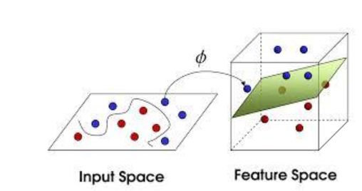
{從數據庫中導入所需工具}
import numpy as np (解析資料)
import matplotlib.pyplot as plt (圖表呈現)
import pandas as pd (計算工具)
{設置工作路徑}
<右側的files,連結到檔案所屬的路徑>
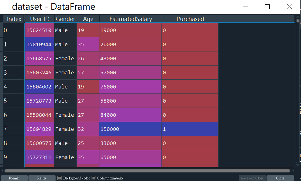
{導入所需數據}
dataset = pd.read_csv('Social_Network_Ads.csv')
X = dataset.iloc[:, [2,3]].values
y = dataset.iloc[:, 4].values
{將資料分成訓練集以及測試集}
from sklearn.model_selection import train_test_split
X_train, X_test, y_train, y_test = train_test_split(X, y, test_size = 0.25, random_state = 0)
{特徵縮放}
<當資料需要找出關聯,但數據差過大時,利用特徵縮放讓數據呈現在同水平>
from sklearn.preprocessing import StandardScaler
sc_X = StandardScaler()
X_train = sc_X.fit_transform(X_train)
X_test = sc_X.transform(X_test)
*y不用特徵縮放, 因為它只有0跟1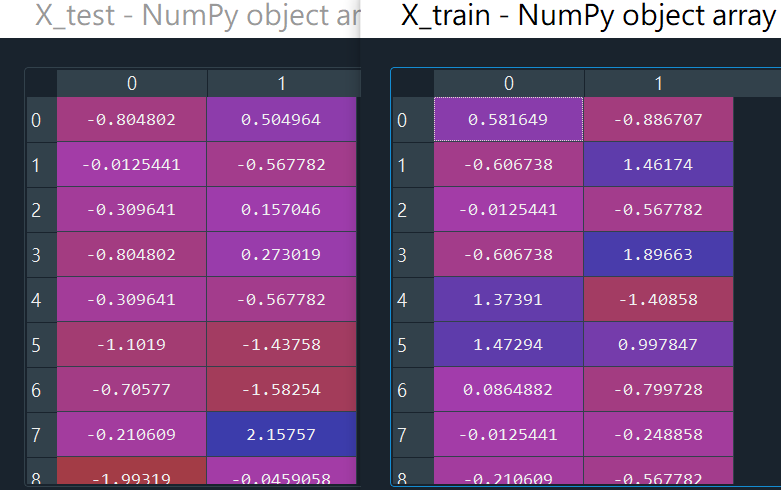
{利用訓練集讓機器開始學習}
from sklearn.svm import SVC
classifier = SVC(kernel = 'rbf', random_state = 0)
classifier.fit(X_train, y_train)
{利用擬和器開始預測}
`y_pred = classifier.predict(X_test)``
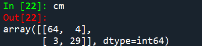
{利用混淆矩陣檢測錯誤樣本數}
from sklearn.metrics import confusion_matrix
cm = confusion_matrix(y_test, y_pred)
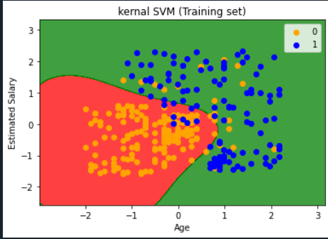
{將結果以圖表成呈現}(訓練集)
from matplotlib.colors import ListedColormap
X_set, y_set = X_train, y_train
X1, X2 = np.meshgrid(np.arange(start = X_set[:, 0].min() - 1, stop = X_set[:, 0].max() + 1, step = 0.01),
                     np.arange(start = X_set[:, 1].min() - 1, stop = X_set[:, 1].max() + 1, step = 0.01))
plt.contourf(X1, X2, classifier.predict(np.array([X1.ravel(), X2.ravel()]).T).reshape(X1.shape),
             alpha = 0.75, cmap = ListedColormap(('red', 'green')))
plt.xlim(X1.min(), X1.max())
plt.ylim(X2.min(), X2.max())
for i, j in enumerate(np.unique(y_set)):
    plt.scatter(X_set[y_set == j, 0], X_set[y_set == j, 1],
                c = ListedColormap(('orange', 'blue'))(i), label = j)
plt.title('SVM (Training set)')
plt.xlabel('Age')
plt.ylabel('Estimated Salary')
plt.legend()
plt.show()
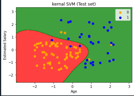
{將結果以圖表成呈現}(測試集)
from matplotlib.colors import ListedColormap
X_set, y_set = X_test, y_test
X1, X2 = np.meshgrid(np.arange(start = X_set[:, 0].min() - 1, stop = X_set[:, 0].max() + 1, step = 0.01),
np.arange(start = X_set[:, 1].min() - 1, stop = X_set[:, 1].max() + 1, step = 0.01))
plt.contourf(X1, X2, classifier.predict(np.array([X1.ravel(), X2.ravel()]).T).reshape(X1.shape),
alpha = 0.75, cmap = ListedColormap(('red', 'green')))
plt.xlim(X1.min(), X1.max())
plt.ylim(X2.min(), X2.max())
for i, j in enumerate(np.unique(y_set)):
plt.scatter(X_set[y_set == j, 0], X_set[y_set == j, 1],
c = ListedColormap(('orange', 'blue'))(i), label = j)
plt.title('SVM (Test set)')
plt.xlabel('Age')
plt.ylabel('Estimated Salary')
plt.legend()
plt.show()