補充:
這邊補充介紹一下 vue 的 is 特性
在 html DOM 中會有些節點的規則,譬如說 ul,ol只能直接包含li標籤,若我們需要在裡面使用組件將會報錯,因此我們可以使用 is 特性來將組件掛在標籤上
<ul>
    <li is="meau"></li>
</ul>

import meau from '@/components/meau.vue'
export default{
    components:{
        meau
    }
}
這樣我們既可以符合 html 的規則又可以將 meau 這個組件掛上囉
正文:
要使用任何東西的第一步當然就是安裝它啦~
npm install element-ui
安裝好後至 main.js 引用它
import Element from 'element-ui'
import 'element-ui/lib/theme-chalk/index.css';
Vue.use(Element)
這樣我們就在專案中使用了 element-ui 囉
結束後我們就先來介紹 element-ui 的 layout 使用方式吧
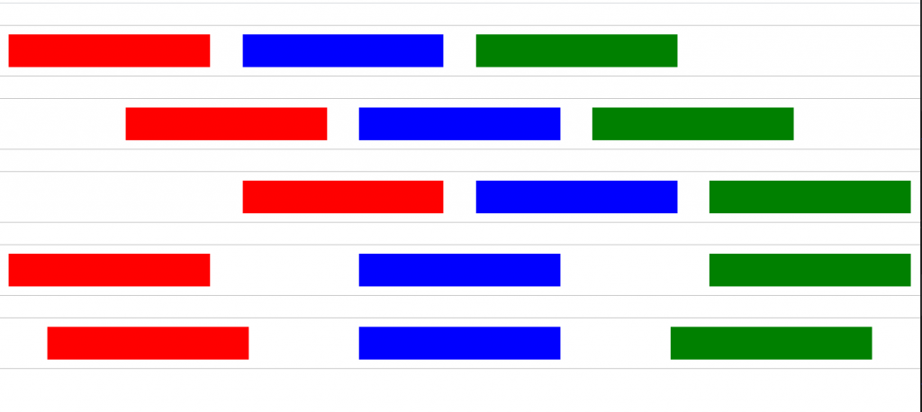
element ui 的布局設計的非常單純,僅需使用 <el-row> 和 <el-col> 即可使用,而在 element-ui 的 <el-row> 中是將容器切割成 24 份來使用,我們僅需要再<el-col> 中透過 其 span 屬性即可分配其寬度
<el-row>
  <el-col :span="10"><div class="red h-30"></div></el-col>
  <el-col :span="8"><div class="blue h-30"></div></el-col>
  <el-col :span="6"><div class="green h-30"></div></el-col>
</el-row>

而我們也可以在 el-row 中透過 gutter 屬性設定間距
<el-row :gutter="30">
  <el-col :span="10"><div class="red h-30"></div></el-col>
  <el-col :span="8"><div class="blue h-30"></div></el-col>
  <el-col :span="6"><div class="green h-30"></div></el-col>
</el-row>

並且我們可以透過 offset 設置偏移欄數
<el-row :gutter="30">
  <el-col :span="10"><div class="red h-30"></div></el-col>
  <el-col :offset="2" :span="6"><div class="blue h-30"></div></el-col>
  <el-col :span="6"><div class="green h-30"></div></el-col>
</el-row>

最後呢,講到布局當然少不了我們的好朋友 flex 啦
<el-row :gutter="30" type="flex">
  <el-col :span="6"><div class="red h-30"></div></el-col>
  <el-col :span="6"><div class="blue h-30"></div></el-col>
  <el-col :span="6"><div class="green h-30"></div></el-col>
</el-row>
<el-row :gutter="30" type="flex" justify="center">
  <el-col :span="6"><div class="red h-30"></div></el-col>
  <el-col :span="6"><div class="blue h-30"></div></el-col>
  <el-col :span="6"><div class="green h-30"></div></el-col>
</el-row>
<el-row :gutter="30" type="flex" justify="end">
  <el-col :span="6"><div class="red h-30"></div></el-col>
  <el-col :span="6"><div class="blue h-30"></div></el-col>
  <el-col :span="6"><div class="green h-30"></div></el-col>
</el-row>
<el-row :gutter="30" type="flex" justify="space-between">
  <el-col :span="6"><div class="red h-30"></div></el-col>
  <el-col :span="6"><div class="blue h-30"></div></el-col>
  <el-col :span="6"><div class="green h-30"></div></el-col>
</el-row>
<el-row :gutter="30" type="flex" justify="space-around">
  <el-col :span="6"><div class="red h-30"></div></el-col>
  <el-col :span="6"><div class="blue h-30"></div></el-col>
  <el-col :span="6"><div class="green h-30"></div></el-col>
</el-row>
今天就先介紹布局方法,明天將介紹容器~


 看影片追技術