一、清單表格:QTable、QMarkupTable
二、彈出視窗:QDialog、DialogPlugin
三、總結
用於清單資訊的呈現
Quasar 提供了兩種表格
根據定義的欄位、v-model的資料,自動產生表格的畫面
可以依照自己的需求,使用分頁、資料的格式與排序等等功能
QTable is a component that allows you to display data in a tabular manner. It’s generally called a datatable. It packs the following main features:
- Filtering
- Sorting
- Single / Multiple rows selection with custom selection actions
- Pagination (including server-side if required)
- Grid mode (you can use for example QCards to display data in a non-tabular manner)
- Total customization of rows and cells through scoped slots
- Ability to add additional row(s) at top or bottom of data rows
- Column picker (through QTableColumns component described in one of the sections)
- Custom top and/or bottom Table controls
- Responsive design
程式碼示意: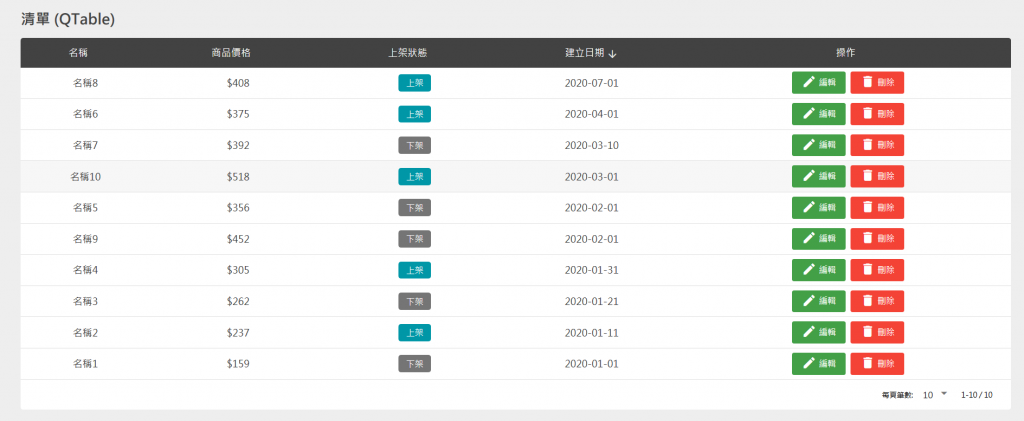
<template>
  <q-page class="q-pa-lg">
    <div class="full-width q-gutter-md">
      <h5 class="text-bold text-grey-9 q-mb-md">清單 (QTable)</h5>
      <q-table
        :data="table.data"
        :columns="table.columns"
        row-key="name"
        table-class="table"
        :pagination.sync="table.pagination"
        flat
      >
        <template v-slot:body-cell-status="props">
          <q-td :props="props">
            <div>
              <q-chip text-color="white" square
                      :color="options.status.find(option => option.value === props.row.status).color"
                      :label="options.status.find(option => option.value === props.row.status).label" />
            </div>
          </q-td>
        </template>
        <template v-slot:body-cell-operation="props">
          <q-td class="q-gutter-x-sm" :props="props">
            <q-btn unelevated color="green-7" @click="editDialog(props.row)">
              <span class="vertical_middle"><q-icon name="edit"></q-icon> 編輯</span>
            </q-btn>
            <q-btn unelevated color="red" @click="openCustomDialog('警告!', '確定要刪除訂單?', props.row)">
              <span class="vertical_middle"><q-icon name="delete"></q-icon> 刪除</span>
            </q-btn>
          </q-td>
        </template>
      </q-table>
      <h5 class="text-bold text-grey-9 q-mb-md">清單 (QMarkupTable)</h5>
      <q-dialog v-model="editForm.isEdit">
        <q-card class="q-pa-lg" style="max-width: 500px; width: 100%">
          <h5 class="text-center text-bold q-mb-lg">編輯項目</h5>
          <div class="form">

          </div>
          <div class="row q-col-gutter-md">
            <div class="col-12">
              <q-input label="名稱" stack-label outlined v-model="editForm.model.name"></q-input>
            </div>
            <div class="col-12">
              <q-input label="價格" stack-label outlined v-model="editForm.model.price"></q-input>
            </div>
            <div class="col-12">
              <q-select outlined v-model="editForm.model.status" :options="options.status" label="狀態" emit-value map-options
      />
            </div>
            <div class="col-6">
              <q-btn v-close-popup unelevated color="primary" class="full-width" label="修改" @click="handleEdit"></q-btn>
            </div>
            <div class="col-6">
              <q-btn v-close-popup unelevated color="grey-7" class="full-width" label="取消"></q-btn>
            </div>
          </div>
        </q-card>
      </q-dialog>
    </div>

  </q-page>
</template>

<script>
import CustomDialog from 'src/components/CustomDialog.vue'

export default {
  data () {
    return {
      editForm: {
        data: null,
        model: {
          name: null,
          price: null,
          status: null
        },
        isEdit: false
      },
      table: {
        pagination: {
          sortBy: 'publish_date',
          descending: true,
          page: 1,
          rowsPerPage: 10
        },
        columns: [
          { name: 'name', field: 'name', align: 'center', label: '名稱', sortable: true },
          { name: 'price', field: 'price', align: 'center', label: '商品價格', format: val => `$${val}`, sortable: true },
          { name: 'status', field: 'status', align: 'center', label: '上架狀態', sortable: true },
          { name: 'publish_date', field: 'publish_date', align: 'center', label: '建立日期', sortable: true },
          { name: 'operation', field: 'operation', align: 'center', label: '操作' }
        ],
        data: [
          { id: 0, name: '名稱1', price: 159, status: 0, publish_date: '2020-01-01' },
          { id: 1, name: '名稱2', price: 237, status: 1, publish_date: '2020-01-11' },
          { id: 2, name: '名稱3', price: 262, status: 0, publish_date: '2020-01-21' },
          { id: 3, name: '名稱4', price: 305, status: 1, publish_date: '2020-01-31' },
          { id: 4, name: '名稱5', price: 356, status: 0, publish_date: '2020-02-01' },
          { id: 5, name: '名稱6', price: 375, status: 1, publish_date: '2020-04-01' },
          { id: 6, name: '名稱7', price: 392, status: 0, publish_date: '2020-03-10' },
          { id: 7, name: '名稱8', price: 408, status: 1, publish_date: '2020-07-01' },
          { id: 8, name: '名稱9', price: 452, status: 0, publish_date: '2020-02-01' },
          { id: 9, name: '名稱10', price: 518, status: 1, publish_date: '2020-03-01' }
        ]
      },
      options: {
        status: [
          { label: '下架', value: 0, color: 'grey-7' },
          { label: '上架', value: 1, color: 'cyan-8' }
        ]
      }
    }
  },
  methods: {
    editDialog (row) {
      this.editForm.isEdit = true

      for (let field in row) {
        this.editForm.model[field] = row[field]
      }
      this.editForm.data = row
    },
    handleEdit () {
      for (let field in this.editForm.model) {
        this.editForm.data[field] = this.editForm.model[field]
        this.editForm.model[field] = null
      }
    },
    openCustomDialog (title, text) {
      this.$q.dialog({
        component: CustomDialog,
        parent: this,
        title: title,
        text: text
      }).onOk(() => {
        console.log('OK')

        let index = this.table.data.indexOf(row)
        this.table.data.splice(index, 1)
      }).onCancel(() => {
        console.log('Cancel')
      }).onDismiss(() => {
        console.log('Called on OK or Cancel')
      })
    }
  }
}
</script>

<style lang="scss" scoped>
  /deep/ .table {

  }
  /deep/ .table th {
    background-color: $grey-9;
    color: white;
    font-size: 16px;
  }

  /deep/ .table tbody td {
    font-size: 16px;
    color: $grey-9;
  }
</style>
其中幾個比較重要的部分:
1.表格欄位
(1)欄位的屬性名稱:name、field
(2)欄位的顯示文字:label
(3)內容對齊:align
(4)內容的格式處理:format
(5)欄位是否允許排序:sortable
<q-table
    :columns="table.columns"
>
columns: [
  { name: 'name', field: 'name', align: 'center', label: '名稱', sortable: true },
  { name: 'price', field: 'price', align: 'center', label: '商品價格', format: val => `$${val}`, sortable: true },
  { name: 'status', field: 'status', align: 'center', label: '上架狀態', sortable: true },
  { name: 'publish_date', field: 'publish_date', align: 'center', label: '建立日期', sortable: true },
  { name: 'operation', field: 'operation', align: 'center', label: '操作' }
],
2.表格資料
設定在QTable的data屬性
<q-table
    :data="table.data"
>
每一個欄位(field)會對應到每一個資料的屬性
只有定義在columns:[]的資料才會顯示
data: [
  { id: 0, name: '名稱1', price: 159, status: 0, publish_date: '2020-01-01' },
  { id: 1, name: '名稱2', price: 237, status: 1, publish_date: '2020-01-11' },
  { id: 2, name: '名稱3', price: 262, status: 0, publish_date: '2020-01-21' },
  { id: 3, name: '名稱4', price: 305, status: 1, publish_date: '2020-01-31' },
  { id: 4, name: '名稱5', price: 356, status: 0, publish_date: '2020-02-01' },
  { id: 5, name: '名稱6', price: 375, status: 1, publish_date: '2020-04-01' },
  { id: 6, name: '名稱7', price: 392, status: 0, publish_date: '2020-03-10' },
  { id: 7, name: '名稱8', price: 408, status: 1, publish_date: '2020-07-01' },
  { id: 8, name: '名稱9', price: 452, status: 0, publish_date: '2020-02-01' },
  { id: 9, name: '名稱10', price: 518, status: 1, publish_date: '2020-03-01' }
]
3. 表格分頁
設定在QTable的pagination屬性
<q-table
    :pagination.sync="table.pagination"
>
(1)預設以什麼欄位排序: sortBy
(2)預設排序的方式:descending
(3)預設頁數:page
(4)預設每一頁的筆數:rowsPerPage
pagination: {
  sortBy: 'publish_date',
  descending: true,
  page: 1,
  rowsPerPage: 10
}
預設是clinet端處理分頁的需求
如果要改成Server端處理分頁
需要在QTable定義分頁更換時、一頁筆數更換時的查詢方法(request event)
<q-table
    @request="onRequest"
>
@request觸發後,可以透過props.pagination取得分頁更換時、一頁筆數更換時的分頁參數
成功從後端查詢後,必須自己寫回在data定義的 pagination
並且在pagination當中設定rowsNumber
pagination: {
  rowsNumber:xx
}
onRequest (props) {
    const { page, rowsPerPage, sortBy, descending } = props.pagination

    // api request

    // update pagination in data ()
    this.pagination.page = page
    this.pagination.rowsPerPage = rowsPerPage
    this.pagination.rowsNumber = rowsNumber
    this.pagination.sortBy = sortBy
    this.pagination.descending = descending
}
4.自定義欄位內容
在<q-table>的slot裡面使用 <template v-slot:body-cell-xxx="props">
透過props.row.xxx即可取得該列某個欄位的資料
xxx 是欄位的name
<template v-slot:body-cell-status="props">
  <q-td :props="props">
    <div>
      <q-chip text-color="white" square
              :color="options.status.find(option => option.value === props.row.status).color"
              :label="options.status.find(option => option.value === props.row.status).label" />
    </div>
  </q-td>
</template>
相當於使用原生的<table>
沒有任分頁、資料的格式與排序等等功能
程式碼示意: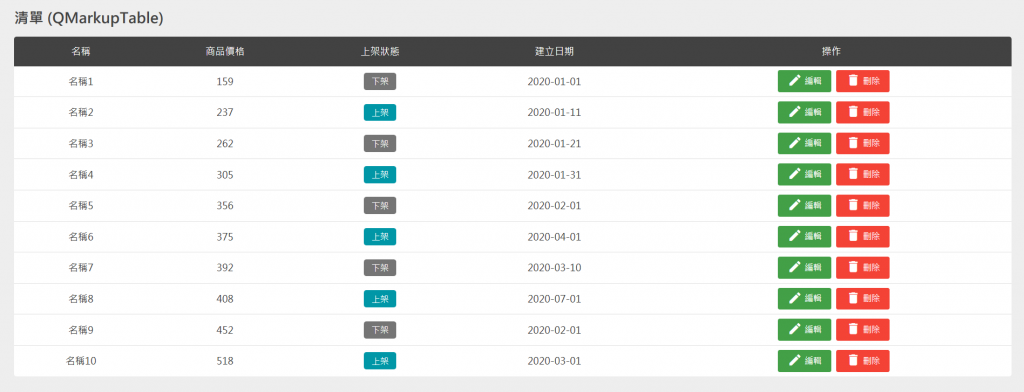
<template>
  <q-page class="q-pa-lg">
    <div class="full-width q-gutter-md">
      <h5 class="text-bold text-grey-9 q-mb-md">清單 (QMarkupTable)</h5>
      <q-markup-table class="table" flat>
        <thead>
          <tr>
            <th v-for="(field, index) in table.columns" :key="index">{{ field.label }}</th>
          </tr>
        </thead>
        <tbody>
          <tr v-for="row in table.data" :key="row.id">
            <td class="text-center">{{ row.name }}</td>
            <td class="text-center">{{ row.price }}</td>
            <td class="text-center">
              <q-chip text-color="white" square
                      :color="options.status.find(option => option.value === row.status).color"
                      :label="options.status.find(option => option.value === row.status).label" />
            </td>
            <td class="text-center">{{ row.publish_date }}</td>
            <td class="text-center q-gutter-x-sm">
              <q-btn unelevated color="green-7" @click="editDialog(row)">
                <span class="vertical_middle"><q-icon name="edit"></q-icon> 編輯</span>
              </q-btn>
              <q-btn unelevated color="red" @click="openCustomDialog('警告!', '確定要刪除訂單?', row)">
                <span class="vertical_middle"><q-icon name="delete"></q-icon> 刪除</span>
              </q-btn>
            </td>
          </tr>
        </tbody>
      </q-markup-table>
      <q-dialog v-model="editForm.isEdit">
        <q-card class="q-pa-lg" style="max-width: 500px; width: 100%">
          <h5 class="text-center text-bold q-mb-lg">編輯項目</h5>
          <div class="form">

          </div>
          <div class="row q-col-gutter-md">
            <div class="col-12">
              <q-input label="名稱" stack-label outlined v-model="editForm.model.name"></q-input>
            </div>
            <div class="col-12">
              <q-input label="價格" stack-label outlined v-model="editForm.model.price"></q-input>
            </div>
            <div class="col-12">
              <q-select outlined v-model="editForm.model.status" :options="options.status" label="狀態" emit-value map-options
      />
            </div>
            <div class="col-6">
              <q-btn v-close-popup unelevated color="primary" class="full-width" label="修改" @click="handleEdit"></q-btn>
            </div>
            <div class="col-6">
              <q-btn v-close-popup unelevated color="grey-7" class="full-width" label="取消"></q-btn>
            </div>
          </div>
        </q-card>
      </q-dialog>
    </div>

  </q-page>
</template>

<script>
import CustomDialog from 'src/components/CustomDialog.vue'

export default {
  data () {
    return {
      editForm: {
        data: null,
        model: {
          name: null,
          price: null,
          status: null
        },
        isEdit: false
      },
      table: {
        columns: [
          { name: 'name', field: 'name', align: 'center', label: '名稱', sortable: true },
          { name: 'price', field: 'price', align: 'center', label: '商品價格', format: val => `$${val}`, sortable: true },
          { name: 'status', field: 'status', align: 'center', label: '上架狀態', sortable: true },
          { name: 'publish_date', field: 'publish_date', align: 'center', label: '建立日期', sortable: true },
          { name: 'operation', field: 'operation', align: 'center', label: '操作' }
        ],
        data: [
          { id: 0, name: '名稱1', price: 159, status: 0, publish_date: '2020-01-01' },
          { id: 1, name: '名稱2', price: 237, status: 1, publish_date: '2020-01-11' },
          { id: 2, name: '名稱3', price: 262, status: 0, publish_date: '2020-01-21' },
          { id: 3, name: '名稱4', price: 305, status: 1, publish_date: '2020-01-31' },
          { id: 4, name: '名稱5', price: 356, status: 0, publish_date: '2020-02-01' },
          { id: 5, name: '名稱6', price: 375, status: 1, publish_date: '2020-04-01' },
          { id: 6, name: '名稱7', price: 392, status: 0, publish_date: '2020-03-10' },
          { id: 7, name: '名稱8', price: 408, status: 1, publish_date: '2020-07-01' },
          { id: 8, name: '名稱9', price: 452, status: 0, publish_date: '2020-02-01' },
          { id: 9, name: '名稱10', price: 518, status: 1, publish_date: '2020-03-01' }
        ]
      },
      options: {
        status: [
          { label: '下架', value: 0, color: 'grey-7' },
          { label: '上架', value: 1, color: 'cyan-8' }
        ]
      }
    }
  },
  methods: {
    editDialog (row) {
      this.editForm.isEdit = true

      for (let field in row) {
        this.editForm.model[field] = row[field]
      }
      this.editForm.data = row
    },
    handleEdit () {
      for (let field in this.editForm.model) {
        this.editForm.data[field] = this.editForm.model[field]
        this.editForm.model[field] = null
      }
    },
    openCustomDialog (title, text) {
      this.$q.dialog({
        component: CustomDialog,
        parent: this,
        title: title,
        text: text
      }).onOk(() => {
        console.log('OK')

        let index = this.table.data.indexOf(row)
        this.table.data.splice(index, 1)
      }).onCancel(() => {
        console.log('Cancel')
      }).onDismiss(() => {
        console.log('Called on OK or Cancel')
      })
    }
  }
}
</script>

<style lang="scss" scoped>
  /deep/ .table {

  }
  /deep/ .table th {
    background-color: $grey-9;
    color: white;
    font-size: 16px;
  }

  /deep/ .table tbody td {
    font-size: 16px;
    color: $grey-9;
  }
</style>
用於彈出資訊的視窗元件
你可以在頁面裡面使用<q-dialog>
使用v-model控制顯示和隱藏
The QDialog component is a great way to offer the user the ability to choose a specific action or list of actions. They also can provide the user with important information, or require them to make a decision (or multiple decisions).
From a UI perspective, you can think of Dialogs as a type of floating modal, which covers only a portion of the screen. This means Dialogs should only be used for quick user actions, like verifying a password, getting a short App notification or selecting an option or options quickly.
https://quasar.dev/vue-components/dialog\
程式碼如上面的範例:
<!-- src/pages/Index.vue -->

<q-dialog v-model="editForm.isEdit">
    <q-card class="q-pa-lg" style="max-width: 500px; width: 100%">
      <h5 class="text-center text-bold q-mb-lg">編輯項目</h5>
      <div class="form">

      </div>
      <div class="row q-col-gutter-md">
        <div class="col-12">
          <q-input label="名稱" stack-label outlined v-model="editForm.model.name"></q-input>
        </div>
        <div class="col-12">
          <q-input label="價格" stack-label outlined v-model="editForm.model.price"></q-input>
        </div>
        <div class="col-12">
          <q-select outlined v-model="editForm.model.status" :options="options.status" label="狀態" emit-value map-options
  />
        </div>
        <div class="col-6">
          <q-btn v-close-popup unelevated color="primary" class="full-width" label="修改" @click="handleEdit"></q-btn>
        </div>
        <div class="col-6">
          <q-btn v-close-popup unelevated color="grey-7" class="full-width" label="取消"></q-btn>
        </div>
      </div>
    </q-card>
</q-dialog>
除了設定Dialog 的 v-model=false關閉之外,
Quasar 有提供 「Close Popup Directive」
可以套用在按鈕上面,按下時關閉Dialog,而不用修改QDialog的v-model
This directive is a helper when dealing with QDialog and QMenu components. When attached to a DOM element or component then that component will close the QDialog or QMenu (whichever is first parent) when clicked/tapped.
https://quasar.dev/vue-directives/close-popup#Introduction
<q-btn v-close-popup></q-btn>
你也可以自訂一個Dialog元件,使用DialogPlugin呼叫全域的Dialog
you can also supply a component for the Dialog Plugin to render (see the “Invoking custom component” section) which is a great way to avoid cluttering your Vue templates with inline dialogs (and it will also help you better organize your project files and also reuse dialogs).
https://quasar.dev/quasar-plugins/dialog
官方文件有示範DialogPlugin預設樣式的範例
以下是呼叫自訂全域Dialog的程式示意

呼叫方式:使用this.$q.dialog
在參數當中,必須指定要呼叫的Dialog元件
在元件當中,定義onOk、onCancel的按鈕
// src/pages/Index.vue
openCustomDialog (title, text, row) {
  this.$q.dialog({
    component: CustomDialog,
    parent: this,
    title: title,
    text: text
  }).onOk(() => {
    console.log('OK')

    let index = this.table.data.indexOf(row)
    this.table.data.splice(index, 1)
  }).onCancel(() => {
    console.log('Cancel')
  }).onDismiss(() => {
    console.log('Called on OK or Cancel')
  })
}
自訂的Dialog元件:
// src/components/CustomDialog.vue
<template>
  <q-dialog ref="dialog" @hide="onDialogHide">
    <q-card class="" style="max-width: 500px; width: 100%;">
      <div class="text-h4 text-bold text-center text-white bg-red-7 q-pa-md">{{title}}</div>

      <q-card-section class="q-pt-lg">
        {{text}}
      </q-card-section>

      <!-- buttons example -->

      <div class="row q-pa-md q-col-gutter-sm">
        <div class="col-6">
          <q-btn unelevated class="full-width" color="red-7" label="確定" @click="onOKClick" />
        </div>
        <div class="col-6">
          <q-btn unelevated class="full-width" color="grey-8" label="取消" @click="onCancelClick"/>
        </div>
      </div>
    </q-card>
  </q-dialog>
</template>

<script>
export default {
  props: ['title', 'text'],

  methods: {
    // following method is REQUIRED
    // (don't change its name --> "show")
    show () {
      this.$refs.dialog.show()
    },

    // following method is REQUIRED
    // (don't change its name --> "hide")
    hide () {
      this.$refs.dialog.hide()
    },

    onDialogHide () {
      // required to be emitted
      // when QDialog emits "hide" event
      this.$emit('hide')
    },

    onOKClick () {
      // on OK, it is REQUIRED to
      // emit "ok" event (with optional payload)
      // before hiding the QDialog
      this.$emit('ok')
      // or with payload: this.$emit('ok', { ... })

      // then hiding dialog
      this.hide()
    },

    onCancelClick () {
      // we just need to hide dialog
      this.hide()
    }
  }
}
</script>
明天將會介紹前端重要的Loading狀態
包括Quasar的Loading Plugin以及 部分元件的loading屬性


 iThome鐵人賽
 看影片追技術