在使用seaborn畫出炫麗的圖片之前,先來做些基本的統計吧。
本文目的:敘述統計、推論統計、視覺直觀之組別差異
download here GitHub
資料集使用的是seaborn提供的iris.csv 長這樣,五個欄位(4個特徵、第5個是品種名稱),150筆記錄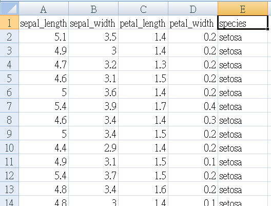
先使用Excel的oneway ANOVA分析,看看使用這四個特徵是否可以區分出不同的品種(組別)。
Null hypothesis虛無假設:三個品種的特徵平均值,並無差異不同。
P小於0.05 可推翻此null hypothesis
(一)、 EXCEL處理資料
Iris.csv是原始資料模式raw data,無法直接套用 ANOVA ,因為”組別”也在欄位內容中。
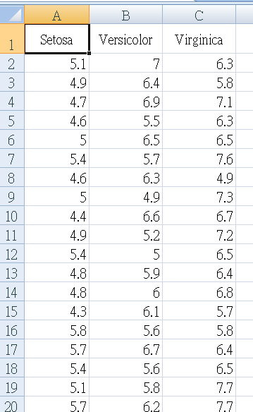
我們先”篩選”組別(species),把四個特值數據複製出來,各自建立一個工作表,第一列寫上品種名稱。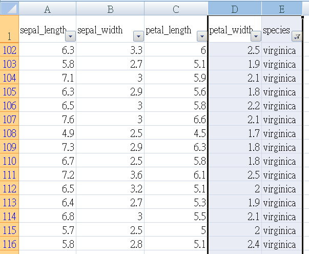
現在,以EXCEL oneway ANOVA (變異數分析),將四個特徵值各自做一次ANOVA
舉例: sepal_length 如下表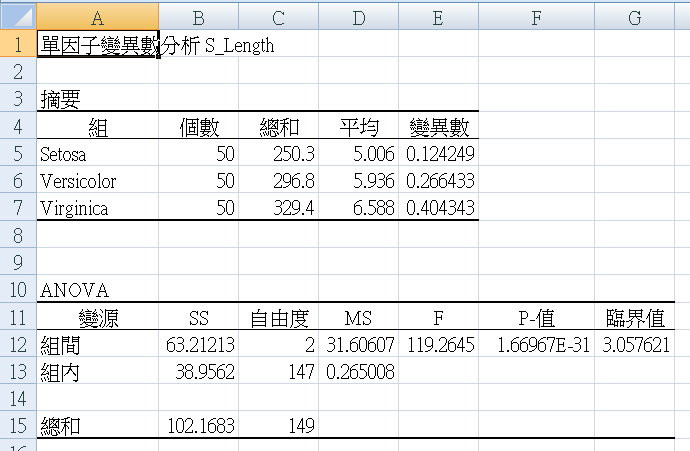
把四個表匯總,如下圖。留著等一下驗證我們python程式的成果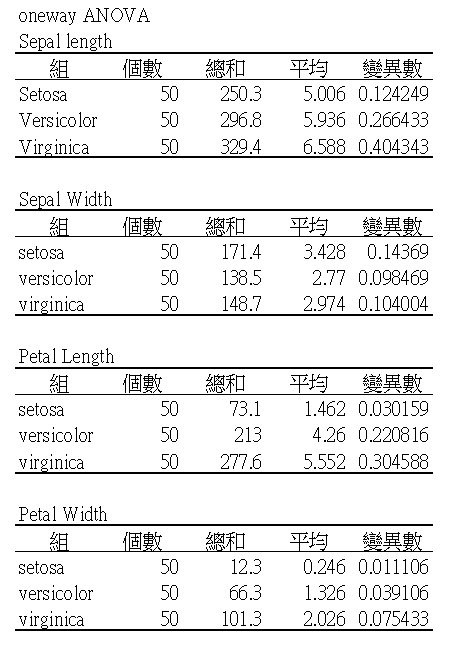
(二)、代碼程序流程:download here GitHub
Step 1. Read csv with dataframe
Step 2. Describe data
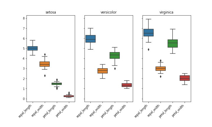
Step 3.畫個Box圖 觀察離散程度
Step 4. 畫 histogram
Step 5. check if Normal distribution
Step 6. ANOVA test
(三)、解說
Sklearn 、seaborn的範例,總是會po出好幾張美美的圖,如這張。
美是美啦,可是,代表啥意思啊?
我們還是先從基本的統計圖表來吧。
Descriptive Statistics 先來描述一下資料吧,統計摘要一下iris.csv這個資料集。
可以這樣看:平均值 Mean、中位數 Median...
#--- 描述性統計數據
def descrStat(gpdf,fld):
    # 以下碼可以用一行 df.describe() 代替之
    SL_min  = gpdf[fld].min()
    SL_max  = gpdf[fld].max()
    SL_mean = gpdf[fld].mean()
    SL_std  = gpdf[fld].std()
    SL_median = gpdf[fld].median()
    SL_var  = gpdf[fld].var()
    SL_q25  = gpdf[fld].quantile(.25)
    SL_q50  = gpdf[fld].quantile(.50)
    SL_q75  = gpdf[fld].quantile(.75)

    print('%s : min %.5f max %.5f mean %.5f std %.5f var %.5f'
          % (fld,SL_min,SL_max,SL_mean, SL_std, SL_var))
    print('median %.5f 25qunatile %.5f 50qunatile %.5f 75qunatile %.5f'
          % (SL_median, SL_q25, SL_q50, SL_q75))

# 只選 setosa這組
df0 = df[df['species']=='setosa']
print('setosa組,統計數據如下:')
print(df0.describe())
#descrStat(df0,'sepal_length')     # 回報統計數據
BoxPlot 可看出數據的集中或離散程度,方盒上標75% 下標25%,中間線是平均值。盒子扁的表示大家都”向中靠隴”,反之盒子寬的,彼此”較生疏”…
''' Step 3. 畫個Box圖 觀察離散程度 min mean max percentile '''
import seaborn as sns
import matplotlib.pyplot as plt

# 把三組畫在一起
fig,axes = plt.subplots(1,3,sharey=True,figsize=(10,6))

axes[0].set_title('setosa')
axes[1].set_title('versicolor')
axes[2].set_title('virginica')

fig.autofmt_xdate(rotation=45)
sns.boxplot(data=df0,ax=axes[0])
sns.boxplot(data=df1,ax=axes[1])
sns.boxplot(data=df2,ax=axes[2])

fig.savefig('iris_box.jpg')
如果換一個表達方式,採用histogram也就是”分佈圖”來看,也可看出大略的離散程度。
''' Step 4. 畫 histogram  '''
#--- 接收參數 fld: field name / jpg: jpgfilename  /NS: normal distribution
def histo(fld,vcolor,jpg,NS):
    #--- hitogram distribution plot
    fig,axes = plt.subplots(1,3,sharex=True,sharey=True,figsize=(10,6))
    #fig,axes = plt.subplots(1,3,figsize=(10,6))
    axes[0].set_title('setosa')
    axes[1].set_title('versicolor')
    axes[2].set_title('virginica')

    sns.histplot(color=vcolor,data= df0,x=df0[fld],ax=axes[0],stat=NS)
    sns.histplot(color=vcolor,data= df1,x=df1[fld],ax=axes[1],stat=NS)
    sns.histplot(color=vcolor,data= df2,x=df2[fld],ax=axes[2],stat=NS)

    fig.savefig(jpg)
Seaborn的histplot() 或pyplot的hist() ,有兩個參數可調整圖型顯示出來的外觀,可參考此網頁
我們來看看,設定density會造成什麼不同:
The density parameter, which normalizes bin heights so that the integral of the histogram is 1.
The resulting histogram is an approximation of the probability density function.
設定density 可以正規化(normalize) 柱子(bin)的高度,類似於”機率密度函數” probability density function的功能。請參考Wiki
seaborn histplot() 預設為不設定density,y軸出現的”count” 如下圖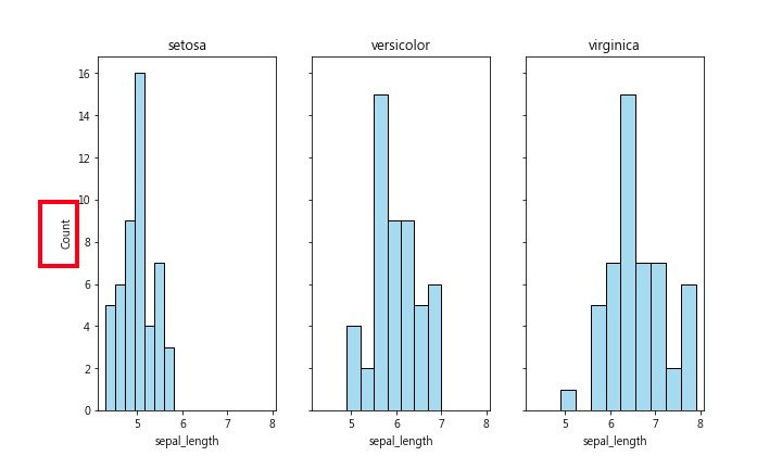
為了比較這三組的sepal_length有何不同之處,我們改採用 density方式圖示之,如下圖: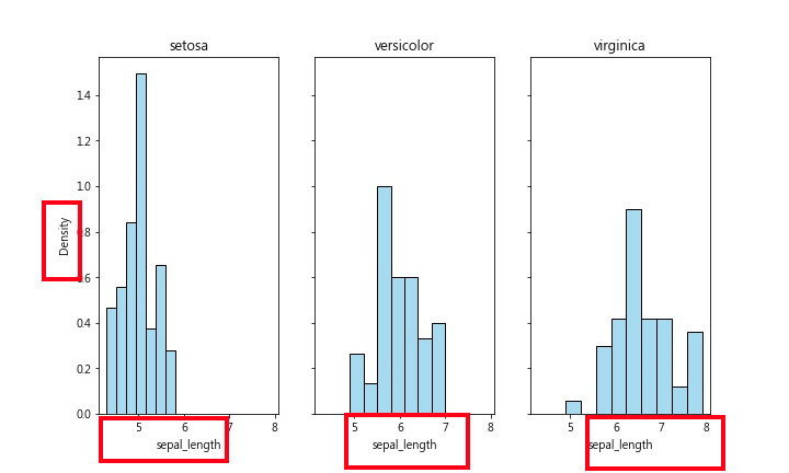
從此圖可看出,setosa組大多數的sepal_length都比較小(小於6),右邊兩圖的數據大多數都是大於5。
三張圖的bin 高度都是採用density表示
sns.histplot(color=,data= ,x=,ax=,stat=’density’)
從boxplot也可看出這種狀況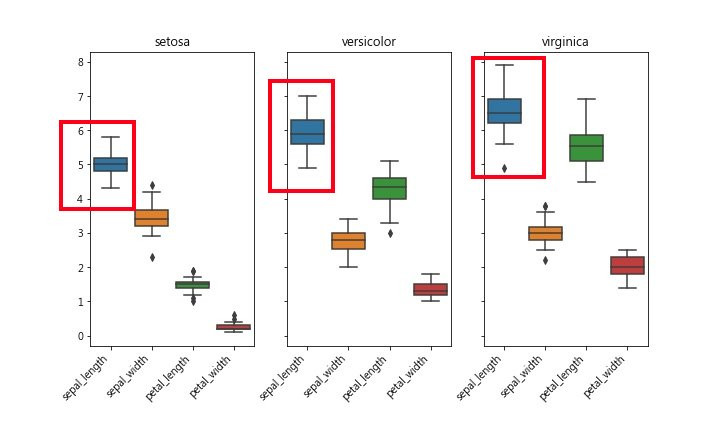
和上面使用EXCEL做出來的數據比對一下,也符合。
(三)、one-way ANOVA of python One-Way Analysis of Variances 單因子變異數分析
請參考這篇
先檢查資料是否為常態分布
Perform the Shapiro-Wilk test for normality 參考此
指令 scipy.stats.shapiro(df0['sepal_length'])
返回兩個數值ShapiroResult(statistic= , pvalue= ),第二個數字就是 p value,p >0.05是常態分佈
''' Step 5.  check if Normal distribution   '''
import scipy.stats

def checkNS(vList):
    _,pValue = scipy.stats.shapiro(vList)
    return pValue

print(checkNS(df0['sepal_length']))
print(checkNS(df0['sepal_width']))

''' 略  '''
One-way ANOVA
Null hypothesis虛無假設:三個品種的”特徵平均值”,並無差異不同。
P 小於0.05 可推翻此null hypothesis
意思就是:三個品種的”特徵平均值”是不一樣的。
表示:組間差異大於組內差異
''' Step 6. ANOVA test '''
dat0 = df0['sepal_length']
dat1 = df1['sepal_length']
dat2 = df2['sepal_length']

_,pANOVA = scipy.stats.f_oneway(dat0, dat1, dat2)

if pANOVA<=0.05:
    print('p value= %.6f '% pANOVA)
其它還有多項統計方法,下回再研究。
另外,要特別提醒的是,常常被誤用的統計方法:Chi-square 並不適用於此數據集。
Chi-square 卡方檢定應該運用於,多組樣本之”次數統計”檢定
請參考此
補充附記:
Seaborn relplot() 是一個資料視覺化的好用工具,一眼就可看出資料之關係/趨勢。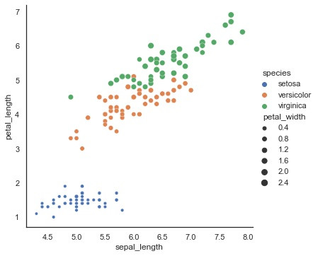
這張圖可看出,三個品種從sepal_length (x軸)、petal_length (y軸)的scatter散點圖,的確區分出三個不同群組。
使用hue參數表示三組。設定petal_width 給Size 點大的表示petal_width大
Virginica組的petal_width 都比較大
import seaborn as sns

sns.set_theme(style="white")

# Load iris dataset
iris = sns.load_dataset('iris')
iris.dropna(inplace=True)
print(iris.info())

sbplot = sns.relplot(x = 'sepal_length',
            y = 'petal_length',
            data = iris,
            kind = 'scatter',
            size = 'petal_width',
            hue = 'species')

sbplot.savefig('iris_scatter.jpg')
 neocaffe
