按鈕也是在基礎組件中常見的項目,它提供了點擊事件可以用來定義互動的功能。
Flutter 提供三種具備onPressed參數的按鈕類別的 widget,早期 Flutter 技術文章大多介紹FlatButton、RaisedButton和OutlineButton 這三種,版本 1.22後 Flutter 為了讓按鈕能夠更加靈活的被使用,目前已另外提供新的 widget 用來替換,分別是對應的是 TextButton、ElevatedButton、OutlinedButton。
新的按鈕設計遵從 Material Design 的規範,透過參數 ButtonStyle 定義的 MaterialStateProperty 參數值控制按鈕的樣式。
新的按鈕的使用方式如下:
    var elevtedButton = ElevatedButton(
      child: Text('ElevatedButton'),
      onPressed: () {},
    );
  var textButton = TextButton(
      child: Text('TextButton'),
      onPressed: () {},
    );
    var outlinedButton = OutlinedButton(
      child: Text('OutlinedButton'),
      onPressed: () {},
    );
新的按鈕透過 ButtonStyle 定義按鈕的樣式設定,參數是由 MaterialStateProperty 所構成,所有參數預設為 null,若要覆寫預設樣式,TextButton、ElevatedButton、OutlinedButton 有提供簡化的靜態方法 styleFrom,用來快速的設定想要的效果。
TextButton.styleFrom()
    var textButtonWithStyle = TextButton(
      child: Text('textButtonWithStyle'),
      onPressed: () {},
      style: TextButton.styleFrom(
        primary: Colors.purple,
        textStyle: TextStyle(fontSize: 30.0),
      ),
    );
ElevatedButton.styleFrom()
    var elevatedButtonWithIcon = ElevatedButton.icon(
      icon: Icon(Icons.home),
      label: Text("Home"),
      onPressed: () {},
      style: ElevatedButton.styleFrom(
        primary: Colors.red,
        shadowColor: Colors.orange,
      ),
    );
OutlinedButton.styleFrom()
    var outlinedButtonWithStyle = OutlinedButton(
      child: Text('OutlinedButton'),
      onPressed: () {},
      style: OutlinedButton.styleFrom(
        primary: Colors.black87,
        shape: RoundedRectangleBorder(
          borderRadius: BorderRadius.circular(18.0),
        ),
        side: BorderSide(width: 2, color: Colors.green),
      ),
    );
若想要使用簡單的 Icon 當作鈕按,也有提供 IconButton 的組件
   var iconButton = IconButton(
      icon: Icon(Icons.build_circle),
      iconSize: 30.0,
      splashRadius: 20.0,
      onPressed: () {},
    );
Icon 指的是一個小圖標,經常會使用在選單或是按鈕,透過圖像的方式讓使用者可以理解該項目提供的功能為何。在 Flutter 的 Material Library 內就有提供大量的素材可以使用,從 Google Fonts 的官網,可以搜尋到對應的圖標樣式。
使用的方法也很簡單:
Icon(Icons.ac_unit, color: Colors.red)

今日成果
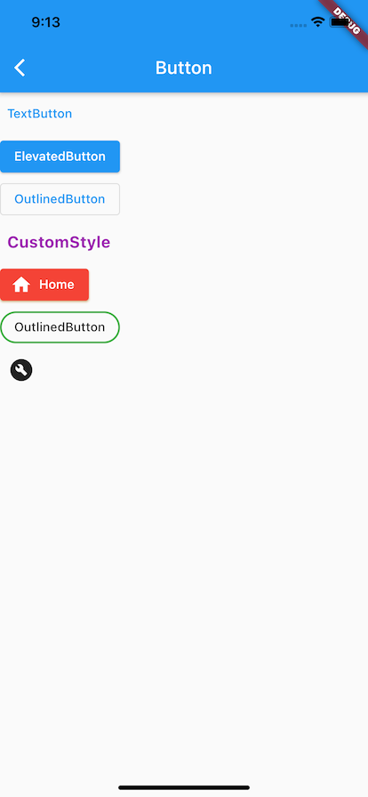
今天學習按鈕的三種類型,可透過styleFrom的設定,任意配置出想要的按鈕樣式,onPressed通常是一個按鈕必備的屬性,用來定義點擊要的行為邏輯。

 iThome鐵人賽
 看影片追技術