這個套件其實跟原生的 table tag 沒什麼太大的差異,在官方文件中有用到 Data Grid,的部分需要再安裝 Lab,但我用起來還是覺得他們的 localization 做得不好(主要就是沒有繁體中文啦),這邊我提供一個我覺得比較值得推薦的套件 material-table,這個套件也是依賴@material-ui/core,但是基本的設定上比較好用。
所以,以下內容會以 material-table 的設定為主。
首先,先確認安裝:
// npm
npm install material-table --save
npm install @material-ui/core --save
// yarn
yarn add material-table
yarn add @material-ui/core
導入後再使用的時候會有一些基本的ICON需要設定:
import { forwardRef } from 'react';

import AddBox from '@material-ui/icons/AddBox';
import ArrowDownward from '@material-ui/icons/ArrowDownward';
import Check from '@material-ui/icons/Check';
import ChevronLeft from '@material-ui/icons/ChevronLeft';
import ChevronRight from '@material-ui/icons/ChevronRight';
import Clear from '@material-ui/icons/Clear';
import DeleteOutline from '@material-ui/icons/DeleteOutline';
import Edit from '@material-ui/icons/Edit';
import FilterList from '@material-ui/icons/FilterList';
import FirstPage from '@material-ui/icons/FirstPage';
import LastPage from '@material-ui/icons/LastPage';
import Remove from '@material-ui/icons/Remove';
import SaveAlt from '@material-ui/icons/SaveAlt';
import Search from '@material-ui/icons/Search';
import ViewColumn from '@material-ui/icons/ViewColumn';

const tableIcons = {
    Add: forwardRef((props, ref) => <AddBox {...props} ref={ref} />),
    Check: forwardRef((props, ref) => <Check {...props} ref={ref} />),
    Clear: forwardRef((props, ref) => <Clear {...props} ref={ref} />),
    Delete: forwardRef((props, ref) => <DeleteOutline {...props} ref={ref} />),
    DetailPanel: forwardRef((props, ref) => <ChevronRight {...props} ref={ref} />),
    Edit: forwardRef((props, ref) => <Edit {...props} ref={ref} />),
    Export: forwardRef((props, ref) => <SaveAlt {...props} ref={ref} />),
    Filter: forwardRef((props, ref) => <FilterList {...props} ref={ref} />),
    FirstPage: forwardRef((props, ref) => <FirstPage {...props} ref={ref} />),
    LastPage: forwardRef((props, ref) => <LastPage {...props} ref={ref} />),
    NextPage: forwardRef((props, ref) => <ChevronRight {...props} ref={ref} />),
    PreviousPage: forwardRef((props, ref) => <ChevronLeft {...props} ref={ref} />),
    ResetSearch: forwardRef((props, ref) => <Clear {...props} ref={ref} />),
    Search: forwardRef((props, ref) => <Search {...props} ref={ref} />),
    SortArrow: forwardRef((props, ref) => <ArrowDownward {...props} ref={ref} />),
    ThirdStateCheck: forwardRef((props, ref) => <Remove {...props} ref={ref} />),
    ViewColumn: forwardRef((props, ref) => <ViewColumn {...props} ref={ref} />)
  };

<MaterialTable
  icons={tableIcons}
  ...
/>
其中的功能都可以換成你想要用的ICONS,當然前提是你有需要用到它所提供的功能啦。
如果像我沒有導入他們 ui 庫的 icons 又不想那麼麻煩的話可以考慮直接導入html Link:
<link
  rel="stylesheet"
  href="https://fonts.googleapis.com/icon?family=Material+Icons"
/>
基本的應用:
function SimpleAction() {
  return (
    <MaterialTable
      title="Simple Action Preview"
      columns={[
        { title: 'Name', field: 'name' },
        { title: 'Surname', field: 'surname' },
        { title: 'Birth Year', field: 'birthYear', type: 'numeric' },
        {
          title: 'Birth Place',
          field: 'birthCity',
          lookup: { 34: 'İstanbul', 63: 'Şanlıurfa' },
        },
      ]}
      data={[
        { name: 'Mehmet', surname: 'Baran', birthYear: 1987, birthCity: 63 },
        { name: 'Zerya Betül', surname: 'Baran', birthYear: 2017, birthCity: 34 },
      ]}
      actions={[
        {
          icon: 'save',
          tooltip: 'Save User',
          onClick: (event, rowData) => alert("You saved " + rowData.name)
        }
      ]}
    />
  )
}
功能上來說比較全面一點,也有排序、換頁、搜尋...等,整合性要比LAB得來的好,細部的應用在官方網站內都能看的到,這邊我就不再細講了,之後有機會在寫這部分的應用。
當用戶將鼠標懸停在、聚焦或點擊元素上時,提示會顯示信息。
<Tooltip title="刪除">
  <IconButton aria-label="delete">
    <DeleteIcon />
  </IconButton>
</Tooltip>
提示有 12 個展示位置選擇,以它們從源頭組件彈出的位置為依據。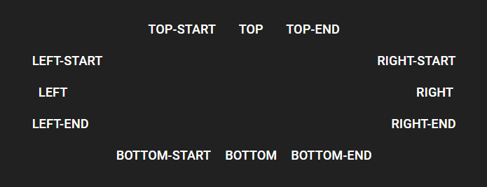
多給 arrow 屬性可以有類似對話框的效果
<Tooltip title="Add" arrow>
  <Button>Arrow</Button>
</Tooltip>
提示需要將 DOM 事件偵聽器應用於其子元素。如果子元素是自定義的 React 元素,則需要確保它將其屬性擴展到底層 DOM 元素。
const MyComponent = React.forwardRef(function MyComponent(props, ref) {
  //  將 props 和監聽的部分拆開
  return <div {...props} ref={ref}>Bin</div>
});

// ...

<Tooltip title="Delete">
  <MyComponent>
</Tooltip>
上面都是比較常用的,其他的效果可以至官方文件查詢。
那麼今天的內容就到這邊,明天會接續後面 Utils 部分的內容做講解。


 iThome鐵人賽
 看影片追技術