他和 Theme Provider 很像,其實就是用 context 在傳遞樣式 object 的方法。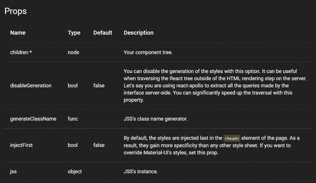
import React from 'react';
import ReactDOM from 'react-dom';
import { StylesProvider } from '@material-ui/core/styles';

function App() {
  return (
    <StylesProvider jss={jss}>...</StylesProvider>
  );
}

ReactDOM.render(<App />, document.querySelector('#app'));
這部分之前已經講解過了就不再贅述了,官方文件內有詳細的內容。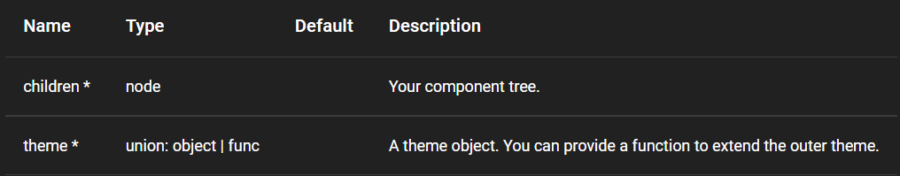
這個 hook 之前的介紹也講解過了,返回了一個 theme ,你可以function component中使用它。
export default function MyComponent() {
  const theme = useTheme();

  return <div>{`spacing ${theme.spacing}`}</div>;
}
使用 higher-order component 的模式與一個具有function component的樣式表相連。它不會修改傳遞給它的組件;相反的,它返回一個帶有 classes 屬性的新組件。這個 classes 對象包含了在 DOM 中註入的類名(class names)。
你可能會注意到一些有趣的細節:
higher-order component: 應該用於包裝組件。
const styles = {
  root: {
    backgroundColor: 'red',
  },
};

function MyComponent(props) {
  return <div className={props.classes.root} />;
}

export default withStyles(styles)(MyComponent);
提供 theme object 作為參數,以便組件可以渲染。
Component: 將被包裝的組件。
Component: 新建的組件。
import React from 'react';
import { withTheme } from '@material-ui/core/styles';

function MyComponent(props) {
  return <div>{props.theme.direction}</div>;
}

export default withTheme(MyComponent);
那麼今天的內容就到這邊了,至此相信大家對這個UI庫已經有一些基本的認識了吧,明天會講解 Customization (自訂) 組件的部分。


 iThome鐵人賽
 看影片追技術