MDX 是 Storybook 提供的另一種攥寫文件的格式,MDX 結合了 Markdown 和 JSX 的標准文件格式,使我們可以用一些 Markdown 語法(例如 # heading1) 來攥寫自由度更高的 Story 文件。
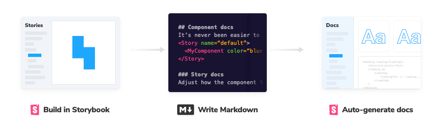
我們用 MDX 的方式重寫一次 Button 的文件,來對比一下和 CSF (Component Story Format) 在攥寫上的差異。
CSF
// Button.stories.js
import MyButton from './Button.vue'

export default {
  title: 'Example/Button',
  component: MyButton,
  argTypes: {
    size: {
      control: {
        type: 'select',
        options: ['small', 'medium', 'large']
      }
    }
  },
  parameters: {
    docs: {
      description: {
        component: 'This is Button\'s description.',
      }
    }
  }
}

const Template = (args) => ({
  components: { MyButton },
  setup () {
    return { args }
  },
  template: '<my-button v-bind="args" />',
})

export const Primary = Template.bind({})
Primary.args = {
  primary: true,
  label: 'Button',
}
MDX (需注意,要將副檔名改成 .mdx)
// Button.stories.mdx

import { Meta, Story, Canvas, ArgsTable } from "@storybook/addon-docs";

import MyButton from "./Button.vue";

<Meta
  title="MDX/Button"
  argTypes={{
    label: {
      control: {
        type: "text",
      },
    },
    size: {
      control: {
        type: "select",
        options: ["small", "medium", "large"],
      },
    },
    primary: {
      control: {
        type: "boolean",
      },
    },
    backgroundColor: {
      control: {
        type: 'color'
      }
    }
  }}
/>

export const Template = (args) => ({
  components: { MyButton },
  setup() {
    return { args };
  },
  template: '<my-button v-bind="args" />',
});

# Button

This is Button's description.

<Canvas>
  <Story
    name="Primary"
    args={{
      primary: true,
      label: "Primary",
    }}
  >
    {Template.bind({})}
  </Story>
</Canvas>

<ArgsTable of={MyButton} />
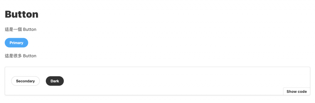
來看一下結果

整體而言 CSF 能做到的事,MDX 都有方法能做到,唯獨在 DocsPage 中 ArgsTable 少了 controls 功能,不過儘管如此也不會影響 MDX 的實用性,因為 MDX 能做到更多的事情,它提供給開發者更高的自由度可以隨即任意所需的內容,也因此在排版上也有很大的彈性。
// Button.stories.mdx

...

# Button

這是一個 Button

<Story
  name="Primary"
  args={{
    primary: true,
    label: "Primary",
  }}
>
  {Template.bind({})}
</Story>

這是很多 Button

<Canvas>
  <Story
    name="Secondary"
    args={{
      primary: false,
      label: "Secondary",
    }}
  >
    {Template.bind({})}
  </Story>
  <Story
    name="Dark"
    args={{
      primary: true,
      label: "Dark",
      backgroundColor: "#333333",
    }}
  >
    {Template.bind({})}
  </Story>
</Canvas>

<ArgsTable of={MyButton} />
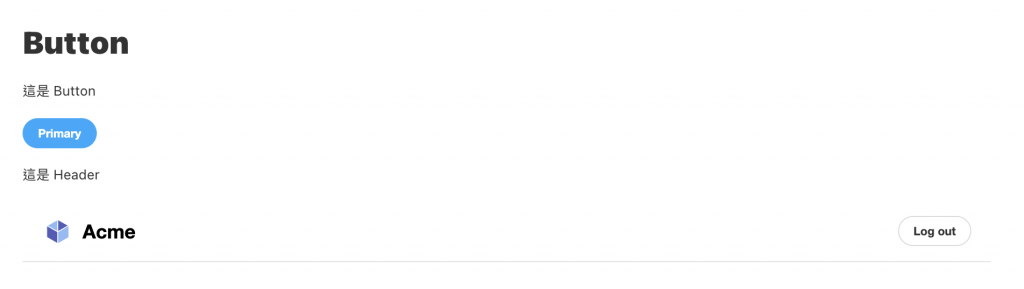
假設你已經有建立了其他的 Story,在 MDX 的語法中,我們可以直接將其嵌入至當前的文件中。
// Button.stories.mdx

...

# Button

這是 Button

<Story
  name="primary"
  args={{
    primary: true,
    label: "Primary",
  }}
>
  {Template.bind({})}
</Story>

這是 Header

<Story id="example-header--logged-in" />
而 Story 的 id 我們可以透過瀏覽器中的 URL 得知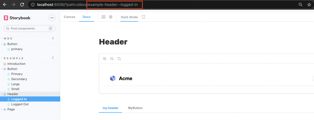
而它其實也是透過 title + story name 組合而來的
title =>  'Example/Header'
story name => 'LoggedIn'
-------------------------
example-header--logged-in
在 MDX 中添加 parameters 和 Decorators 的方法
import { Meta, Story } from '@storybook/addon-docs';

<Meta
  title="MyComponent"
  decorators={[ ... ]}
  parameters={{ ... }}
/>

<Story
	name="story"
	decorators={[ ... ]}
	parameters={{ ... }}
>
...
</Story>
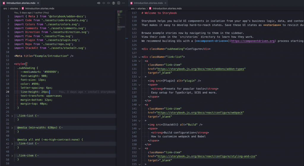
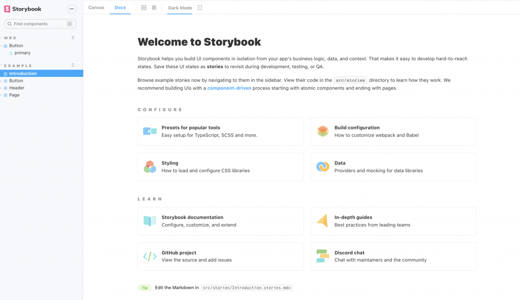
如果我們只是想寫新手指引或是 Design guide 等性質的說明文件, MDX 會是你唯一的選擇,基本上寫法就完全像是在我們平常在寫 Markdown 語法的文件,甚至因為有支援 JSX,所以可以添加 HTML 與 CSS 來產出更精美的文件,而 CLI 建立的專案中就有一個很好的例子 introduction.stories.mdx 。
今天的分享就到這邊,如果大家對我分享的內容有興趣歡迎點擊追蹤 & 訂閱系列文章,如果對內容有任何疑問,或是文章內容有錯誤,都非常歡迎留言討論或指教的!
明天要來分享的是 Storybook 主題的第七篇 Colors & Typography,那我們明天見!


 iThome鐵人賽
 看影片追技術