DocsPage 是由 Storybook Docs 所提供的頁面,無需任何的設定自動就會從 Stories 和元件中的 props, emits、slots 甚至是註解 (沒錯就是註解) 中解析聚合出基本的預設文檔。
Storybook Docs 包含在 Essential Addons 中,所以用 CLI 建立的專案都會預設含有 Storybook Docs。
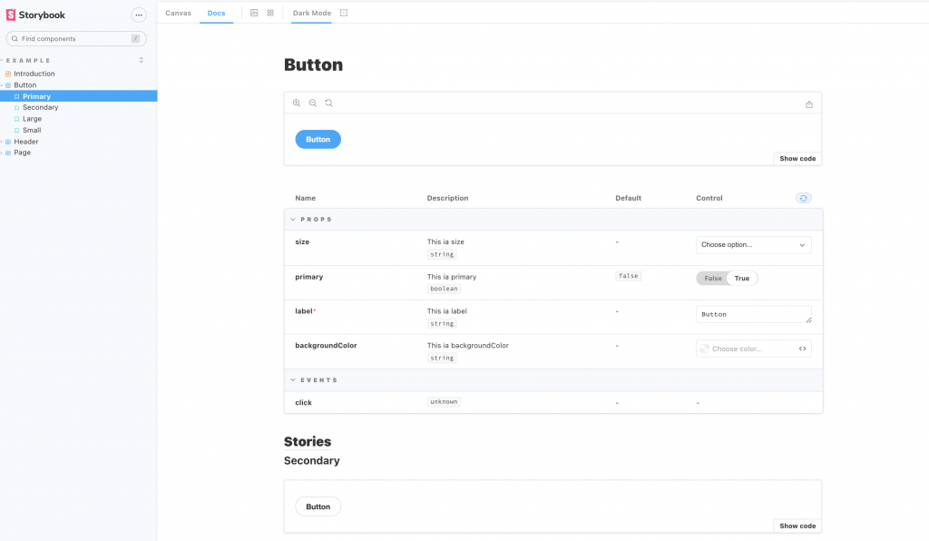
如果有看過上一篇 Storybook - Controls 的朋友一定會注意到, DocsPage 中的 ArgsTable 和 Controls 面板非常相似,因為事情上他們背後是使用相同的運作原理,所以 argsType 的設定會同時在 Controls 面板中以及 DocsPage 出現。
ArgsTable 的內容預設是從元件以及 Story 中自動推斷出來的,但 Storybook 也提供我們一些屬性可以自己定義內容來讓文件更豐富。
欄位 | 說明
:------------ | :-----------—
name | 屬性名稱
type.required | 是否為必填屬性,是的話會出現紅色星號
description | 屬性說明
table.category | 屬性的分類
table.subcategory | 屬性的子分類
table.type.summary | 屬性類型的簡短描述
table.type.detail | 屬性類型的描述
table.defaultValue.summary | 屬性預設值的簡短描述
table.defaultValue.detail | 屬性預設值的描述
control | 查看完整列表
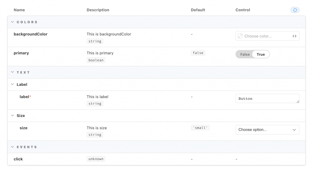
其中我特別挑 category 和 subcategory 出來說明,我們可以將類似的 args 分門別類,甚至細到可以再分一層子類別。
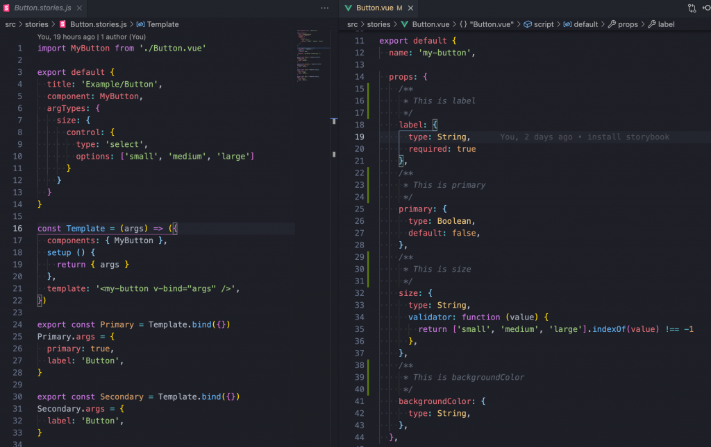
import MyButton from './Button.vue'

export default {
  title: 'Example/Button',
  component: MyButton,
	argTypes: {
	  backgroundColor: {
	    control: 'color',
	    table: {
	      category: 'Colors'
	    }
	  },
	  primary: {
	    table: {
	      category: 'Colors'
	    }
	  },
	  label: {
	    table: {
	      category: 'Text',
	      subcategory: 'Label'
	    }
	  },
	  size: {
	    table: {
	      category: 'Text',
	      subcategory: 'Size'
	    },
	    control: {
	      type: 'select',
	      options: ['small', 'medium', 'large']
	    }
	  },
	  click: {
	    table: {
	      category: 'Events'
	    }
	  }
	}
}
我們可以為整份 DocsPage 寫上補充說明
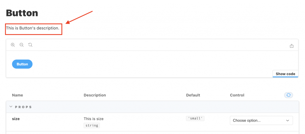
import MyButton from './Button.vue'

export default {
  title: 'Example/Button',
  component: MyButton,
  parameters: {
    docs: {
      description: {
        component: 'This is Button\'s description.',
      }
    }
  },
  ...
}
有些元件可能會在包裹著子元件,這時如果要想要將他們一起顯示在同一個 DocsPage 中,可以透過subcomponents 屬性。
// src/stories/Header.stories.js

import MyHeader from './Header.vue';
import MyButton from './Button.vue';

export default {
  title: 'Example/Header',
  component: MyHeader,
  subcomponents: { MyButton }
};

今天的分享就到這邊,如果大家對我分享的內容有興趣歡迎點擊追蹤 & 訂閱系列文章,如果對內容有任何疑問,或是文章內容有錯誤,都非常歡迎留言討論或指教的!
明天要來分享的是 Storybook 主題的第六篇 MDX,那我們明天見!


 iThome鐵人賽
 看影片追技術