CSS中的Transform(線性轉換)是繼昨天Transition後另一常見動畫屬性,本篇主要介紹以下幾種應用:
A.transform: rotate(),括號內可輸入deg代表角度,例如transform: rotate(90deg);意指將選擇的元素順時針轉90度。其餘可輸入值可參考以下頁面transform: rotate
B.transform: scale(X,Y),此屬性能將指定元素之X軸Y軸按所設定的比例放大或縮小,例如transform: scale(2,3);意指將該元素水平放大2倍,垂直放大3倍。
C.transform: translate(X,Y),此屬性能使元素依設定值移動位置,例如transform: translate(200px,300px);,意指將元素向右位移200px、向下位移300px,值得一提的是,在這裡提到的Y軸正向是下方,至於其原因將在transform-origin中以圖片說明。
D.transform: skew(X,Y),此屬性能將元素依設定值偏斜,例如transform: skew(15deg,15deg);,意指將該元素各向X、Y軸偏斜15度。
在以圖片說明上述四項應用前,要先提到transform-origin軸心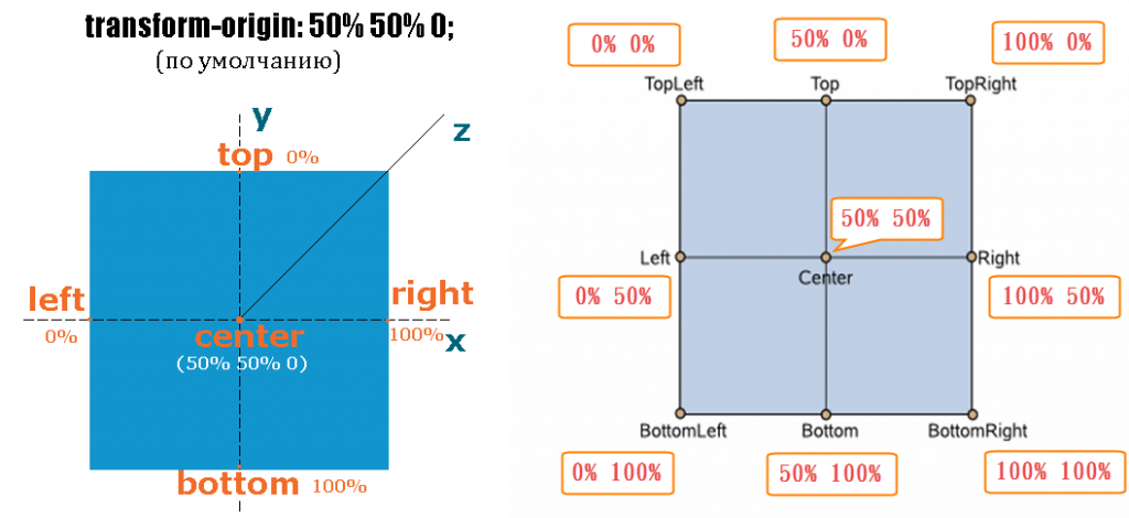
若無特別設定transform-origin軸心位置,其預設值會是元素中心點,由此圖可以看出中心點座標預設為(50%,50%)因此在這裡其原點為左上位置,從水平方向往右稱為x軸,垂直向下稱為y軸。此設定可用來變更軸心位置,以實現特殊動畫效果,如時鐘。
圖片來源及參考資料
本次示範圖如下,將8個div歸類在2個section中,並以不同顏色標示,這樣在接下來的示範中較易區別。
transform: rotate():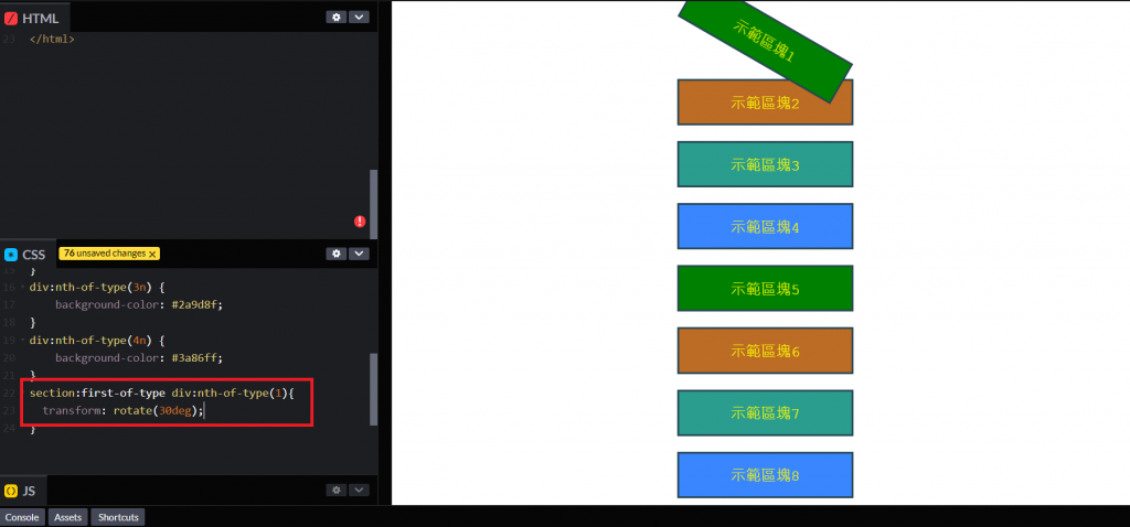
輸入section:first-of-type div:nth-of-type(1){transform: rotate(30deg);},意指將第1塊section中的第1個div順時針旋轉30度。
transform: scale(X,Y):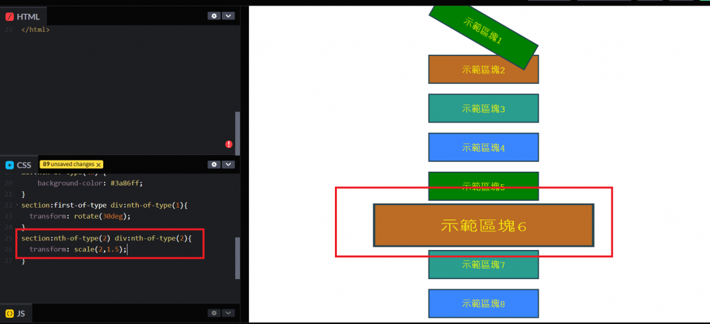
輸入section:nth-of-type(2) div:nth-of-type(2){transform: scale(2,1.5);},意指將第2塊section中的第2個div水平寬度放大為2倍,垂直高度放大為1.5倍。
transform: translate(X,Y):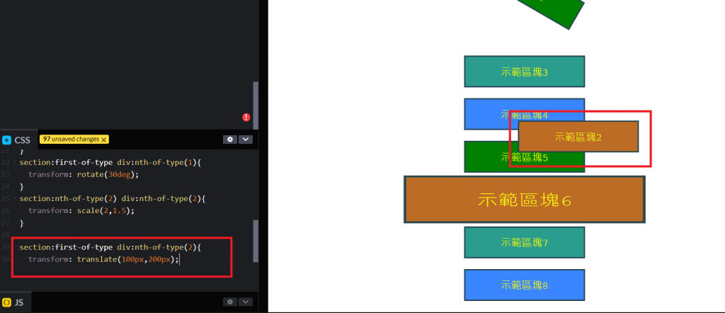
輸入section:first-of-type div:nth-of-type(2){transform: translate(100px,200px);},意指將第1塊section中的第2個div水平向右位移100px,垂直向下位移200px。
transform: skew(X,Y):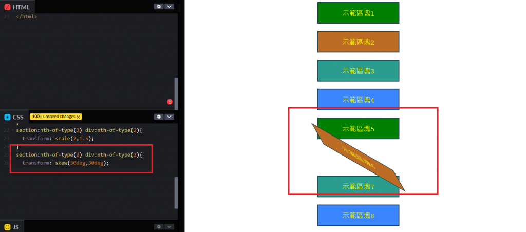 輸入
輸入section:nth-of-type(2) div:nth-of-type(2){transform: skew(30deg,30deg);},意指將第2塊section中的第2個div水平向右及垂直向下各傾斜30度。
當然也可以多個Transform屬性一並使用,不過各屬性中間會以空格區分
例:輸入section:nth-of-type(2) div:nth-of-type(2){transform: rotate(30deg) translate(-100px,-200px) scale(2,2);},可同時設定第2塊section中的第2個div順時針旋轉30度、水平向左位移100px、垂直向上200px、水平寬度及垂直高度各放大2倍。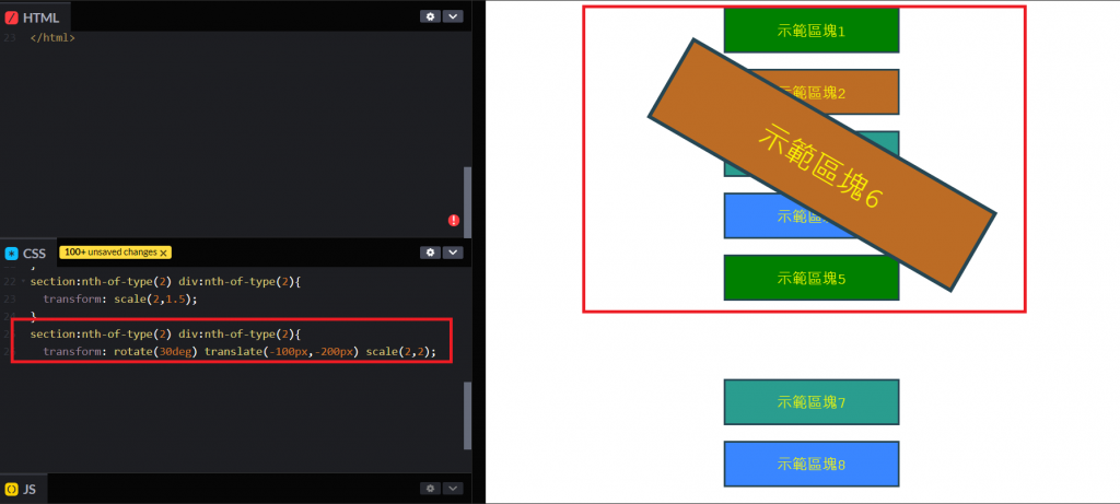
小結:其實Transform還有許多進階用法,尤其上述例子僅用2D圖形示範,沒有提到Rotate、Scale、Translate可以多輸入Z軸值,做出3D動畫效果。


 看影片追技術