FlexBox可稱為彈性盒子,是因應各項行動裝置有不同螢幕尺寸或顯示設備而誕生的設計/佈局模式(Layout mode),以下用stack overflow網站做例子: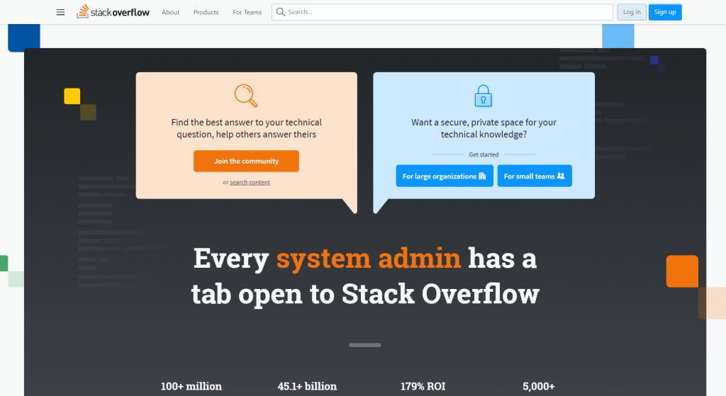
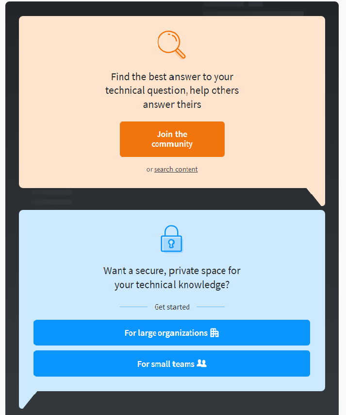
上圖為正常頁面大小,下圖為將視窗水平大小縮到極限後的畫面,可以看到原本水平排列的區塊在縮放後變為垂直排列,換言之利用Flexbox排版後,可以容許在一定範圍內的物件更改其長寬大小以貼合原本的區塊。
參考自
再來,依序介紹FlexBox幾項重要屬性:
A:Display:Flex(設定一個Flexbox及介紹Main Axis及Cross Axis)
B:Flex-direction(row/collum/row-reverse/column-reverse)
C:Justify-content
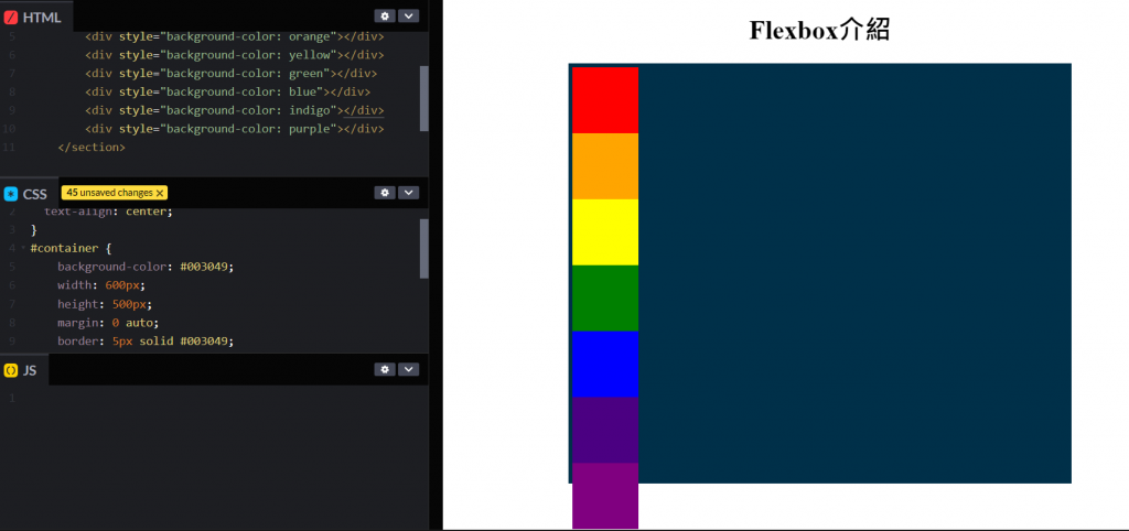
上圖示範為在1個id=container的<section>中有7個<div>的情形,為方便識別,各自賦予<div>紅橙黃綠藍靛紫顏色做區別,並統一長寬;<section>則有額外設定Border。由圖可以看出7個<div>的height超過了<section>,因此紫色的<div>超出了邊界,如果希望<div>放在<section>中,不要超出其範圍可以怎麼做呢?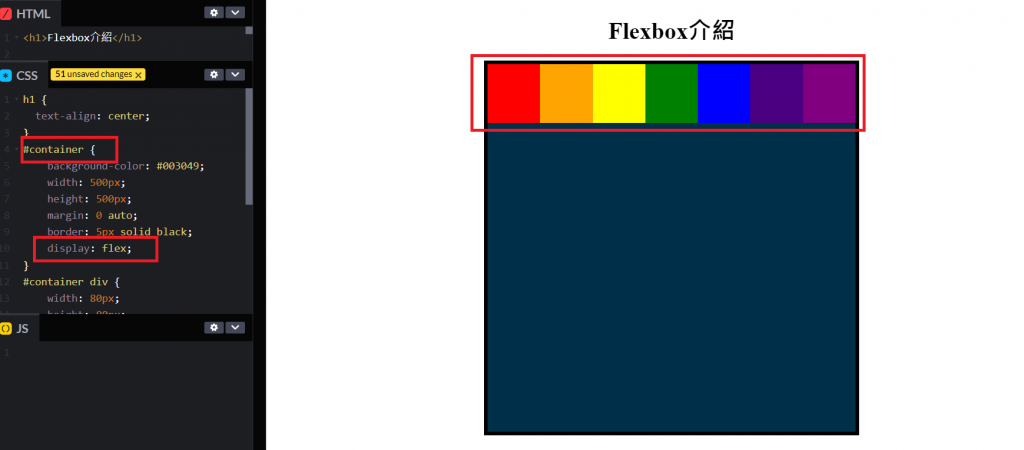
A:在id=container的<section>中加入display: flex;後,便將整個<section>設為一個彈性盒子,原本應該超出範圍的<div>像是彈簧一樣以由左至右的方式貼合於<section>上方。
在進入Flex-direction前,要先前置一個重要概念主軸(main axis)、次軸(cross axis)
上圖的<div>被放進flexbox後即以由左至右的方向排列,原因係由左至右為主軸(main axis)文字(內容)預設方向;次軸(cross axis)則指若項目數量/大小超過容器範圍的"換行"方向,通常預設為由上至下。
B-a:
在<section>中輸入flex-direction: row;發現其排列方式並無變化,因為row預設方向亦為由左至右。
B-b: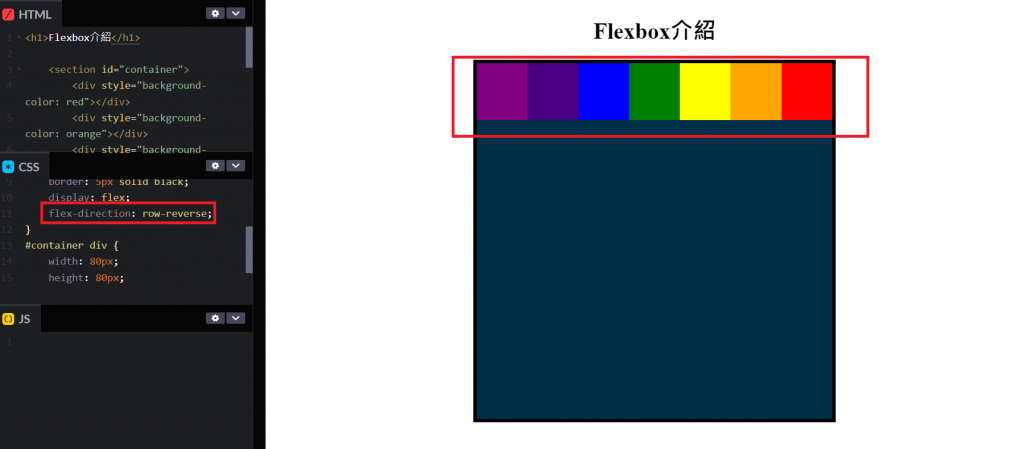
在<section>中輸入flex-direction: row-reverse;發現其排列方式改為由右至左。
B-c: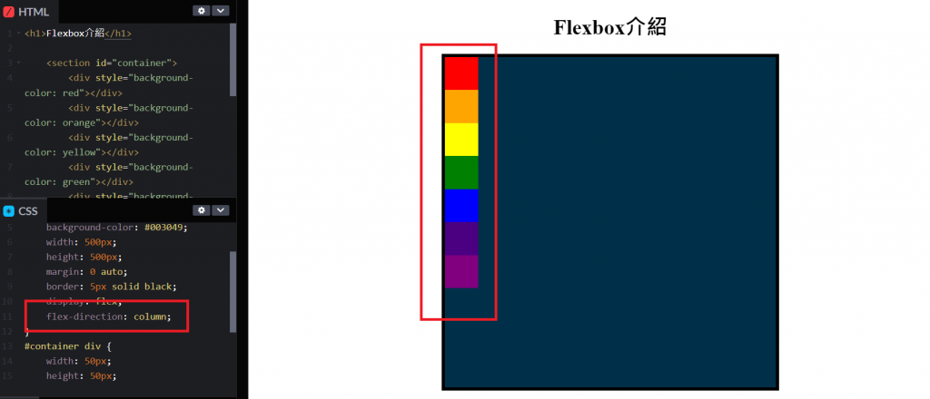
在<section>中輸入flex-direction: column;發現其排列方式改為由上而下,此處將<div>縮小較易看出差別。
B-d: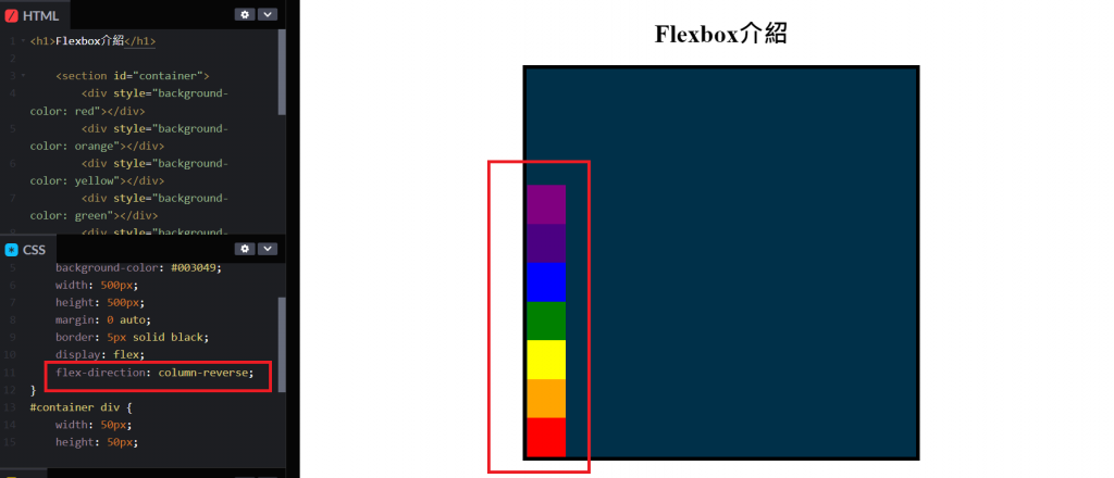
在<section>中輸入flex-direction: column-reverse;發現其排列方式改為由下而上。
這邊用簡易表格統整一下flex-direction及main axis/cross axis關係。
| flex-direction | 主軸(main axis)文字方向 | 次軸(cross axis)換行方向 |
|---|---|---|
| row | 由左至右 | 由上到下 |
| row-reverse | 由右至左 | 由上到下 |
| column | 由上到下 | 由左至右 |
| column-reverse | 由下到上 | 由左至右 |
C-a: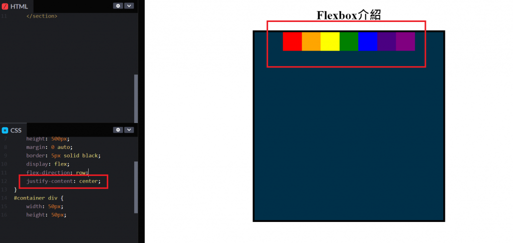
在<section>中輸入justify-content: center;可將主軸文字/內容置中排列。
C-b: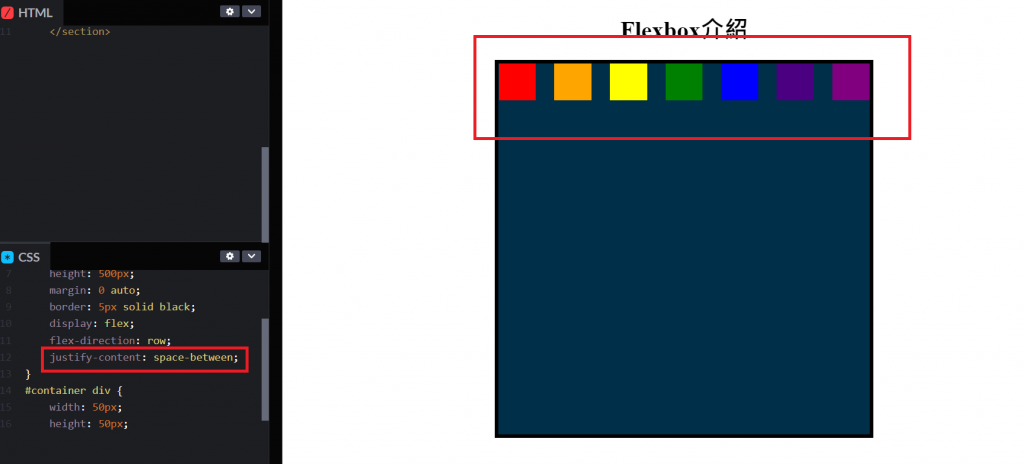
在<section>中輸入justify-content: space-between;可將主軸首位文字/內容推到最起始側;末位文字/內容推到最後側,其餘內容以均衡間距排列。
C-c: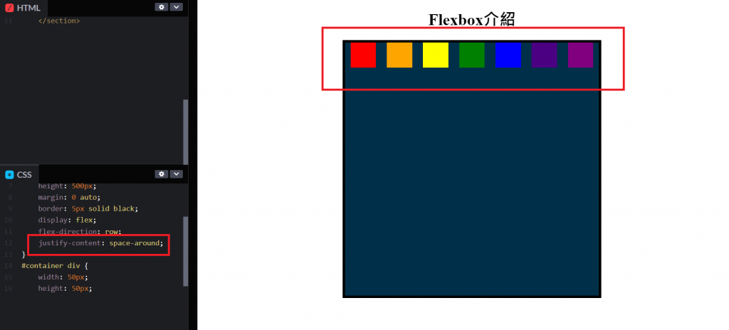
在<section>中輸入justify-content: space-around;可將主軸間文字/內容以均衡間距排列,但其首位與末位與各自邊距不同(僅為內容間距一半)。
C-d: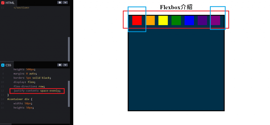
在<section>中輸入justify-content: space-evenly;與space-around稍有不同的地方在於主軸間文字/內容及首末位邊距均以相等間距排列。
明日接著介紹flexbox其二。


 看影片追技術