基礎資料視覺化
思考有無其他分析面向
以前在視覺化階段時,幾乎都是使用Python的matplotlib,自從在搜索資料看到seaborn的圖時,就被美到了
所以這次試著用seaborn來完成視覺化的部分^^。順帶一題,查資料發現seaborn算是matplotlib的進階版,讓使用者可以用更簡潔的方式作圖,這個網站介紹的蠻詳細的。
比較可惜的是seaborn中沒有餅圖,所以這裡用matplotlib來呈現!
import seaborn as sns
import matplotlib.pyplot as plt #導入套件
plt.figure(figsize=(4,4),dpi=150) #調整圖片大小和解析度
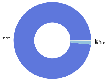
short=df1['ride_length'][mask & mask_1].count() #短租數量
middle=df1['ride_length'][mask_2 & mask_3].count() #中租數量
long=df1['ride_length'][mask_4].count() #長租數量
time_proportion=[short,middle,long]
x=['short','middle','long']
colors=['#5e77dc','#92c2de','#ffffe0']
plt.pie(time_proportion,labels=x,colors=colors,radius=1.5,wedgeprops={'linewidth':1.5,'width':0.8}) #餅圖設定
plt.show() #顯示圖片
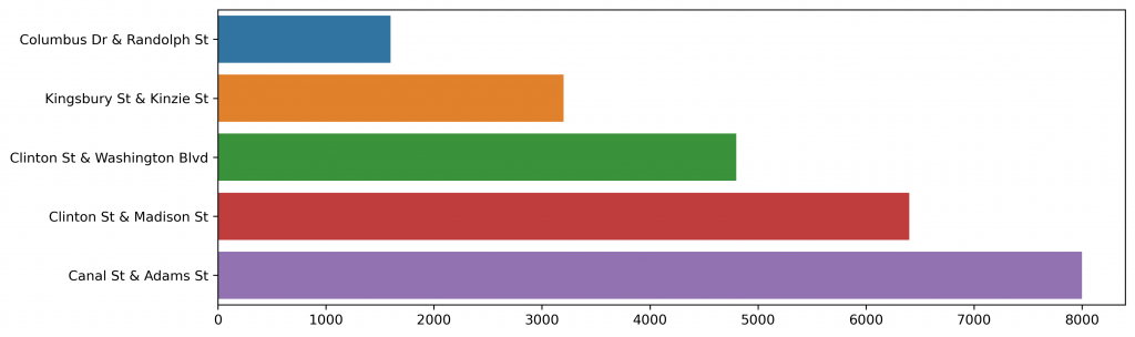
plt.figure(dpi=300,figsize=(12,4))

y=['Columbus Dr & Randolph St',
   'Kingsbury St & Kinzie St',
   'Clinton St & Washington Blvd',
   'Clinton St & Madison St',
   'Canal St & Adams St']
x=[1600,3200,4800,6400,8000]
d=[a['start_station_id'][0],a['start_station_id'][1],a['start_station_id'][2],a['start_station_id'][3],a['start_station_id'][4]]
d=pd.DataFrame(d)
sns.barplot(x=x,y=y,data=d)
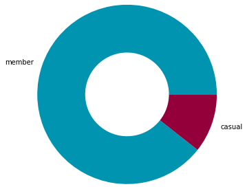
plt.figure(figsize=(4,4),dpi=150)

member=sum(test['member_casual']=='member') #374670
casual=sum(test['member_casual']=='casual') #44529
d=[member,casual]
x=['member','casual']
colors=['#0094b0', '#93003a']

plt.pie(d,labels=x,colors=colors,radius=1.5,wedgeprops={'linewidth':1.5,'width':0.8})

plt.show()
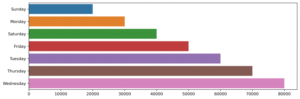
plt.figure(dpi=300,figsize=(12,4))

y=['Sunday',
   'Monday',
   'Saturday',
   'Friday',
   'Tuesday',
   'Thursday',
   'Wednesday']
x=[20000,30000,40000,50000,60000,70000,80000]
d=[sum(df1[mask_5]['day_of_the_week']=='3'),
   sum(df1[mask_5]['day_of_the_week']=='4'),
   sum(df1[mask_5]['day_of_the_week']=='2'),
   sum(df1[mask_5]['day_of_the_week']=='5'),
   sum(df1[mask_5]['day_of_the_week']=='6'),
   sum(df1[mask_5]['day_of_the_week']=='1'),
   sum(df1[mask_5]['day_of_the_week']=='7')]
d=pd.DataFrame(d)

sns.barplot(x=x,y=y,data=d)
思索了一番,覺得還可以加入一些查看「關聯性」的資料,但x,y值可能還要想一下,這部分就可以用散點圖來表現了!
明天見! (體力已不支xd)