今天會針對之前發的圖表做優化,添加圖標、圖例以及顏色美化等等。
另外,也會針對沒有比較到的部分進行補充(非會員與會員的部分)
1.圓餅圖
騎乘總時間比例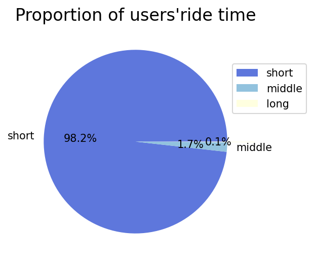
plt.figure(figsize=(4,4),dpi=150)

short=df1['ride_length'][mask & mask_1].count() #短租人數
middle=df1['ride_length'][mask_2 & mask_3].count()  #中租人數
long=df1['ride_length'][mask_4].count() #長租人數

time_proportion=[short,middle,long]
x=['short','middle','']
colors=['#5e77dc','#92c2de','#ffffe0']
explode=[0,0,0.3]

plt.pie(time_proportion,labels=x,colors=colors,autopct='%1.1f%%',explode=explode) #加入百分比和explode(可分出pie chart中想間隔的區塊)
plt.title("Proportion of users'ride time", {"fontsize" : 16}) #加入標題;調整字體大小
plt.legend(labels=['short','middle','long'],loc=0,bbox_to_anchor=(9/10, 3/5)) #加入圖標,使用bbox_to_anchor讓圖標不會擋住圓餅圖

plt.show()
bbox_to_anchor可參考這個網址,寫得蠻詳細的
不重複使用者(member/casual)
plt.figure(figsize=(4,4),dpi=150)

non_uni=df1[mask]['ride_id'].nunique() #不重複使用者
uni=(df1[mask]['ride_id'].count()-df1[mask]['ride_id'].nunique()) #重複使用者

member=sum(df1[mask]['member_casual']=='member') #374670
casual=sum(df1[mask]['member_casual']=='casual') #44529
d=[member,casual]
x=['member','casual']
colors=['#0094b0', '#93003a']
explode=[0,0.1]
plt.pie(d,labels=x,colors=colors,autopct='%1.1f%%',explode=explode)
plt.title("Proportion of member & non-member", {"fontsize" : 14})
plt.legend(labels=['member','casual'],loc=0,bbox_to_anchor=(9/10, 3/5))
plt.show()
2.長條圖
長條圖的部分,覺得如果是要在簡報呈現的話,bar愈多就不能有太多顏色,不然很干擾觀察,用同色方式表達(原本想使用由淺到深的顏色,但一直報錯:ValueError: RGBA sequence should have length 3 or 4)。
DoW(哪天最多人使用)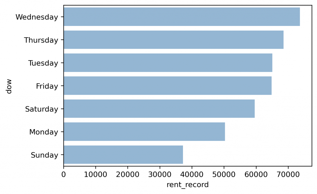
plt.figure(dpi=300)

y=['Wednesday',
   'Thursday',
   'Tuesday',
   'Friday',
   'Saturday',
   'Monday',
   'Sunday']

x=[sum(df1[mask]['day_of_the_week']=='3'),
   sum(df1[mask]['day_of_the_week']=='4'),
   sum(df1[mask]['day_of_the_week']=='2'),
   sum(df1[mask]['day_of_the_week']=='5'),
   sum(df1[mask]['day_of_the_week']=='6'),
   sum(df1[mask]['day_of_the_week']=='1'),
   sum(df1[mask]['day_of_the_week']=='7')]

d=pd.DataFrame({"rent_record":x,"dow":y})
sns.barplot(x='rent_record',y='dow',data=d,color='#89b7de')
前5名頻繁使用站點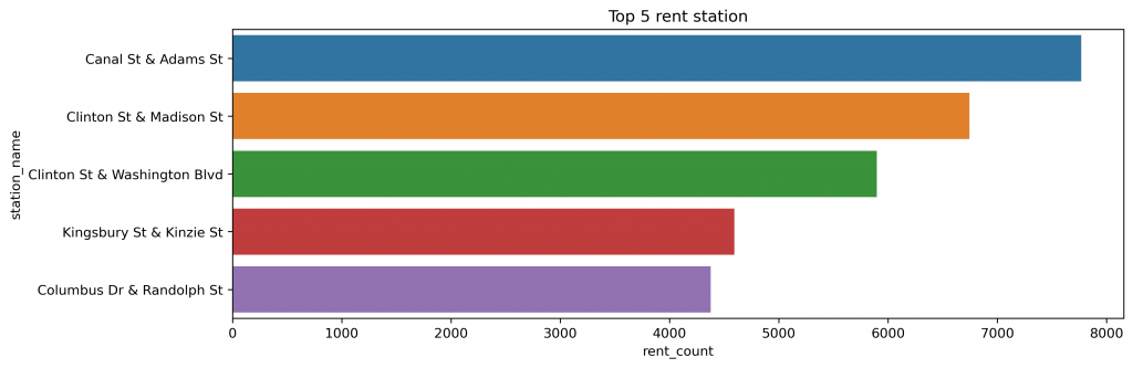
#計算多於1分鐘、各站點使用次數,並降冪排序
a=df1[mask].groupby('start_station_name').count()
a=a.sort_values('start_station_id',ascending=False)

plt.figure(dpi=300,figsize=(12,4))

y=['Canal St & Adams St',
   'Clinton St & Madison St',
   'Clinton St & Washington Blvd',
   'Kingsbury St & Kinzie St',
   'Columbus Dr & Randolph St']
x=[a['start_station_id'][0],a['start_station_id'][1],a['start_station_id'][2],a['start_station_id'][3],a['start_station_id'][4]]
d=pd.DataFrame({"rent_count":x,"station_name":y})
sns.barplot(x="rent_count",y="station_name",data=d)
plt.title('Top 5 rent station')
3.地理位置(非會員/會員是否有不同)
非會員熱門租借站點
(相較於會員更接近湖畔邊景點)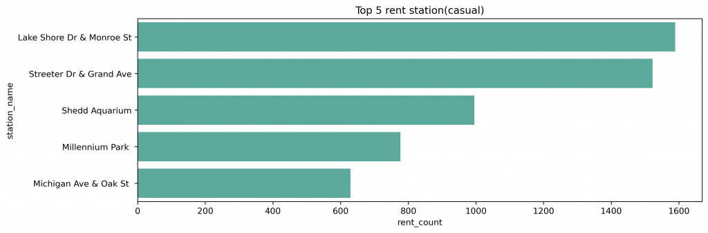
mask_5=df1['member_casual']=='casual' #使用另一個遮罩
df1[mask&mask_5] #雙條件篩選
df_test2=df1[mask&mask_5].groupby('start_station_name').count()
df_test2=df_test2.sort_values('start_station_id',ascending=False)

df_test2.head(5)

plt.figure(dpi=300,figsize=(12,4))

y=['Lake Shore Dr & Monroe St',
   'Streeter Dr & Grand Ave',
   'Shedd Aquarium',
   'Millennium Park ',
   'Michigan Ave & Oak St ']
x=[df_test2['start_station_id'][0],
   df_test2['start_station_id'][1],
   df_test2['start_station_id'][2],
   df_test2['start_station_id'][3],
   df_test2['start_station_id'][4]]
d=pd.DataFrame({"rent_count":x,"station_name":y})
sns.barplot(x="rent_count",y="station_name",data=d,color='#4eb7a5')
plt.title('Top 5 rent station(casual)')
會員熱門租借站點
(多位於城市交通要道附近)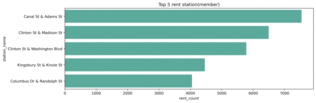
mask_6=df1['member_casual']=='member'
df1[mask&mask_6]
df_test3=df1[mask&mask_6].groupby('start_station_name').count()
df_test3=df_test3.sort_values('start_station_id',ascending=False)

df_test3.head(5)
plt.figure(dpi=300,figsize=[12,4])
y=['Canal St & Adams St',
   'Clinton St & Madison St',
   'Clinton St & Washington Blvd',
   'Kingsbury St & Kinzie St',
   'Columbus Dr & Randolph St']
x=[df_test3['start_station_id'][0],
   df_test3['start_station_id'][1],
   df_test3['start_station_id'][2],
   df_test3['start_station_id'][3],
   df_test3['start_station_id'][4]]
d=pd.DataFrame({"rent_count":x,"station_name":y})
sns.barplot(x="rent_count",y="station_name",data=d,color='#4eb7a5')
plt.title('Top 5 rent station(member)')
很快的就要進入30天了
能夠堅持到今天,自己也覺得蠻感動的
雖然到後面發文時常常處於很趕的狀態
明天會針對data studio的部分進行補強
看看是否有一些好玩的圖表能夠用
可能也可以帶到需要自訂義計算的地方!