接續昨天
https://www.youtube.com/watch?v=ttWXapXj4cg&list=PL5e68lK9hEzeeXtsQCQYd9SAzj6u6wZpi
HTML沒變
<link href="C1.css" rel="stylesheet" type="text/css">
<body>
	<section>
		<div class="T1">
			<span style="--i:1;"></span>
			<span style="--i:2;"></span>
			<span style="--i:3;"></span>
			<span style="--i:4;"></span>
			<span style="--i:5;"></span>
			<span style="--i:6;"></span>
			<span style="--i:7;"></span>
			<span style="--i:8;"></span>
			<span style="--i:9;"></span>
			<span style="--i:10;"></span>
			<span style="--i:11;"></span>
			<span style="--i:12;"></span>
			<span style="--i:13;"></span>
			<span style="--i:14;"></span>
			<span style="--i:15;"></span>
			<span style="--i:16;"></span>
			<span style="--i:17;"></span>
			<span style="--i:18;"></span>
			<span style="--i:19;"></span>
			<span style="--i:20;"></span>
		</div>
	</section>
</body>
CSS
*{
	margin: 0;
	padding: 0;
	box-sizing: border-box;
}

body{
	background: #000000;
	justify-content: center;
	align-items: center;
	min-height: 100vh;
	display: flex;
}

section{
	display: flex;
	justify-content: center;
	align-items: center;
	min-height: 100vh;
	animation: animateBg 10s linear infinite;
}

@keyframes animateBg{  /*@ + keyframes 應該是連用的,指定 animateBg 的動作*/
	0%{
		filter: hue-rotate(0deg);  /*依照"色環",顏色漸變*/
	}
	100%{
		filter: hue-rotate(360deg);
	}
}

section .T1{
	position: relative;
	width: 120px;
	height: 120px;
}

section .T1 span{
	position: absolute;
	top: 0;
	left: 0;
	width: 100%;
	height: 100%;
	transform: rotate(calc(18deg * var(--i)));  /*有20個 SPAN標籤 360/20=18*/
}

section .T1 span::before{
	content: '';
	position: absolute;
	top: 0;
	left: 0;
	width: 15px;
	height: 15px;
	border-radius: 50%;
	background: #33D4FF;
	box-shadow: 0 0 10px #33D4FF,
				0 0 20px #33D4FF,
				0 0 40px #33D4FF,
				0 0 60px #33D4FF,
				0 0 80px #33D4FF,
				0 0 100px #33D4FF;   /*光暈多層才看得到,單一層100px會幾乎沒有*/
	animation: animate 2s linear infinite;
	animation-delay: calc(0.1s * var(--i));
}
@keyframes animate{  /*閃爍 呼吸燈?*/
	0%{
		transform: scale(1);
	}
	80%,100%{
		transform: scale(0);
	}
}
成果(原本是藍色,但程式碼有顏色變化)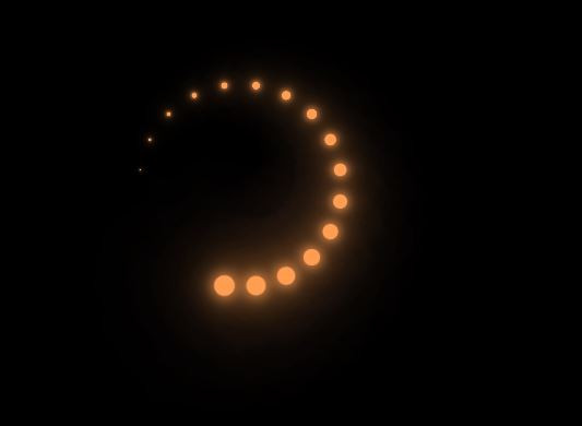
今天先這樣,明天找新的~


 看影片追技術