今天的參考(我猜最複雜的地方應該是動畫秒數的分配)
https://www.youtube.com/watch?v=cqK7VgXWjt8
HTML
<!DOCTYPE html>
<html lang="en">
<head>
	<meta charset="utf-8">
	<title>測試</title>
	<link href="C1.css" rel="stylesheet">
</head>
<body>
	<div class="container">
		<div class="box">
			<div class="cube"></div>
		</div>
	</div>
</body>
</html>
CSS
*{
	margin: 0;
	padding: 0;
	box-sizing: border-box;
}

body{
	display: flex;
	justify-content: center;
	align-items: center;
	min-height: 100vh;
	background: #000000;
	overflow: hidden;
}

.container{
	position: relative;
	width: 100%;
}

.container .box
{
	position: relative;
	display: flex;
	justify-content: center;
	align-items: center;
	width: 100%;
	-webkit-box-reflect: below 1px linear-gradient(transparent,#0004); /*倒影 #0004不是色碼,可能是指透明度*/
}

.container .box .cube{
	position: relative;
	width: 200px;
	height: 200px;
	background: #FF5CF4;
	box-shadow: 0 0 5px rgba(255,92,244,1), /*同 #FF5CF4*/
				0 0 25px rgba(255,92,244,1),
				0 0 50px rgba(255,92,244,1),
				0 0 100px rgba(255,92,244,1),
				0 0 200px rgba(255,92,244,0.5), /*注意分號&逗號*/
				0 0 300px rgba(255,92,244,0.5); /*多層才會夠亮*/
	transform-origin: bottom;
	animation: AA 1.5s ease-in-out infinite;
}

@keyframes AA{
	0%{
		transform: rotate(0deg);
	}
	60%{
		transform: rotate(90deg);
	}
}
成果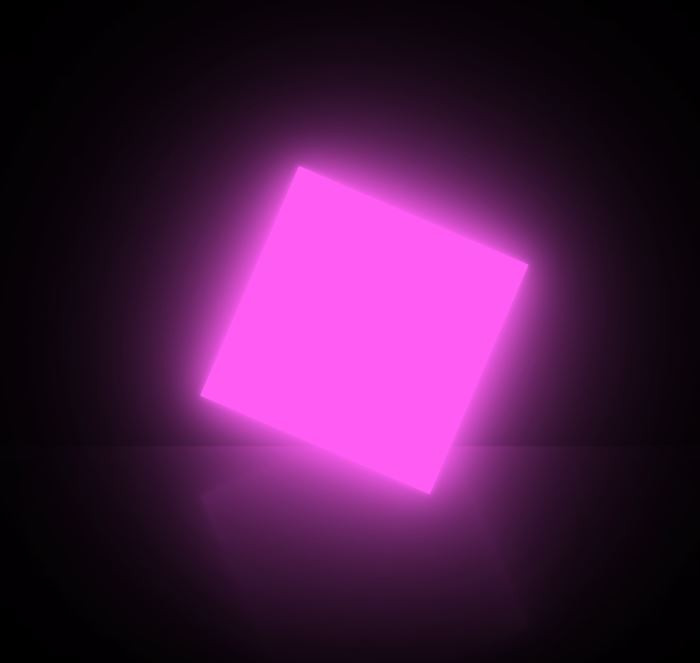


 iThome鐵人賽
 看影片追技術