今天一樣要研究grid的布局,依照慣例,在開始前要先來個簡單的小複習,複習一下Day26說到的grid的功能:
Repeat():重複有規律的行高或列寬設定,避免數量過多寫到瘋,Repeat(重複次數, 行高或列寬)。
Minmax():符合響應式網頁,設定最大值與最小值,在改變網頁寬高的時候配合伸縮,Minmax(最小值, 最大值)。
以上就是昨天的小複習,接著繼續看看grid還有哪些功能吧~
在grid中有區塊分配的功能,grid-template-areas是大範圍的空間概念;grid-area是小區域的命名,可以兩者互相搭配,來做出表格布局。
簡單來說grid-template-areas是以grid-area中各別命名的類別取下名字,以名字的方式設計他的格局,所以我們可以外部和內部的區塊。
我先將三個box中的grid-area分別命名為a、b、c。
.boxa {
    grid-area: a;
    background-color: darkorange;
}
.boxb {
    grid-area: b;
    background-color: blueviolet;
}
.boxc {
    grid-area: c;
    background-color: cadetblue;
}
接著就是隨意示範三種grid-template-areas的排版:
.container{
    display: grid;
    grid-template-columns: repeat(2, 50px);
    grid-template-rows: repeat(2, 225px);
    grid-template-areas:
    "a a a b"
    "c c c b";
}
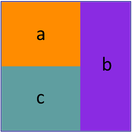
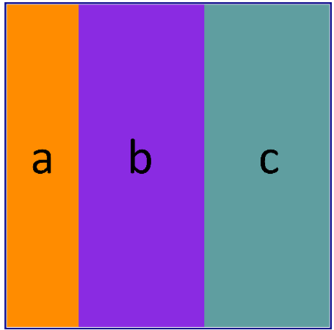
.container{
    display: grid;
    grid-template-columns: repeat(2, 50px);
    grid-template-rows: repeat(2, 225px);
    grid-template-areas:
    "a a b c"
    "a a b c";
}
.container{
    display: grid;
    grid-template-columns: repeat(2, 50px);
    grid-template-rows: repeat(2, 225px);
    grid-template-areas:
    "a a b ."
    ". . . c";
}

在上述的示範中可以看出grid-template-areas的排版規律需要符合正規的矩形才能顯示,像是L型或是同一區域不可分開。
若要空格可以使用.來隔開物件,.可以當作空白區塊。
CSS格線布局 - MDN Web Docs
CSS Grid 屬性介紹 - 卡斯伯Blog - 前端
CSS | 所以我說那個版能不能好切一點? - Grid 基本用法
CSS Grid 格線佈局 - 一顆藍莓
A Complete Guide to Grid
CSS Grid 网格布局教程 - 阮一峰的个人网站


 iThome鐵人賽
 看影片追技術