可以看以下的程式碼和截圖,或者看codepen範例:https://codepen.io/rochelwang1205/pen/LYMQMMP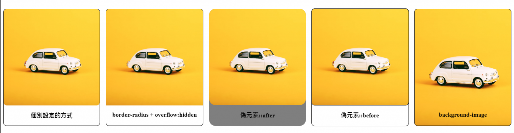
<div class="container container1"> <img src="https://images.unsplash.com/photo-1581235720704-06d3acfcb36f?ixlib=rb-4.0.3&ixid=M3wxMjA3fDB8MHxwaG90by1wYWdlfHx8fGVufDB8fHx8fA%3D%3D&auto=format&fit=crop&w=1780&q=80" alt="Image" />
  <h3>個別設定的方式</h3>
</div>
.container1 {
  border: 2px solid #000;
  border-radius: 10px;
  width: 300px;
}
.container1 img {
  border-radius: 10px; /* Rounded corners for the image */
  width: 300px;
}
<div class="container container2"> <img src="https://images.unsplash.com/photo-1581235720704-06d3acfcb36f?ixlib=rb-4.0.3&ixid=M3wxMjA3fDB8MHxwaG90by1wYWdlfHx8fGVufDB8fHx8fA%3D%3D&auto=format&fit=crop&w=1780&q=80" alt="Image" />
    <h3>border-radius + overflow:hidden</h3>
  </div>
.container2 {
  border: 2px solid #000;
  border-radius: 10px;
  overflow: hidden; /* 將內容裁切到容器的圓角形狀 */
  width: 300px;
}
.container2 img {
  width: 100%; /* 確保圖片填滿容器 */
}
<div class="container container3">
    <img src="https://images.unsplash.com/photo-1581235720704-06d3acfcb36f?ixlib=rb-4.0.3&ixid=M3wxMjA3fDB8MHxwaG90by1wYWdlfHx8fGVufDB8fHx8fA%3D%3D&auto=format&fit=crop&w=1780&q=80" alt="Image" />
    <h3>偽元素::after</h3>
  </div>
.container3 {
  position: relative;
  width: 300px;
  overflow: hidden;
}
.container3::after {
  content: "";
  position: absolute;
  top: 0;
  left: 0;
  width: 100%;
  height: 100%;
  background-color: #000;
  border-radius: 20px;
  opacity: 0.5;
  z-index: 1;
}
.container3 img {
  display: block;
  width: 100%;
  height: auto;
  border-radius: 20px;
  position: relative;
  z-index: 2;
}
<div class="container container4">
    <img src="https://images.unsplash.com/photo-1581235720704-06d3acfcb36f?ixlib=rb-4.0.3&ixid=M3wxMjA3fDB8MHxwaG90by1wYWdlfHx8fGVufDB8fHx8fA%3D%3D&auto=format&fit=crop&w=1780&q=80" alt="Image" />
    <h3>偽元素::before</h3>
  </div>
.container4 {
  position: relative;
}
.container4::before {
  content: "";
  position: absolute;
  top: 0;
  left: 0;
  width: 100%;
  height: 100%;
  outline: 2px solid #000;
  border-radius: 10px;
  z-index: -1;
}
.container4 img {
  display: block;
  width: 300px;
  outline: 2px solid #000;
  border-radius: 10px;
}
<div class="container container5">
    <h3>background-image</h3>
  </div>
</div>
.container5 {
  background-image: url(https://images.unsplash.com/photo-1581235720704-06d3acfcb36f?ixlib=rb-4.0.3&ixid=M3wxMjA3fDB8MHxwaG90by1wYWdlfHx8fGVufDB8fHx8fA%3D%3D&auto=format&fit=crop&w=1780&q=80);
  background-size: cover;
  background-position: center;
  border: 2px solid #000;
  border-radius: 10px;
  width: 300px;
}
.container5::before {
  content: "";
  display: block;
  padding-top: 100%; /* 保持容器的長寬比例 */
}
各個方法的優缺點
overflow: hidden 和 border-radius 組合:
::before 或 ::after):
img 標籤。以上就是幾個可以將卡片切圓角(含圖片)的方法,至於要用哪種方法,優缺點也簡單的在上面描述了。
參考資料:

 iThome鐵人賽
 看影片追技術